Whether you own or rent decides which of these ideas is yours. The list runs from a rug or a lamp to veneer cabinets and glass block walls.
Tapered legs, the narrowing wooden leg that makes a low sideboard look lighter than it is, show up in nearly every room here, so a single well-built wooden piece is the best place to start spending.
1. Mid-century Modern Art
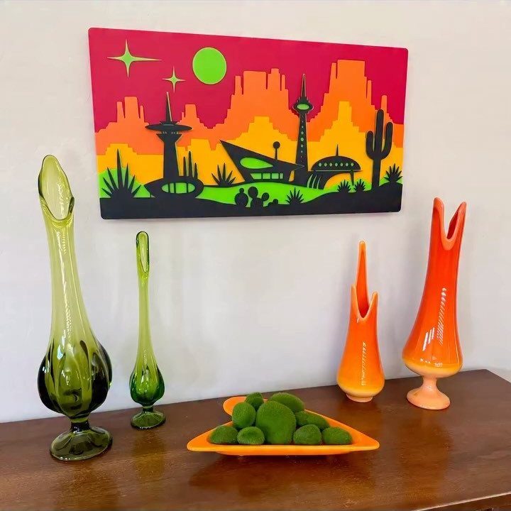
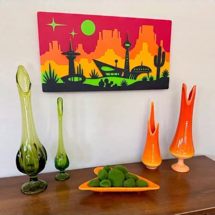
A single large painting does more for a mid-century room than a gallery wall of small prints.
Bold color and simple, stylized shapes are what to look for, and the greens and oranges in this piece pick up the vases on the table below it.
Hang it at eye level over a console or table, and let the objects underneath echo 2 of its colors. Thrift stores and print shops are the budget routes; a secondhand frame in wood suits the look.
2. Streamlined Wooden Furniture with Tapered Legs
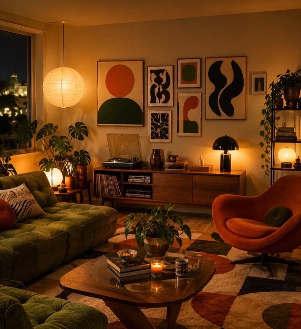
Tapered legs are the detail that makes a piece read as mid-century: the body stays low and clean, and the legs narrow toward the floor so the whole thing looks lighter than it is.
I would spend money on one well-built wooden piece, like a sideboard, before buying several cheap ones. Check the joinery and the drawer fronts, and look at secondhand listings first, since solid wood holds up and can be refinished.
Let the wood be the calm element, then add color around it with a sofa or chair.
3. Layering Colors
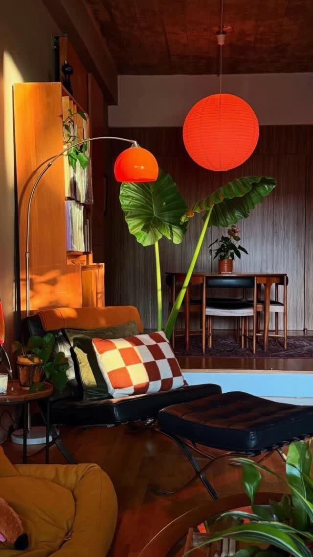
Start with a quiet base, then add color in pieces you can swap out.
Wood walls and a black chair already give a room its neutral backbone, so orange lamps, green plants and a checkered pillow can carry the color without crowding.
Keep to two or three accent colors and repeat each one at least twice, in different places. Pillows and lamps are the cheapest things to change, which suits renters well.
4. Large Windows with Minimal Window Treatments
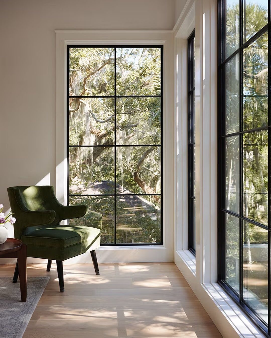
Big windows ask very little of you: the view is the decoration.
With black-framed grid panes like these, I would leave the glass bare or use something very light, since heavy drapes would hide the frame that gives the window its look.
Place one chair and a small side table near the glass and let the light fall on them. Renters who cannot change windows can still keep treatments minimal by choosing a simple sheer or none at all.
5. Mid-century Lighting Fixtures
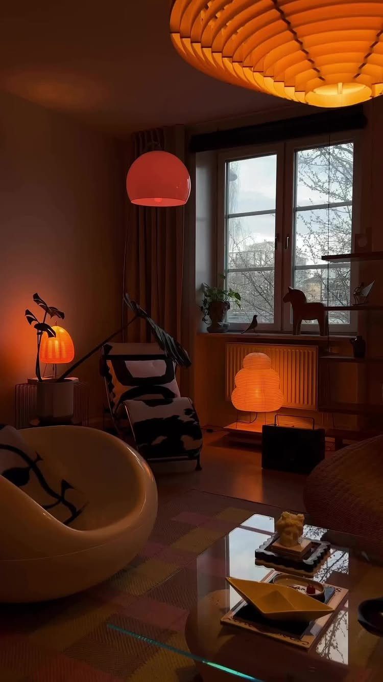
Lighting is where a mid-century room gets its warm glow, and a mix of heights works best: one large pendant overhead, then table lamps lower down. Warm orange tones make the light feel soft in the evening.
Look for iconic shapes and sculptural forms, and secondhand shops often carry vintage lamps at friendlier prices than new reproductions. Rewiring an old lamp is worth the cost for safety.
Pick one statement fixture first, then build around it.
6. Use Natural Materials
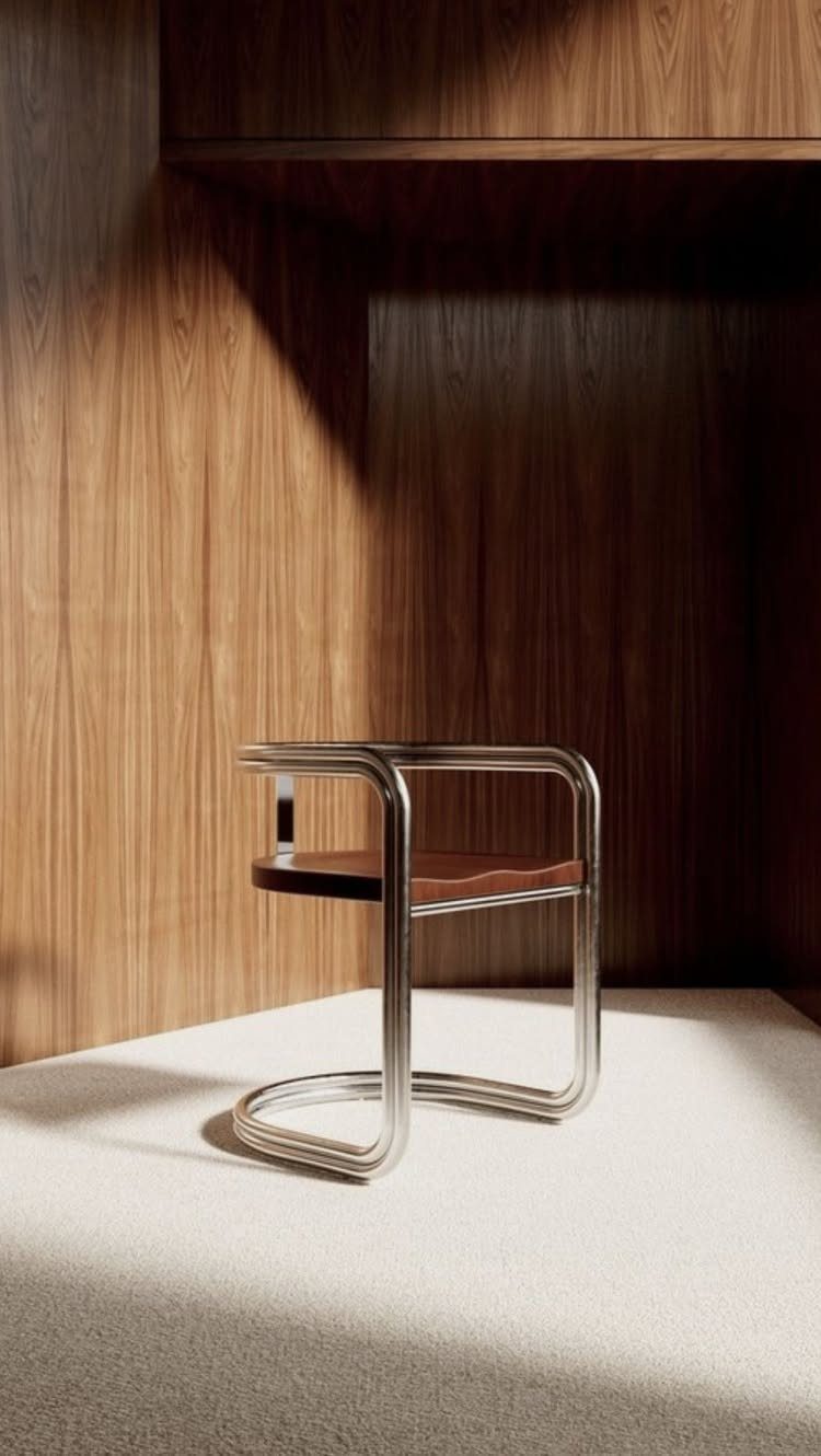
Wood, leather and chrome are the materials that make this chair work: warm vertical paneling behind it, a metal frame in front, and soft texture between them.
Real wood paneling is a big project, but a renter can get a similar mood with wood furniture, a leather seat and a metal-framed piece. I like keeping the materials honest and visible rather than painted over.
Choose two organic materials and one metal, and stop there.
7. Create a Cohesive Color Palette
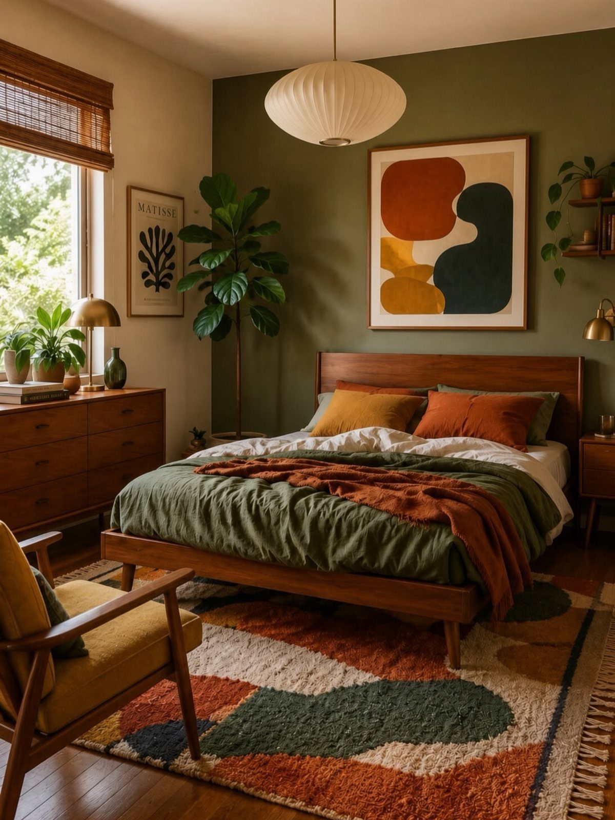
Olive green walls anchor a palette that stays in one temperature: wood tones, earth-colored rugs and art in the same warm range.
Pick one wall color first, then choose the rug, bedding and art to match it rather than the other way around.
Paint is the cheapest piece to get right, and a rug with two or three of the same tones ties the room together.
I would keep the palette to a few colors and let the wood do the rest.
8. Mid-Century Kitchen Interior Design
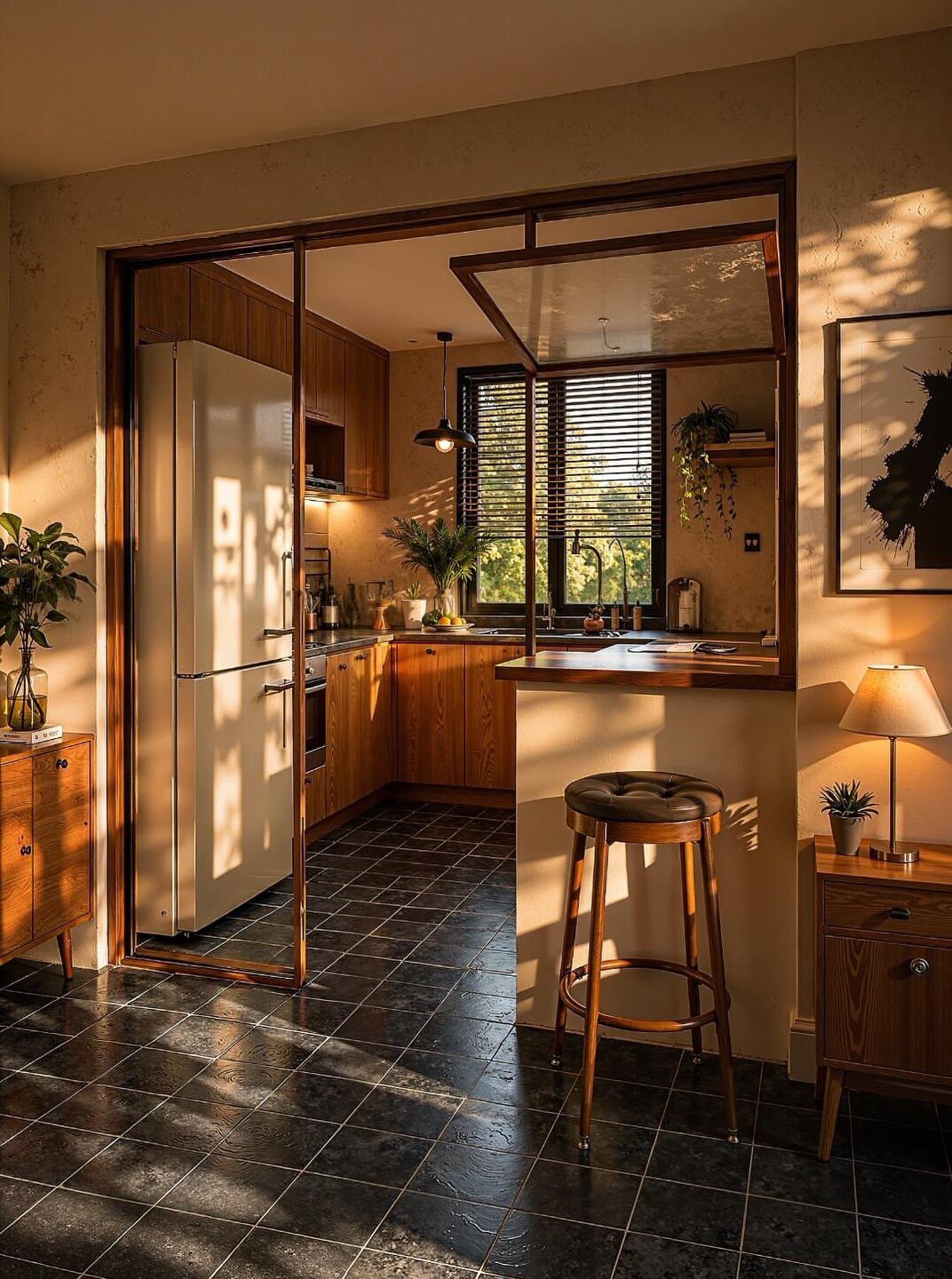
Real veneer cabinets cost a lot, so on a budget I would keep the doors you have and look at flat-front replacements, or refinish what is there. Choose plain pulls or none at all, since hardware breaks up the grain.
Black tile on the floor and a leather-seated stool at the bar both play well against warm wood. White appliances keep the whole thing light.
9. Mid-Century Modern Bathroom
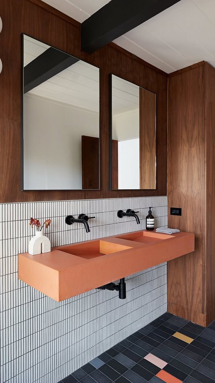
A bathroom rarely gets the mid-century treatment, which is exactly why a bold sink can carry the whole room.
Pick one bold fixture in a warm color, then let black hardware, white tile and a dark floor do the rest. 2 mirrors over a double sink repeat the symmetry.
Renters can borrow the look with a wood-framed mirror and orange towels or a ceramic soap dish.
10. Glass Block Feature Walls
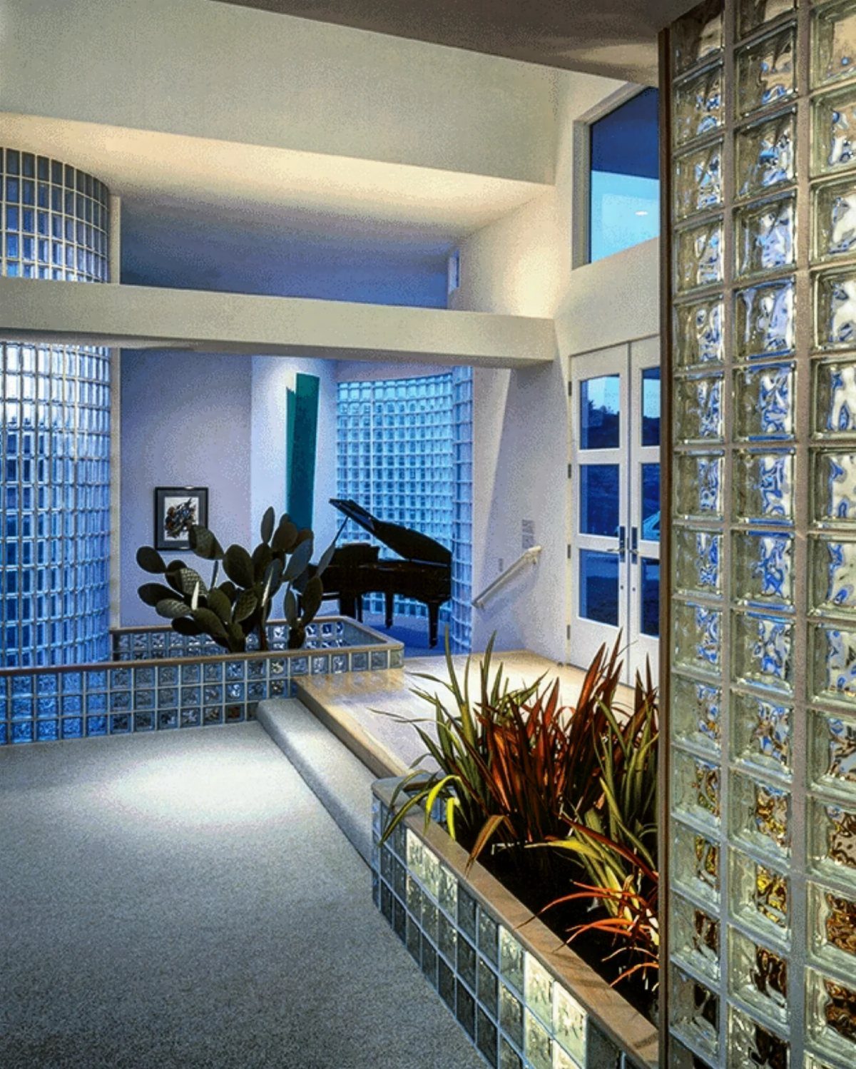
Glass block showed up in mid-century interiors, then disappeared for decades. I think they deserve a second look, because they pass light through while still dividing a room.
Use them where you want separation without a solid wall, such as around a piano corner or an entry. Pair the cool, hazy glass with plants and dark furniture so it reads as a deliberate feature, not a leftover.
This is a build, not a weekend swap, so renters should skip it.
11. Mix Mid-century with Modern
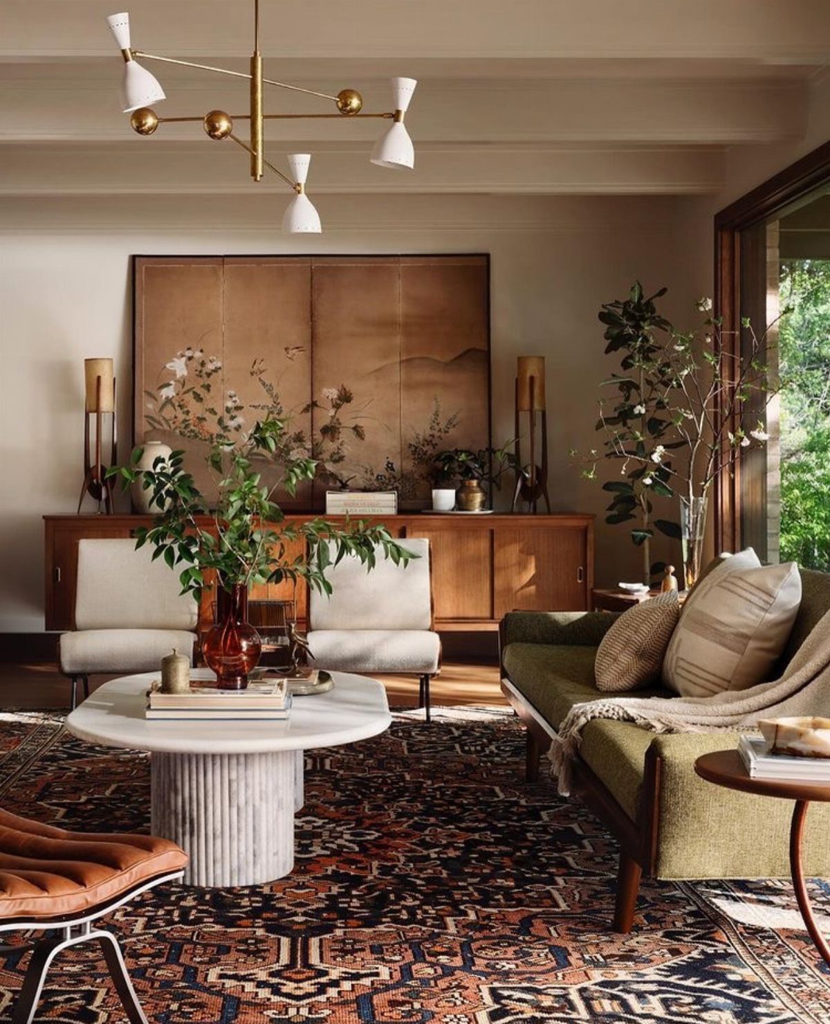
Mid-century shapes sit well beside contemporary pieces when one side leads. Here a green sofa with a retro profile is paired with white chairs, a marble coffee table and a patterned rug, so the older lines get fresh surfaces.
I would pick one mid-century anchor, usually the sofa, and let the newer pieces stay simple. Repeat one color from the rug in another place.
Secondhand sofas with good frames can be reupholstered, which often costs less than buying new.
12. Layer Textures
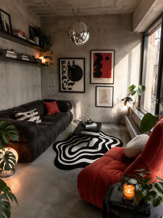
Different textures carry more weight than color shifts: leather against velvet, a textured rug next to smooth concrete, each one distinct when you touch it or look across the room.
Aim for at least three textures in one seating area, with something soft, something smooth and something rough. A rug is the easiest place to start, and plants add a living texture for almost nothing.
Keep the color count low so the textures can stand out.
13. Cozy Reading Nooks
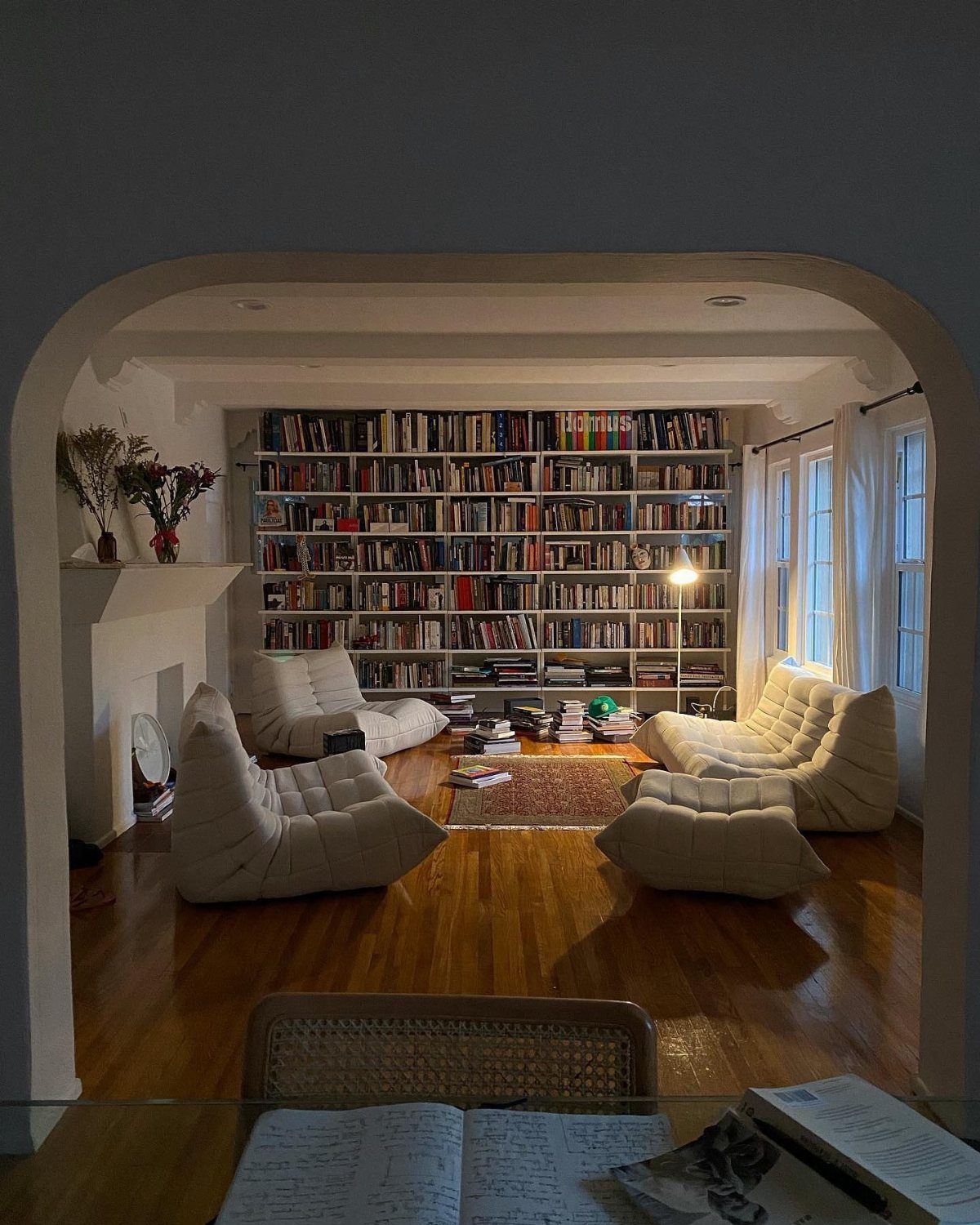
A reading nook needs only 3 things: a deep seat, a light you can aim, and a spot to set a book down.
White lounge chairs with low, rounded bodies suit that, and a floor lamp beside one keeps the glow at page height rather than lighting the whole room.
Put the chair against a wall of shelves so books stay within reach, then lay a small rug under it to mark the corner as its own.
I would pick the lamp before the chair, since a good reading light does more for the nook than any cushion.
14. Statement Rugs
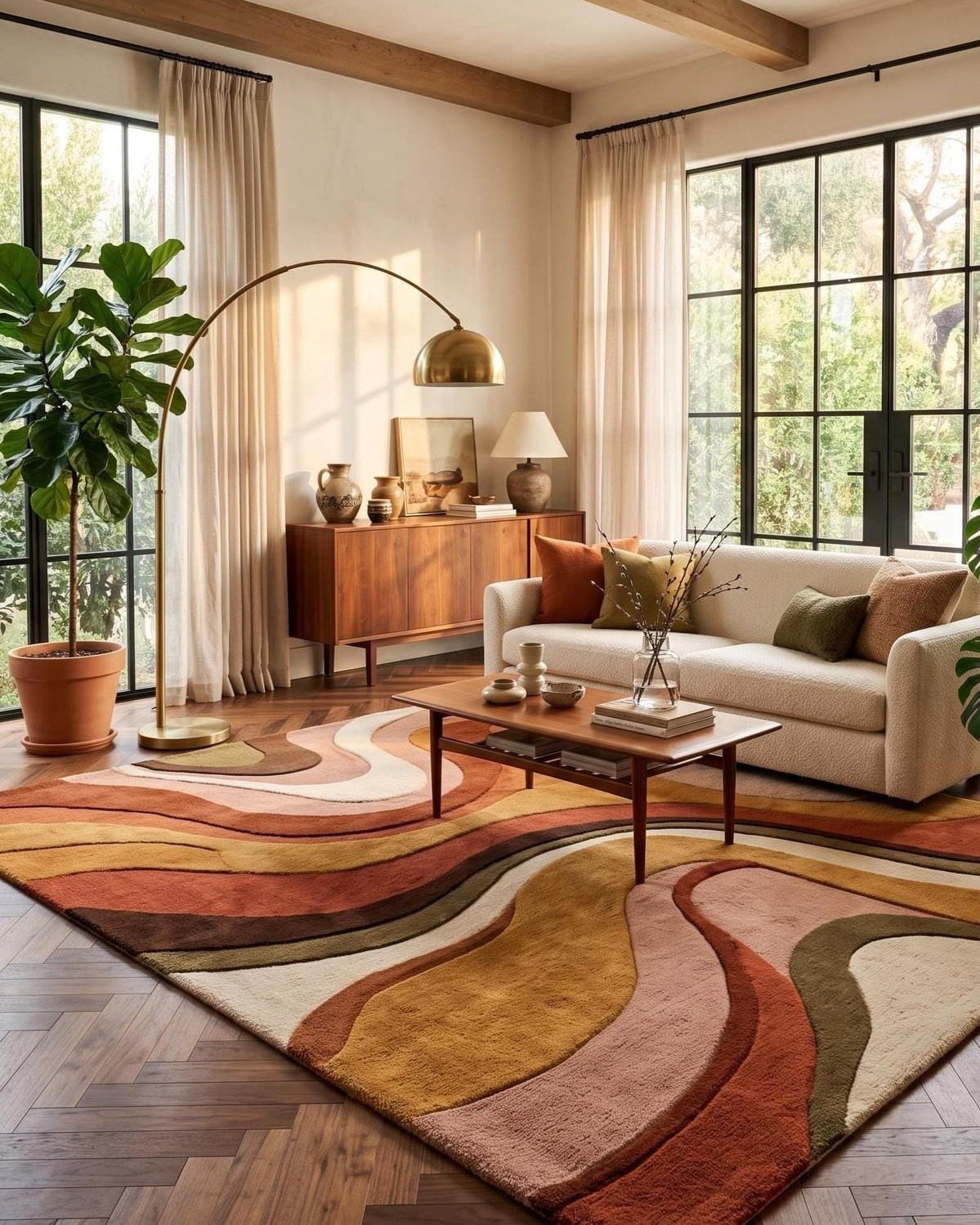
Rugs with a bold wavy pattern can carry a whole living room, so the sofa and sideboard around them can stay calm. White upholstery and warm wood let the pattern be the loudest thing in the room.
Choose a rug large enough that the front legs of the sofa sit on it, and pull one color from the pattern into a pillow or a plant pot.
Rugs are also the easiest big swap for a renter, since nothing gets painted or drilled.
Pick the rug first, then match everything else to it.
Importance of Function
The style ran from the late 1940s through the mid 1960s, born in postwar design that stripped out anything extra. Chairs were made for sitting, cabinets for daily use, windows placed where light was needed.
Use that as a test before you buy. If a piece has no job, it has to earn its place some other way, and in this style that is hard to do.
Fewer, well-made pieces that do more than one thing beat a room full of decorative extras.
A bench that holds shoes, or a credenza that stores linens and also serves as a console, fits the idea better than another accent table.
Leave breathing room around the furniture too. Crowding a room cancels the clean look you are paying for.
The movement spanned from about 1933 to 1965 and included architecture as well as industrial, interior, and graphic design. Designers such as Charles and Ray Eames, Harry Bertoia, Arne Jacobsen, and George Nelson created iconic furniture and lighting that are still highly coveted.
Mixing Styles
Clean lines and honest materials are why mid-century pieces sit comfortably beside Scandinavian, industrial or eclectic rooms. Nothing about them fights for attention, so they adapt.
Choose by your own taste rather than by what is trending. A room made only of things you adore holds together even when the styles differ, and you will not tire of it.
Simplicity and Calm
Clutter works against this style more than any wrong color does. Clean lines and open surfaces are what create the calm, so give each surface a few things at most and put the rest in closed storage.
Let raw materials show: wood grain, metal, glass. Hiding them under paint or heavy covers undoes the plain, down-to-earth feel.
One thing is worth keeping out in the open: an object with a past. A family piece or a vintage find can sit in a clear spot and do that job.
Frequently Asked Questions
What is mid-century modern interior design?
It is a style built on clean lines, natural materials and furniture that does a job. The movement began after World War II and ran through the mid 1960s, cutting away ornament in favor of function.
Some sources date the wider modern movement back to the 1930s. Wood, tapered legs, geometric shapes and open, uncluttered surfaces are the usual signs.
What colors work well with mid-century modern decor?
Warm neutrals and wood tones make the base, with bold accents like mustard yellow, olive green, burnt orange and deep teal.
Pick two or three colors and use each one more than once so they tie the room together instead of sitting in one corner.
Throw pillows and table lamps cost less than furniture and let you try a palette before committing, and colors from the early part of the era skew brighter while late-60s palettes lean toward burnt orange and avocado.