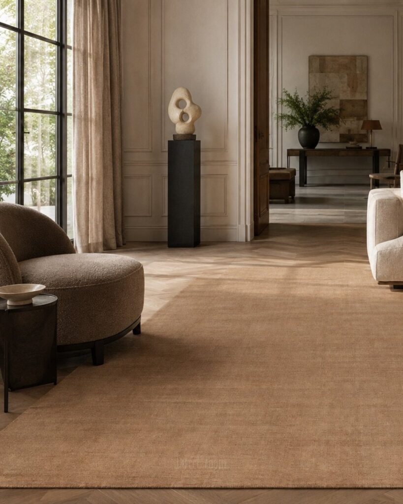
The ideas here run from a free swap of pillows or bulbs to a fresh coat of terracotta paint or a dark-painted bookshelf, and the one fact about your home that decides where to start is what you can’t change: floors, wood furniture, stone, upholstery and metal finishes set the undertone everything else has to match.
A renter locked into cool gray floors will lean on mixing warm and cool neutrals, while a room with good bones can commit to a full warm color palette.
Whichever you pick, a warm neutral shifts with the light, so test it on the actual wall before buying the gallon.
1. Layer Interesting Materials
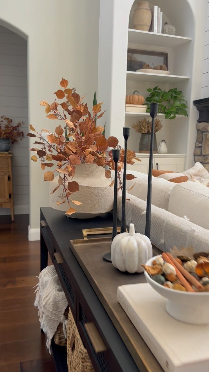
A console table gets more interesting when no 2 things on it share a surface.
Matte black candle holders, a glossy white vase, a pumpkin with a chalky skin and a bowl of loose potpourri each catch light differently, and that contrast does the work a bold color would.
Keep the palette to 2 or 3 tones and let the finishes vary. I like starting with the vase, then adding one rough item and one smooth item around it.
2. Use Warm Neutral Colors
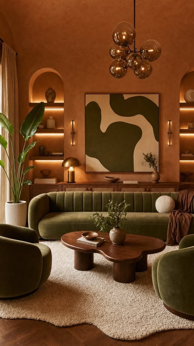
Terracotta walls prove that a warm neutral does not have to be beige. Earthy clay, cream and dark wood sit comfortably together, and a green sofa gives the eye somewhere to rest.
Start with the paint or the biggest piece, then layer in natural wood, cozy textures, woven accents and a few plants.
The creator of this room recommends exactly that order, and I agree with it. Keep the decor simple and let natural materials carry the warmth.
Test a sample patch first, since terracotta shifts with the light in each room.
3. Jute, Sisal
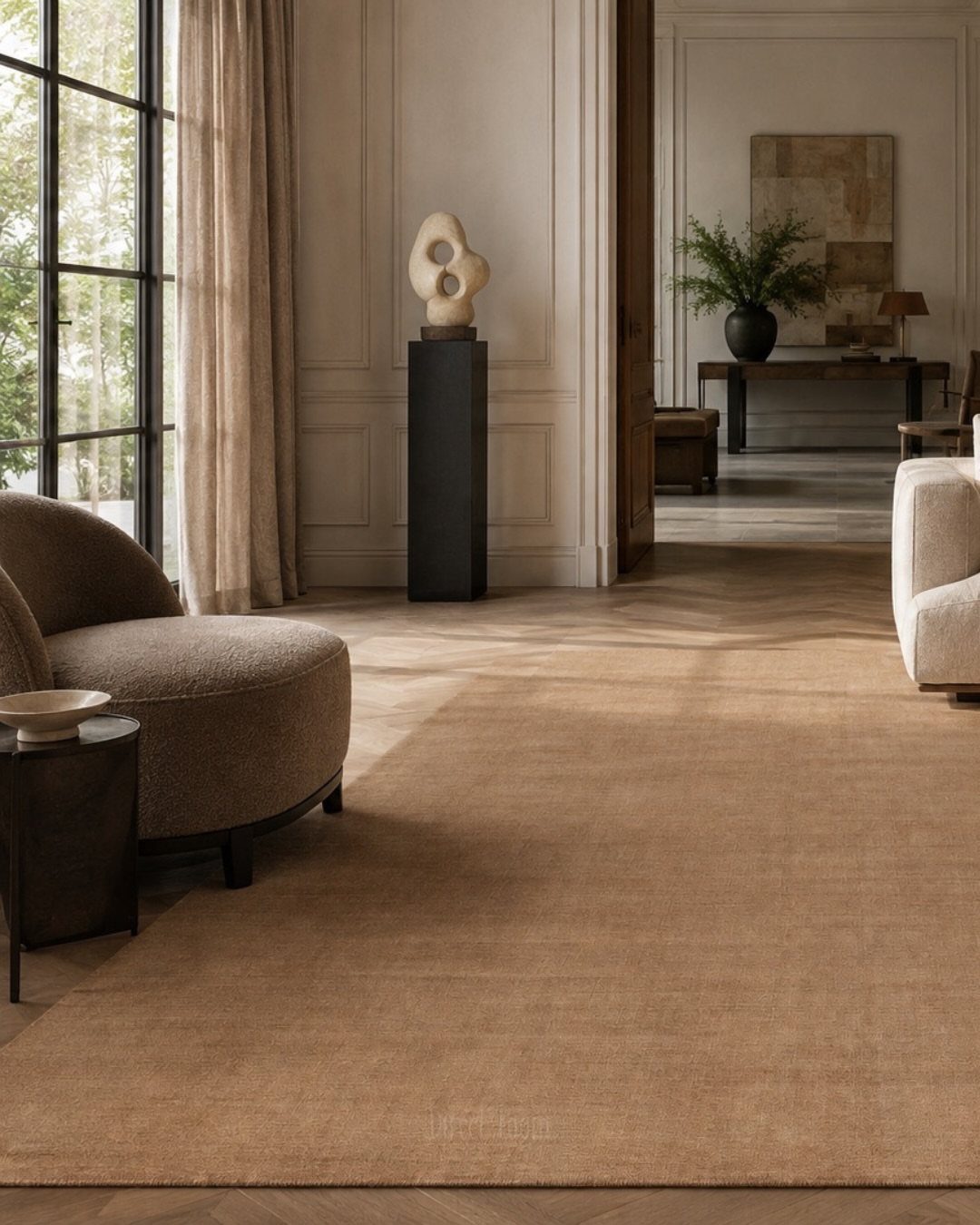
Under curved beige seating, a large tan rug does two jobs: it ties the pieces into one zone and adds a coarse, woven contrast to smooth upholstery. Jute, sisal and wool all work here.
Choose a rug big enough that at least the front legs of every seat sit on it. A rug that is too small makes the grouping look scattered.
Jute and sisal bring the most grit and a natural, flat look. Wool is softer underfoot, so I pick it for rooms where people sit on the floor.
4. Incorporate Texture
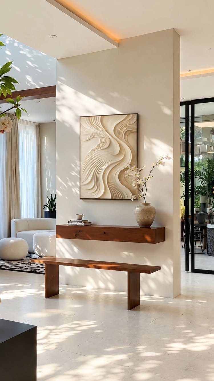
A white 3D wave panel proves that texture can come from shadow alone. Ridges catch the light and change through the day, so a plain white wall never looks flat.
Pair it with something wooden, like the floating shelf and bench here, so the room stays warm rather than stark. One sculptural piece is enough; a second one starts to compete.
Renters can hang wall art without paint or panelling, which makes it the easiest way to add texture on a budget.
5. Warm-Toned Lighting
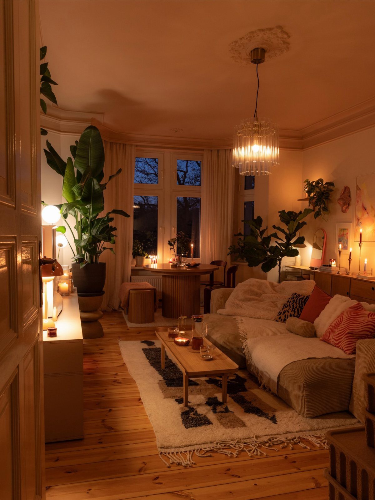
Paint a wall the perfect cream and a cold bulb will still make it look gray. Light changes how every color in the room reads, so bulbs deserve as much thought as swatches.
Use warm-toned bulbs, then layer sources at different heights: a chandelier overhead, lamps at sofa level and candles low. That mix is what gives this room its glow.
Check the label on each bulb before buying, and keep every lamp in a room the same warmth so the tones match.
6. Tone-on-Tone Sofas and Seating
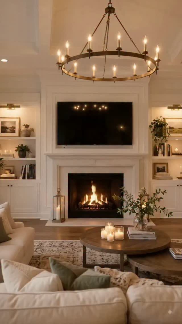
Cream on cream is the calmest way to seat a room. A cream sofa against a white fireplace reads soft rather than stark, and a few pillows in neutral and green tones add just enough variation.
I would pick the performance fabric for a busy household, and bouclé if texture matters most.
Keep the pillows within the same family, then add one accent color, like the green here.
7. Bring in the Metallic Warmth
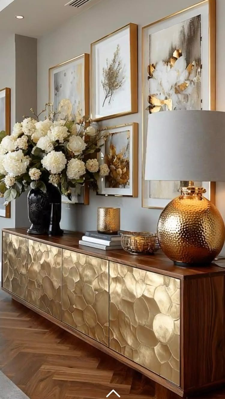
Gold repeated 3 times reads as a plan, and that is what this room does: a hammered-front sideboard, a lamp and a picture frame all carry the same warm metal against a quiet wall.
Repetition keeps the shine from looking random.
Aged brass, unlacquered bronze, oil-rubbed iron and hammered copper all give that warmth. Pick one metal, then repeat it in 3 pieces at different heights.
A thrifted frame or lamp base is the cheapest way in, and a hammered finish hides fingerprints better than a mirror-bright one.
8. Mix Warm and Cool Neutrals
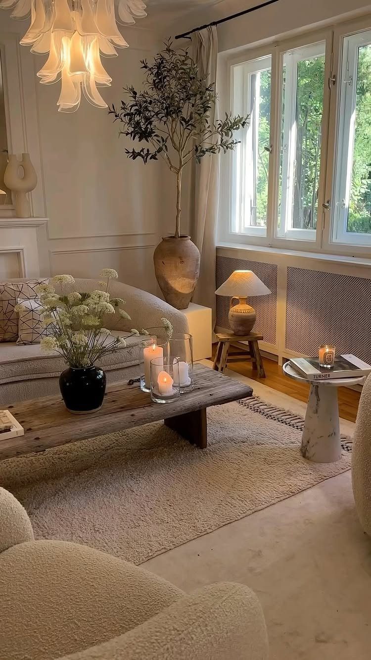
Beige and marble have different undertones, and setting them side by side sharpens both. The warm piece looks cozier beside something cool, and the cool piece looks cleaner beside something warm.
Let warm neutrals cover the big surfaces and use cool ones for smaller touches: marble, a white chandelier, a grey book cover. I would keep the split near two-thirds warm, one-third cool, since an even split can feel undecided.
9. Warm Neutral Kitchen
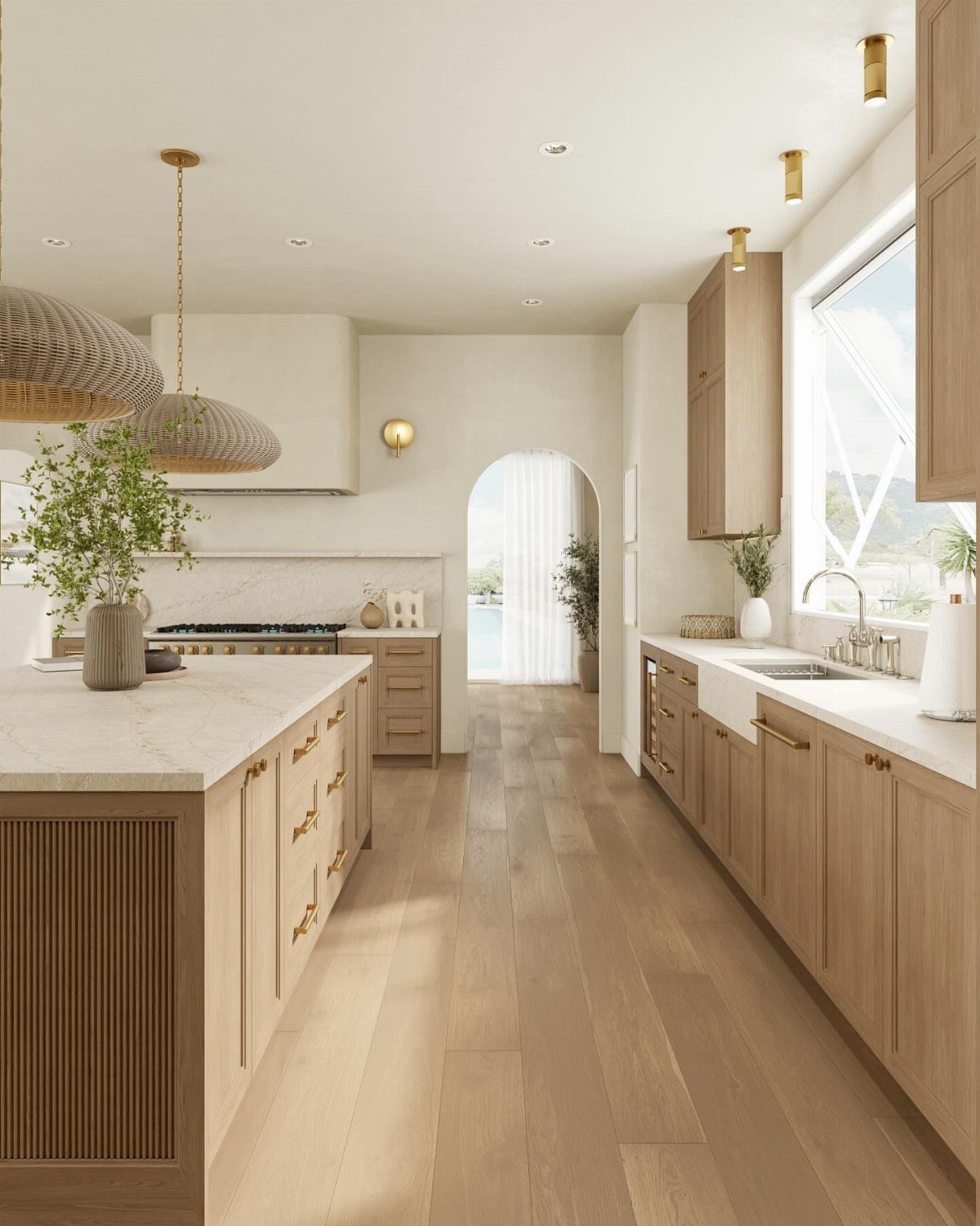
Light wood cabinetry already has the hard part done, so lean into it rather than fighting it with stark fixtures. Light wood floors and cabinets with white countertops keep a kitchen bright without feeling clinical.
Choose warm-toned bulbs inside them so the cabinets don’t turn gray at night.
Renters can change pendants or shades without touching the cabinets.
10. Add Pops of Color
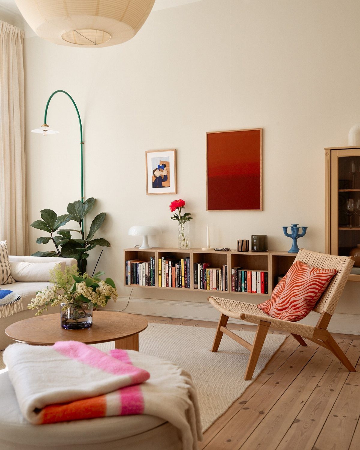
Neutral walls and a wood floor give color somewhere calm to land, so a single bright note looks deliberate.
Pick 2 accents at most, such as red art and a green lamp, and repeat each once somewhere else in the room. Pillows, art and lamps are cheap to swap, which makes them the safest place to test a bold shade.
If the color tires you out, put the pillow away.
11. Anchor with Dark Tones
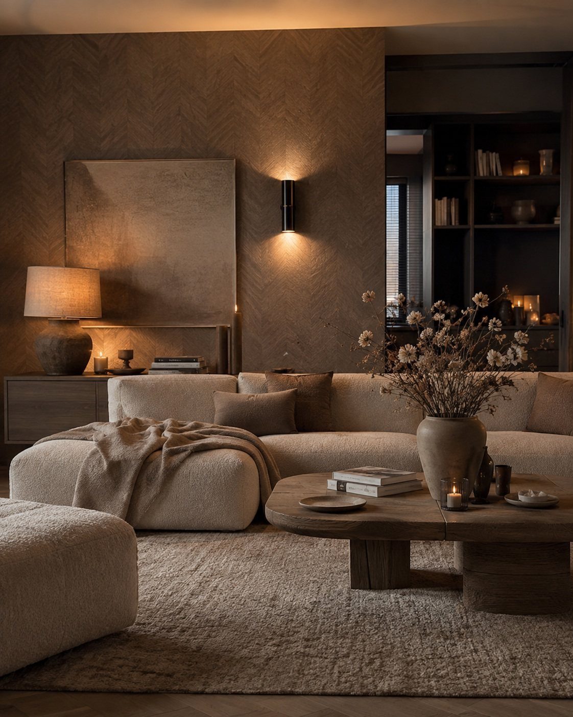
A dark built-in bookshelf on one side of a beige room gives the eye a place to start. Without it, a sectional, a wood table and a neutral rug can all blur into the same mid-tone.
Keep the dark piece to one spot, as here, so it anchors rather than weighs the room down. Shelves are an easy candidate: a dark paint on an existing unit costs far less than new furniture.
I would leave the rest of the room light, and let the shelves hold the contrast.
Understanding Warm Neutral Colors
Warm neutrals are muted shades with yellow, red, brown, peach or golden undertones. Beige, cream, sand, almond, taupe, camel and wheat all belong here, and they sit in the earth-toned family.
Cool neutrals lean gray, blue or green. Warm ones feel softer and more inviting, yet they stay quiet enough to act as a backdrop for wood, stone, linen and art instead of competing like an accent color.
Light changes them.
Cool northern light calls for a warm neutral, which adds comfort to the room. Strong sunlight pushes warm neutrals toward gold, so test your color on the actual wall before you buy the gallon.
Choosing a Color Palette
Start with what cannot change: floors, wood furniture, stone, upholstery, curtains and metal finishes.
Beige and almond pair well with lighter woods and cream-toned stone. Taupe, camel and wheat need enough lighter contrast around them, or the room goes too brown and heavy.
Judge the undertone, not the name. Sand reads gold, almond leans peachy or cream, and taupe can pull brown or gray depending on the base.
Buy several large samples and move them from wall to wall. Look at them next to your flooring, trim and fabrics at different times of day.
North-facing rooms make warm neutrals look cooler and more muted.
South- and west-facing rooms push the yellow, orange or red undertones. The right pick looks balanced in daylight and under lamps.
Common Mistakes in Neutral Decor
The first mistake is using too few tones: one shade of cream across the whole room falls flat. Use several tones within the warm family so the walls, sofa and rug are not a single block.
Too few textures does the same thing.
When every surface is smooth, the sofa, rug, table and pottery all blur together. Bring in something with texture: woven fabric, carved wood, or a rough unfinished surface.
Buying everything new is another one. One vintage piece, even small, gives a room history that new furniture takes years to build.
Last, don’t match every wood tone.
Decorating with neutrals is one of the most timeless decorating ideas. Far from boring, a perfectly layered neutral scheme that offers plenty of textural interest feels timeless, calming, and sophisticated.
Frequently Asked Questions
What are some ideas for a neutral and warm living room?
A cream sofa and a tan jute or wool rug anchor the room, then I limit the palette to 2 or 3 tones and change up the finishes.
Add warm-toned bulbs at different heights, one dark piece like a built-in bookshelf to anchor the room, and one metal such as aged brass repeated in 3 pieces.
Texture from woven fabric, natural wood and a few plants keeps cream-heavy rooms from looking flat.
What color is replacing beige?
Creamy whites and soft taupes are taking over from plain beige.
Today’s versions are more nuanced, with names like greige, mushroom, oatmeal and linen. Terracotta and clay also work as warm neutrals that are not beige at all.
What is the 3-color rule in interior design?
In a neutral room, I stick to 2 or 3 tones and get variation from the finishes and textures rather than bringing in more colors.
Matte next to glossy, rough next to smooth: the surfaces catch light in different ways, and that contrast does what a bold color would.
If an accent works, I add one more and repeat each in another spot in the room.