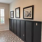
Which one fits depends on how much wall you have and how often you want to swap the art, so a gallery wall and a picture ledge sit at opposite ends of that question.
The ideas run from a single framed piece of fabric art to a grid of matching frames, and the 2/3 rule sets the width for all of them.
1. Gallery Wall
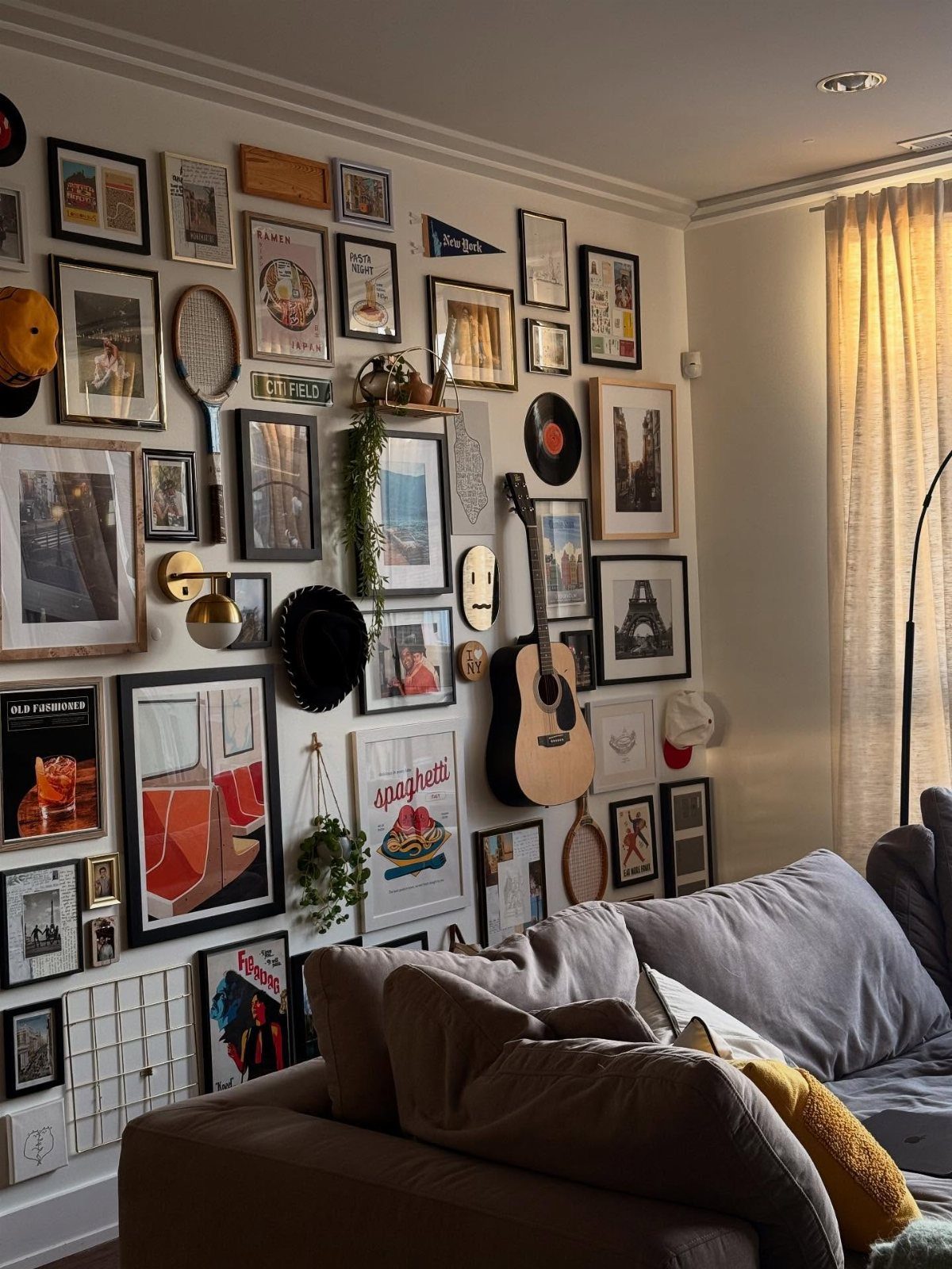
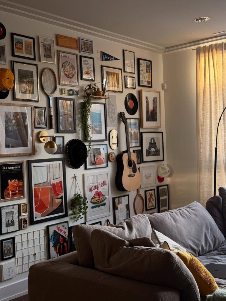
A gallery wall earns its place when the pieces share something, and a guitar next to framed prints proves that the glue can be as simple as personality.
Mixing objects with art keeps the wall from feeling like a set of matching store prints.
Lay everything on the floor first and shuffle until the weight feels even.
Then trace each piece on paper, tape the paper to the wall, and adjust before you drive a single nail. Renters can use removable hanging strips for the lighter frames.
2. One Large Piece of Art
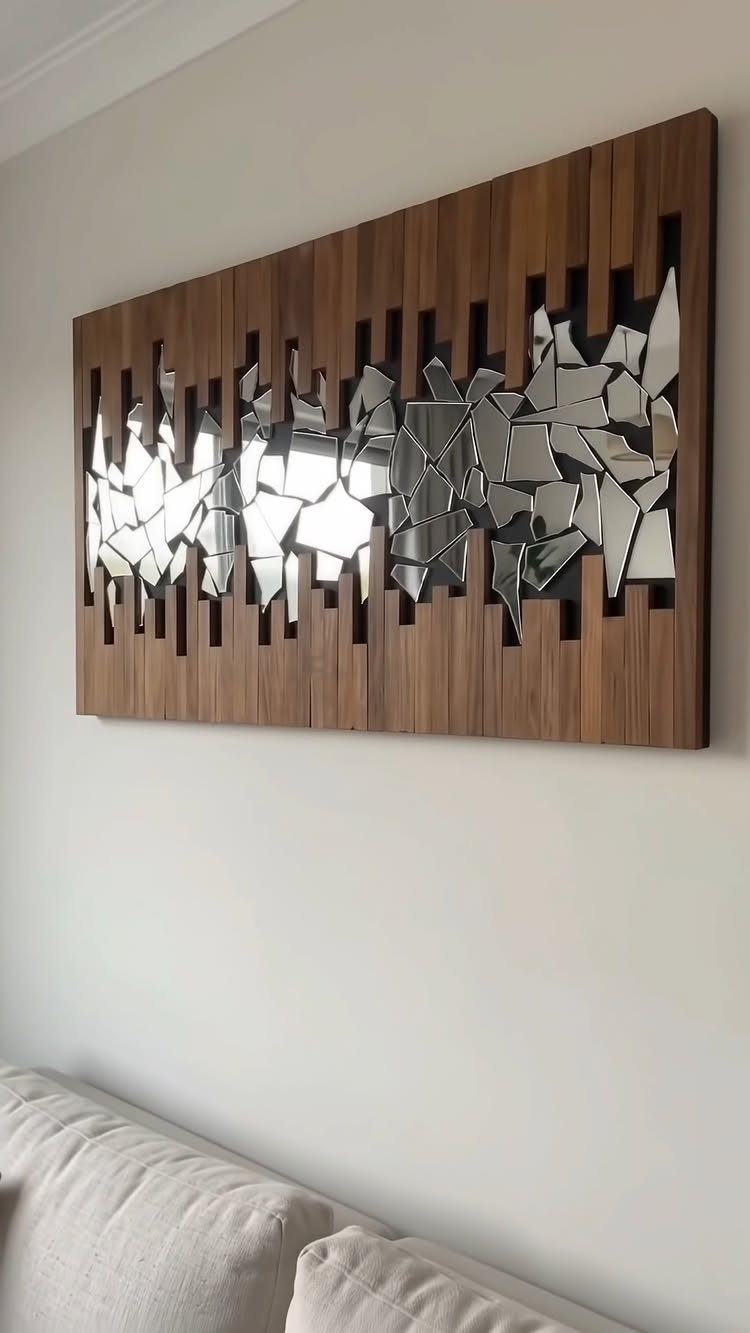
One oversized piece does the work of a whole arrangement, and texture is what keeps it from feeling empty.
Wood with mirrored shards catches light and adds depth against a plain white wall, which is why I would choose it over a flat print.
Aim for a piece that covers roughly two-thirds of the couch width.
Hang it with two hooks rather than one so it stays level. A big piece is a single decision, so it suits a weekend and a modest budget.
3. Art Grid
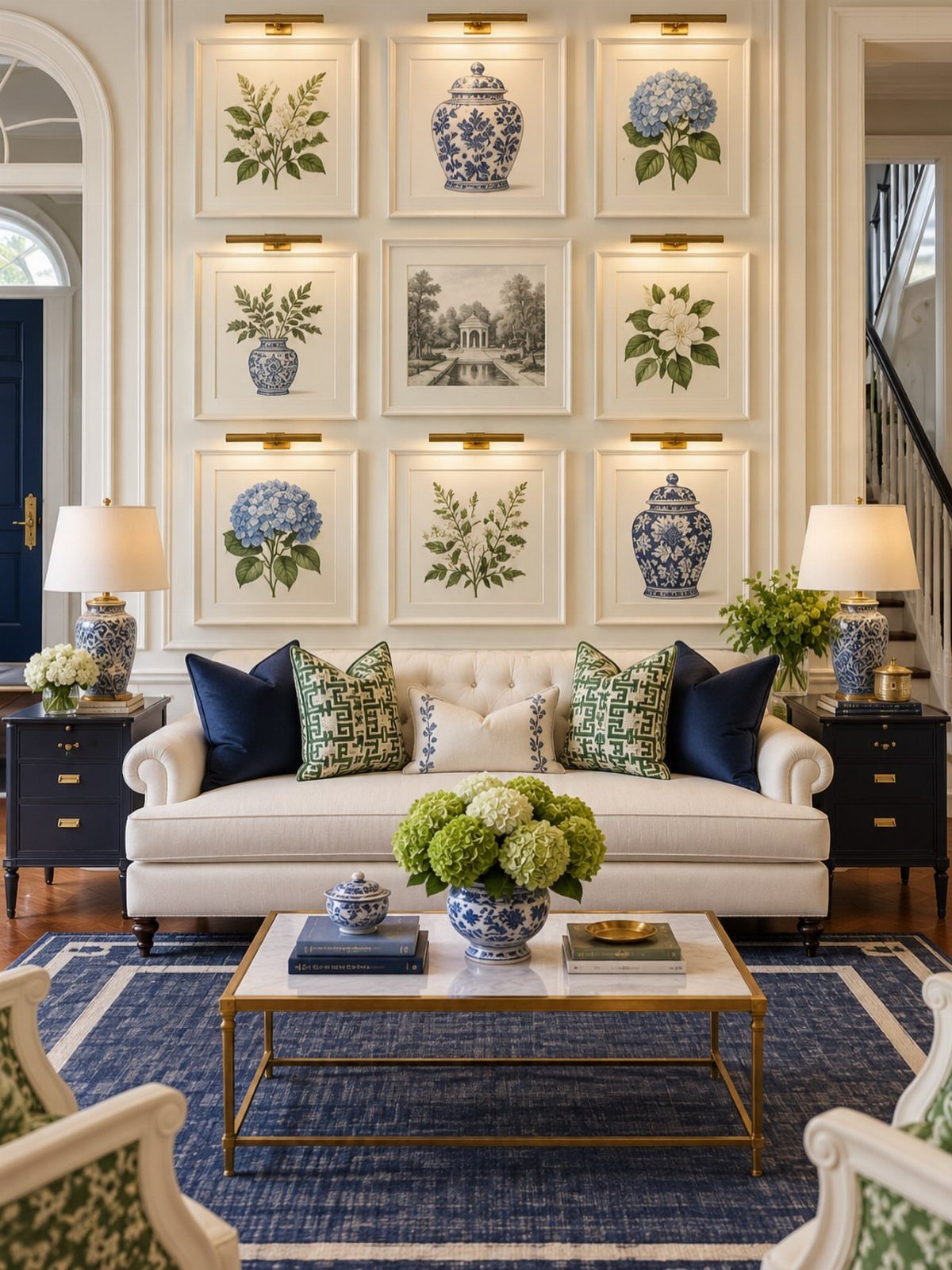
9 matching frames in a 3×3 grid read as calm and deliberate, and the repetition does the styling for you. Botanical prints work well because the subjects vary while the frames stay uniform.
Keep the gaps between frames identical, 2 inches being an easy, common spacing. Cut a paper template for each frame, tape the grid to the wall, and mark nail spots through the paper.
A level is worth the few dollars. Picture lights are already part of this look, and they give a grid of frames a soft evening glow that overhead lighting can’t match.
4. Fabric Art
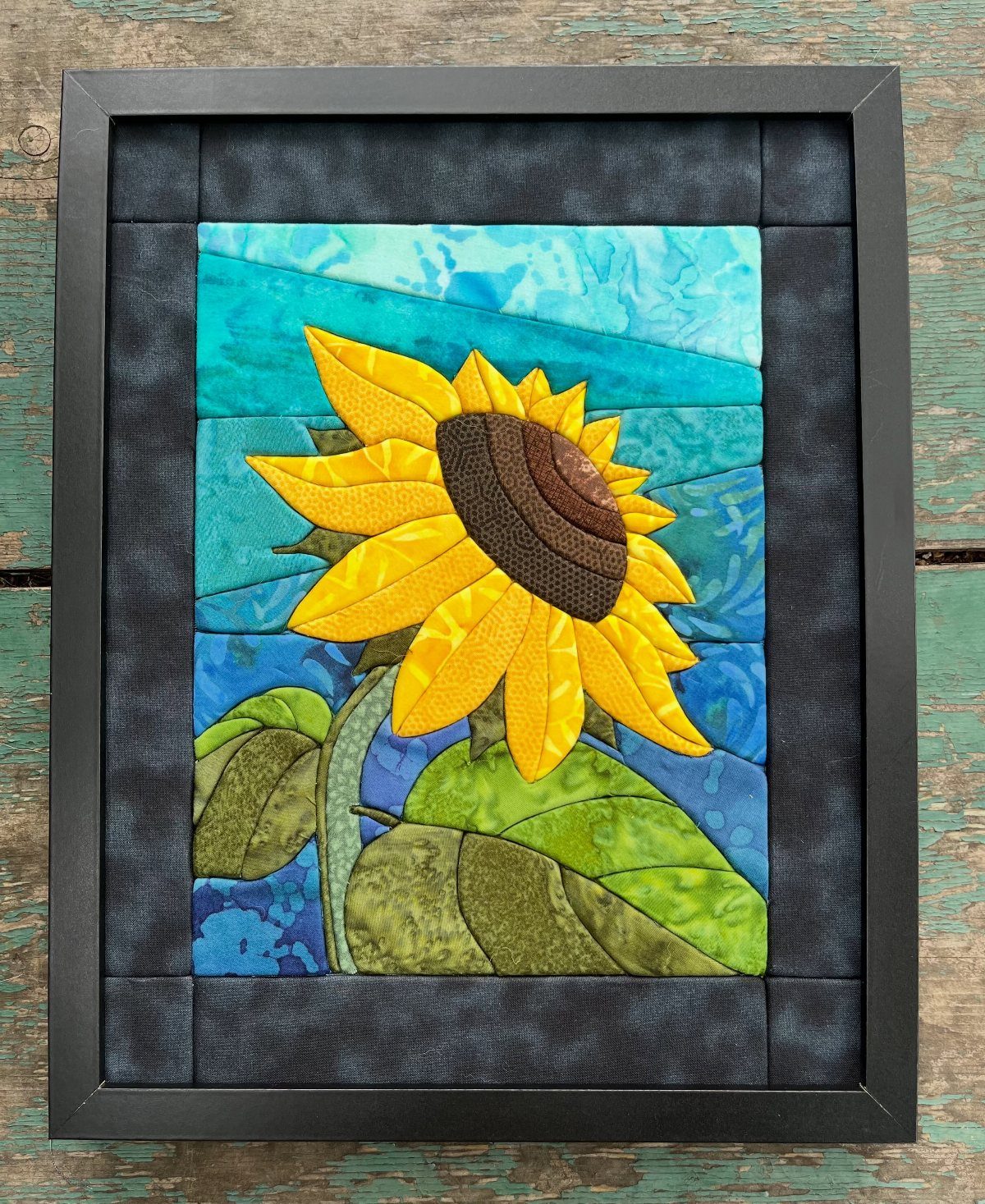
Fabric brings softness that glass and paint cannot, and a framed textile is the easiest way to use it.
A sunflower in yellow and green against blue stitches color and texture into one piece, and it lowers the glare you get from glass-fronted frames.
Mount the fabric taut on a backing board or stretcher before framing so it does not sag.
Iron it first. Scarves, remnants and embroidery all work, so the cost can stay very low.
5. Picture Ledge Shelf
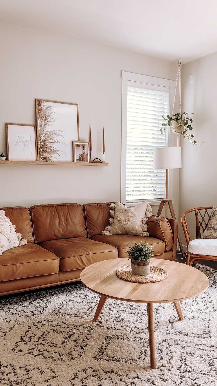
A wooden ledge lets you change the art whenever you like, with no new nail holes each time. Leaning frames and setting candles beside them gives you layers, and I prefer it for anyone who gets bored easily.
Mount the ledge into studs or use proper wall anchors, since frames add weight. Put the tallest piece at the back and overlap the smaller ones in front.
6. Decorative Wall Clock
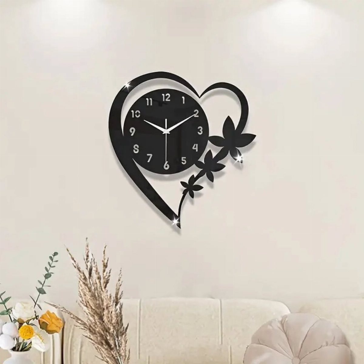
A decorative clock is art with a job, and a heart shape with floral accents makes it a focal point instead of an afterthought. Black stands out nicely against a white wall.
Hang it centered over the couch, and keep it low enough that the clock reads as part of the seating area rather than floating up on its own.
One clock can look lonely on a wide wall, so a vase on a side table helps balance it.
Height for Wall Art
Height decides whether art looks anchored or lost.
Too high is the common mistake.
Once a piece creeps up toward the ceiling, it stops relating to the couch below it and ends up looking stranded on the wall. If you are torn between a few inches more or less, go lower rather than higher.
Mark the spot with painter’s tape before any nail goes in, then sit on the couch and look at it from there. That is the view you will live with.
2/3 Rule for Wall Art
Proportion is easy to check with one measurement.
Take the width of your sofa and multiply by two-thirds. A 90-inch couch calls for about 60 inches of art, counting the whole arrangement and the gaps between pieces.
A small piece over a big sofa gets lost, like a single sticky note stuck in the middle of a huge whiteboard. Too wide and the wall feels crowded, so keep the total under the full width of the sofa.
If you hang several large pieces from the same set, treat them as one block and measure the outer edges. Matching sizes and colors keep a row or grid of four to six canvases looking planned.
Cohesive Color Palette
A shared palette is what lets different pieces sit together without looking random. Pick two or three colors, then check that each frame or print repeats at least one of them.
Matching frames do a lot of the work too.
Photos, prints and other mediums in different sizes still read as a set when the frames are the same finish, so buying one frame style in bulk is a cheap way to tie things together.
Lay the pieces side by side on the floor before hanging. If one stands out for the wrong reason, swap it out before you make any holes.
Frequently Asked Questions
How high should wall art be above a couch?
Art that sits close to the sofa back ties the two together, so the couch and the wall read as one seating area instead of two separate things.
Art that creeps toward the ceiling loses its link to the couch and looks stranded, so if you’re torn, go lower.
What is the 2/3 rule for sofas?
Aim for art that spans roughly two-thirds of the couch’s width; anything much narrower looks lost above it.
On a 90-inch sofa, that math (90 x 0.67) lands near 60 inches total, and the gaps between frames in a group count toward that number.
Smaller looks lost on the wall, and anything wider than the sofa feels crowded. For several large pieces, measure the outer edges of the whole block.
Which wall art is good for a living room?
One oversized piece, a gallery wall, or a grid of matching frames all work above a couch.
A single large piece is the simplest, and texture, like wood with mirrored shards, keeps it from feeling empty. A gallery wall suits you if you like mixing objects with prints.
A grid of 9 matching frames reads as calm and planned. Whichever you pick, keep the colors to a shared palette of two or three.