If you rent, the ideas that work are peel-and-stick slat panels, plug-in LED strips, a new faucet and one bold chair; owners can also repaint cabinets, install recessed lighting or open up a floor plan.
The changes run from a free declutter and a coat of ceiling paint to new hardware and 50mm quartz on a kitchen island, and the smallest moves often land hardest.
1. Wooden Furniture
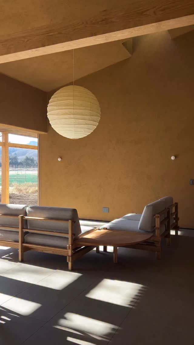
Wood furniture and ochre walls get along because both sit in the same warm family. A wooden-framed sofa with a low wooden coffee table keeps the room calm, and the single round paper lamp adds shape without adding clutter.
I like this combination for small budgets. Buy one solid wood piece and let the rest stay plain.
Matching the wood tone between the sofa frame and the table makes a room feel planned rather than collected.
2. Bold Furniture
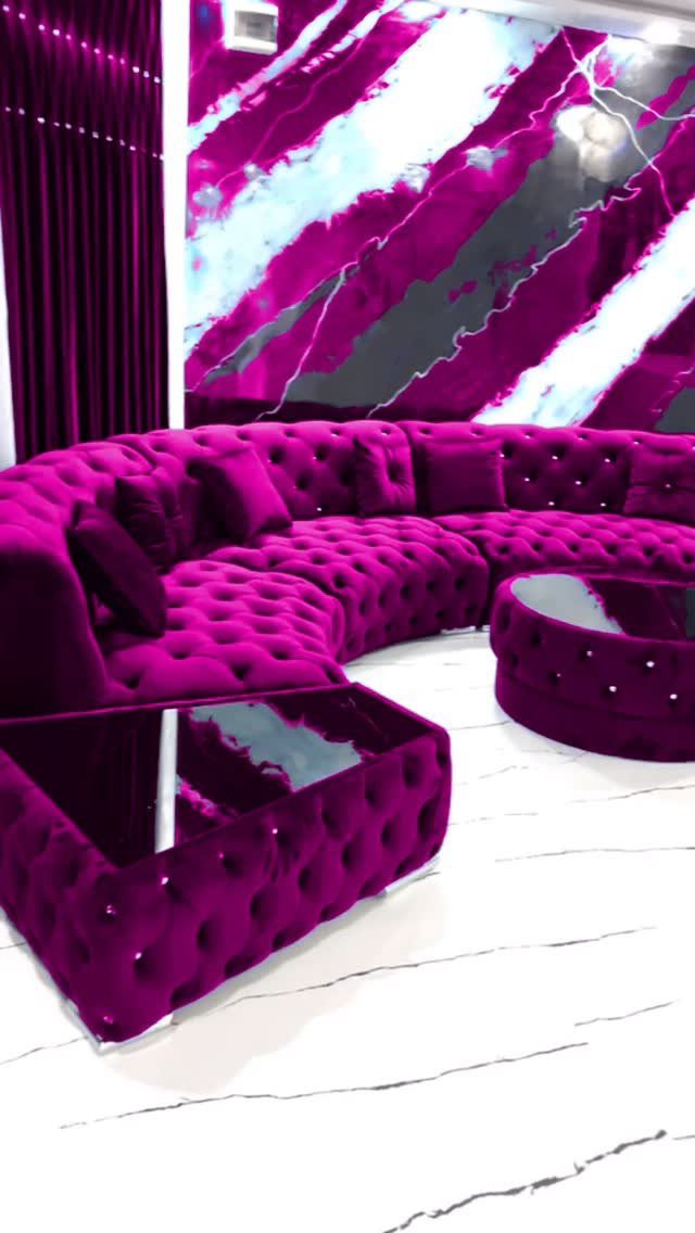
One oversized piece in a saturated color can carry a whole room.
Bold furniture is the splurge on this list, so choose the piece you will still want to sit on in 5 years. Velvet in a strong color is a commitment.
If the budget is tight, start with one chair in the shade you love and keep the walls and curtains quiet around it.
3. Modern Kitchen
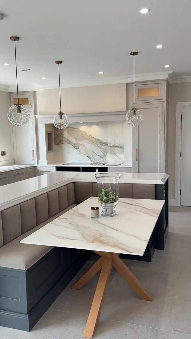
Thick stone gives a modern kitchen its clean, heavy look.
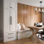
Marble on the table and backsplash, grey cabinetry and a built-in banquette all stay in a narrow color range, so nothing fights for attention.
A banquette saves floor space compared with separate chairs, which helps in a tight kitchen.
4. Simple Lighting
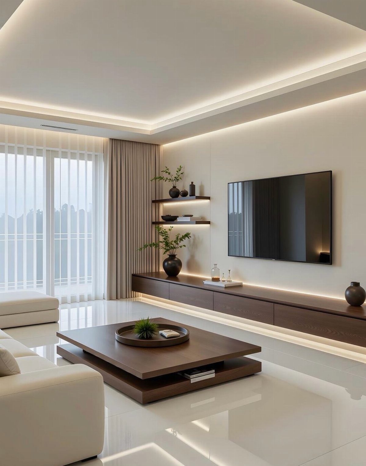
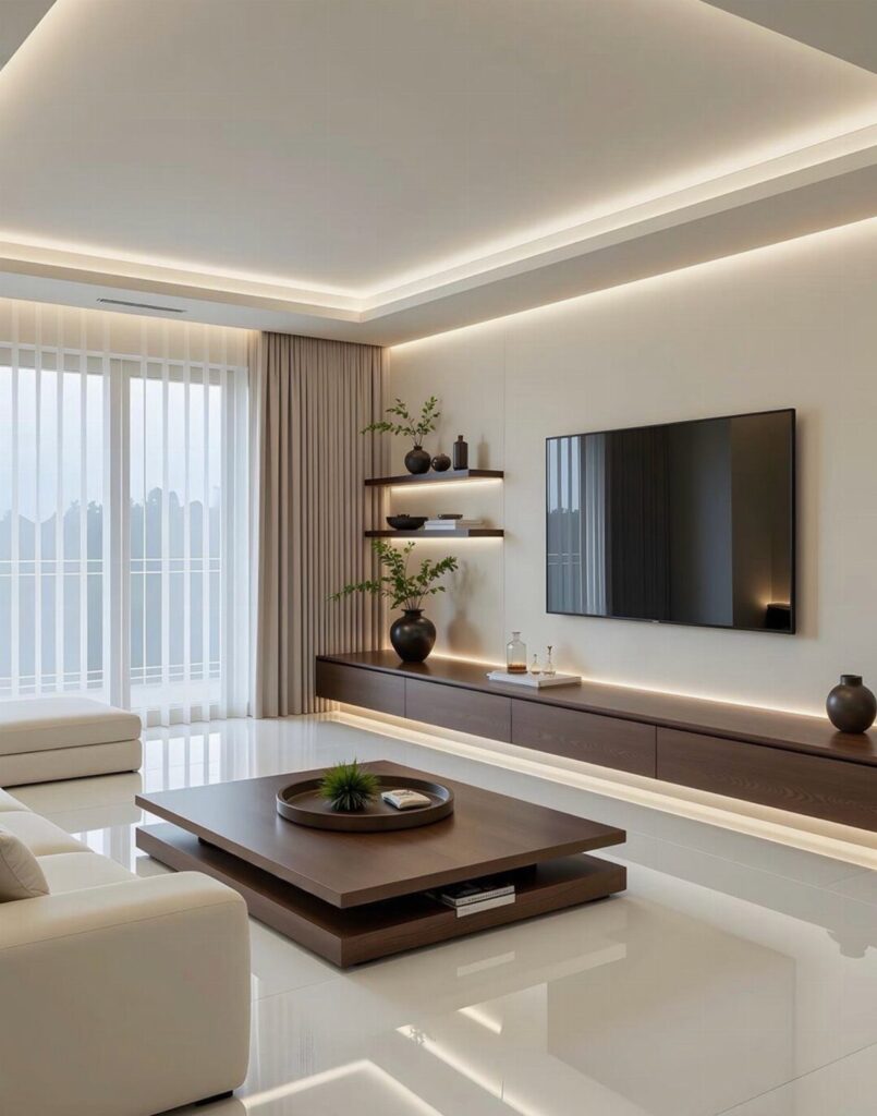
Lighting that disappears is the simplest kind. Recessed ceiling lights and an under-cabinet strip wash the room evenly, so the white sofa and brown wooden coffee table stay the focus.
I prefer this to a single overhead fixture, since it lets you light only what you need. Put the lights on dimmers if you can.
Recessed fittings usually mean wiring work, so renters should look at plug-in or adhesive LED strips for the under-cabinet part.
5. Industrial Interior Design
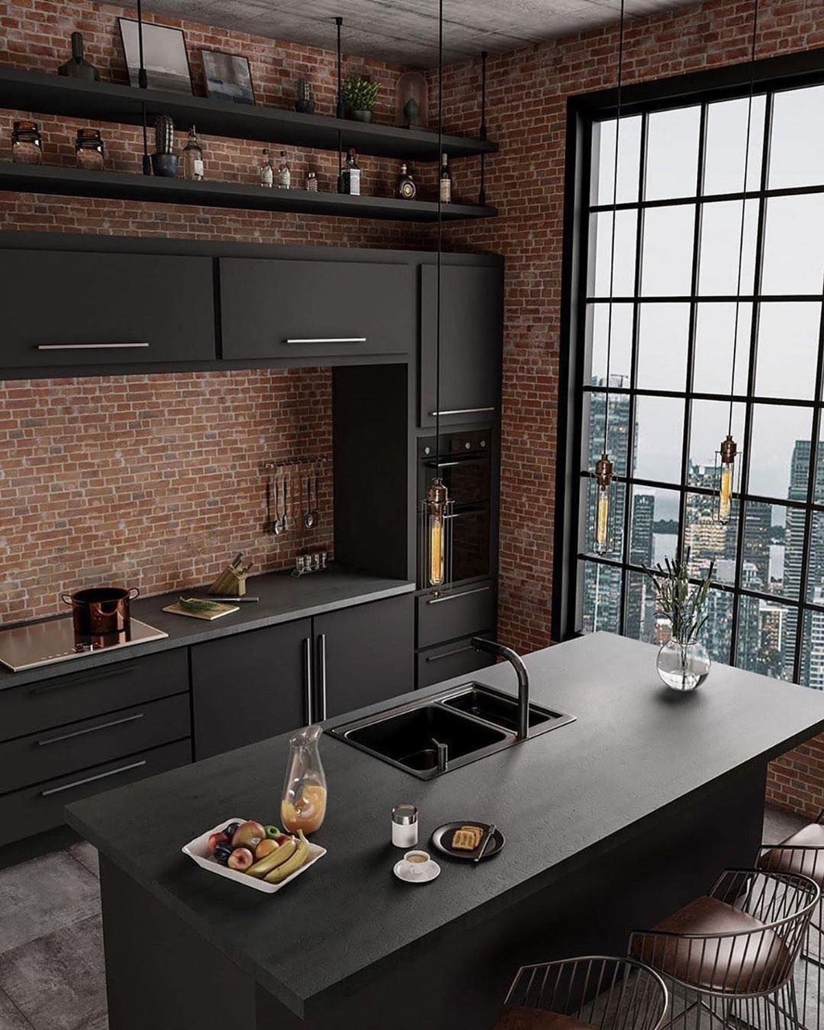
Raw brick brings texture and warmth, while the black keeps the kitchen sharp.
A large grid window matters as much as the materials, because it supplies the open, light-filled feel that industrial spaces rely on.
Most renters cannot expose a wall, but brick-look panels or paint on one wall get close.
6. Modern Dining Area
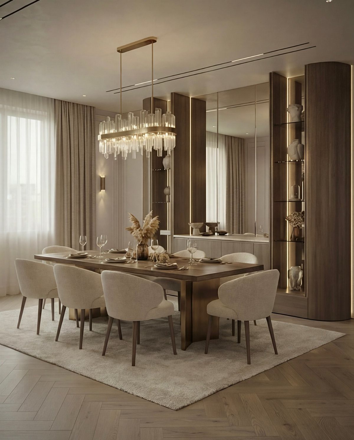
A dining room looks best when it asks very little of the eye.
I would spend on the chandelier and the table, then keep everything else quiet. Built-in wooden shelving against the wall adds storage without breaking the calm.
Beige chairs show less wear than white ones, but pick a fabric you can wipe clean.
7. Kitchen Hardware
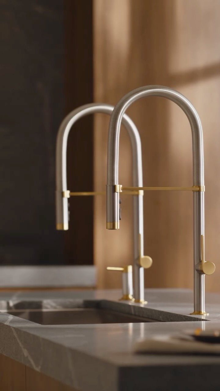
Polished brass and gold finishes brought warmth back after years of brushed nickel everywhere, and a faucet is the cheapest place to try them. A silver faucet with gold accents is a good middle path.
A high-arc spout gives room for tall pots, and I would pick that shape over a low one. Swapping a faucet is usually a one-evening job.
Keep the gold to the faucet and maybe a pull or two, so the grey stone stays the main event.
8. Accent Walls
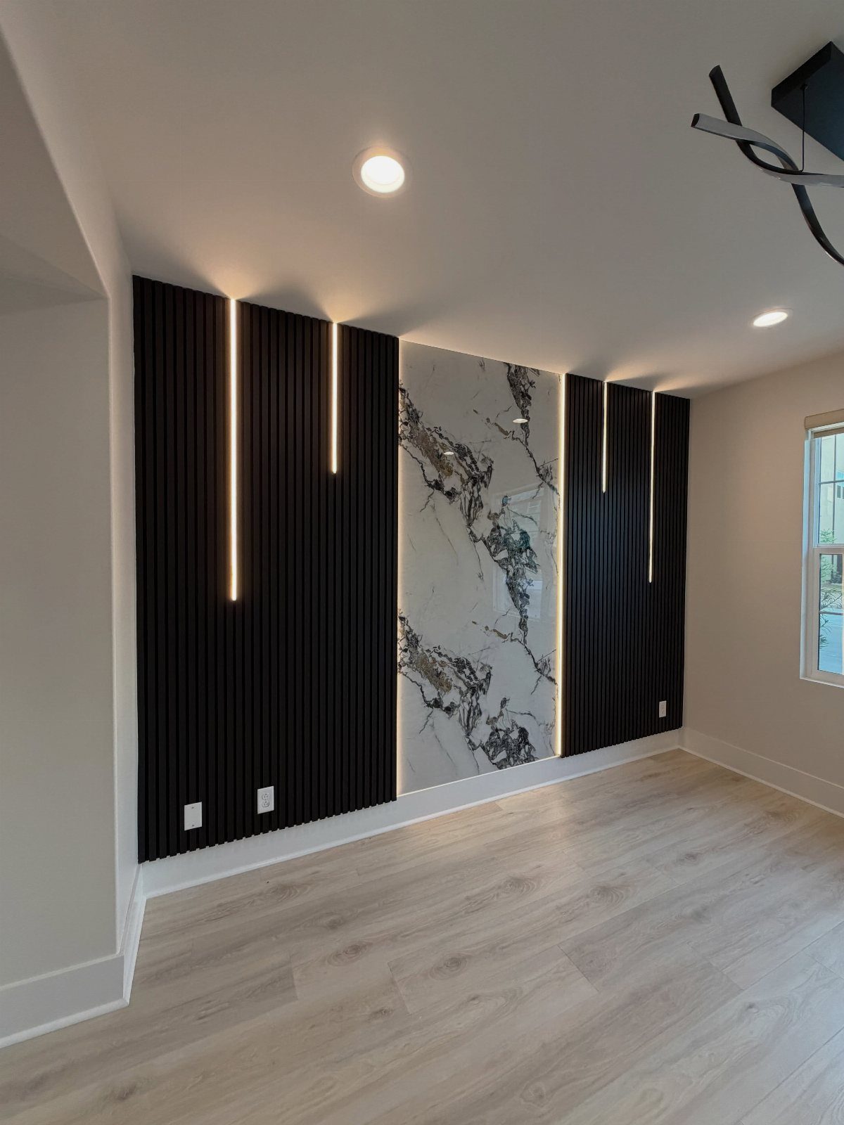
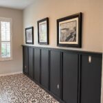
Black slats with a light strip tucked in turn one wall into the room’s focal point without any paint at all.
A lighter panel in the center breaks up dark slats so the wall reads layered instead of heavy. I like this treatment on the wall you face when you walk in.
Renters can copy the idea with peel-and-stick slat panels and a plug-in LED strip. If you would rather spend almost nothing, one wall in a bold color or pattern does the same job.
9. Indoor Plants
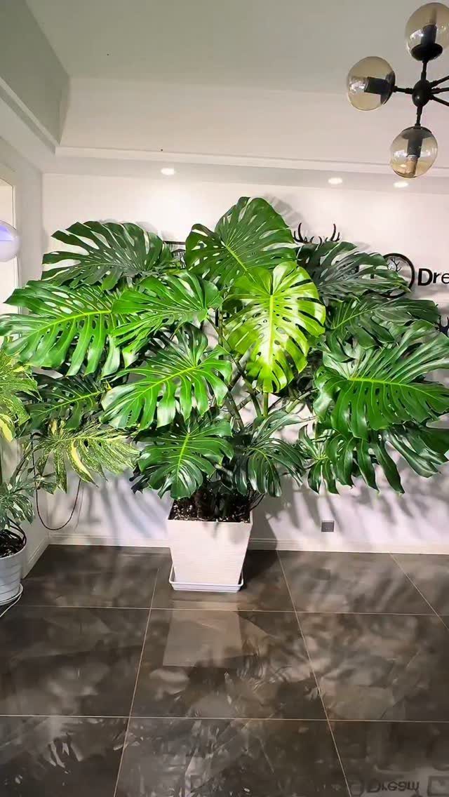
A single large Monstera in a white square pot does more for a plain room than a shelf of small plants. Big leaves fill blank wall space and soften hard surfaces like tile.
I would choose one big plant over several tiny ones, since it reads as a deliberate choice. Pick a pot with clean lines to match a modern light fixture.
Put it where the room gets good light, and give it space to spread.
10. Open Floor Plan
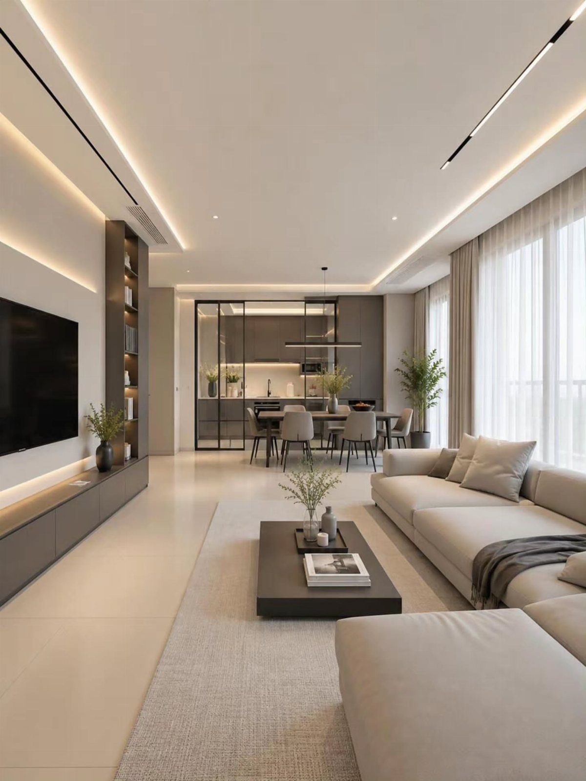
An open floor plan lets the living and dining areas share one stretch of floor, so a small home feels bigger.
Keeping both zones in the same neutral beige and grey tones is what stops it from looking like 2 rooms jammed together. A sectional can mark the edge of the living area, and a dining set marks the other.
Recessed lighting suits the layout, since nothing hangs in the way of the sightline. Renters can’t knock down walls, but a rug under each zone defines them well.
11. Painted Ceilings
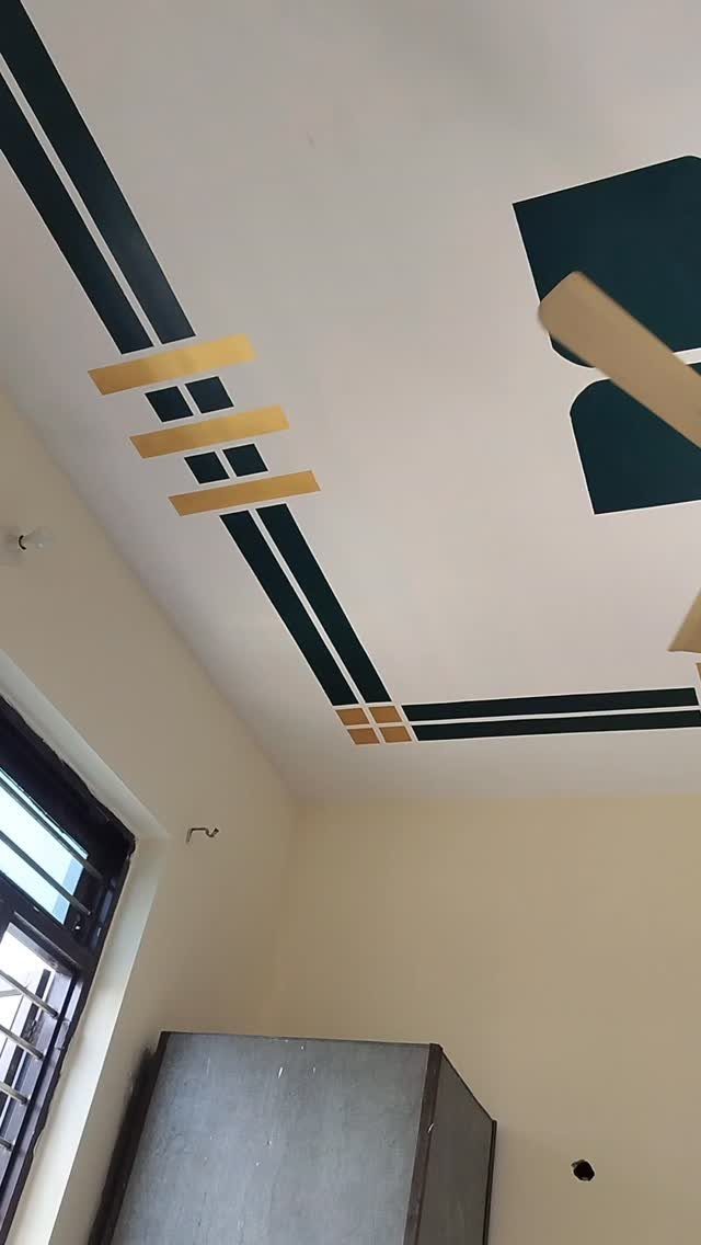
Look up: a white ceiling with dark green and gold stripes and shapes turns the most ignored surface into the feature.
I would keep the walls beige and quiet, as they are here, so the ceiling does the talking. Painter’s tape makes crisp geometric lines, and a small pot of metallic gold paint goes a long way.
Sketch the pattern lightly before you tape, and expect some neck strain.
12. Crisp White Kitchen Cabinet Color
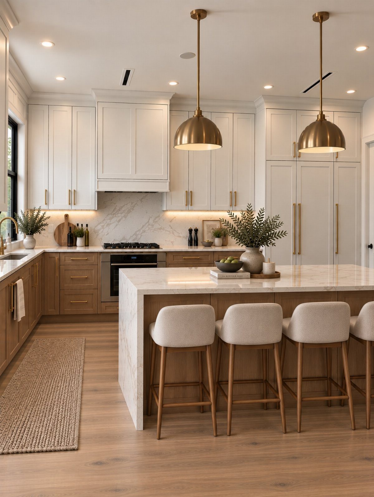
Benjamin Moore CC-40 Cloud White is a soft, clean white that suits cabinets. Here it sits on the upper cabinets only, with wood below, and I like that split because it keeps a white kitchen from feeling cold.
Paint a sample board and check it in morning and evening light before you commit to a whole kitchen.
13. Balcony Seating Area
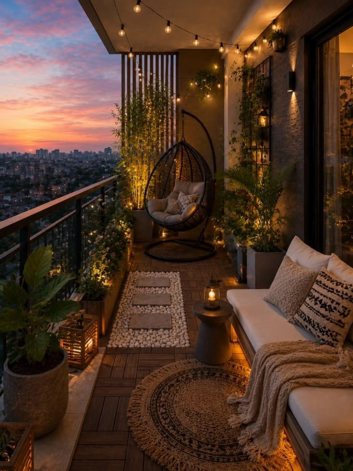
A hanging egg chair gives a small balcony a place to sink in without eating floor space the way a second sofa would. Pair it with a compact white sofa and a side table, and the corner becomes a room.
I would pick the swing-style chair over a standard lounger, since it adds height and movement to a flat space. Potted plants and string lights finish the setup for very little money.
Check how the hanging chair is anchored before you sit in it, and renters should ask the landlord first.
14. Unique Lampshades
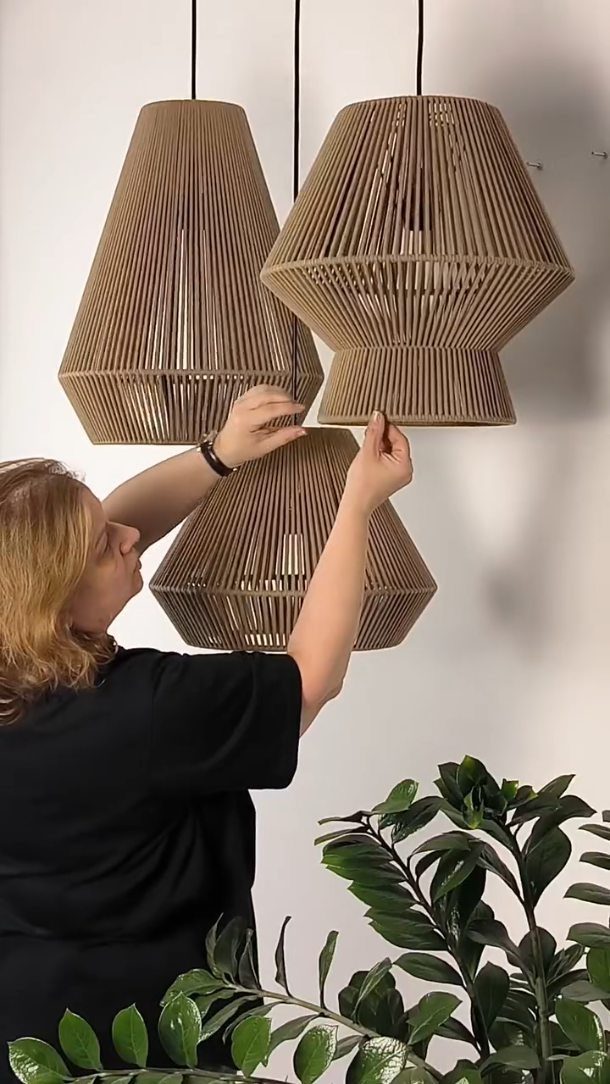
Unusual shapes do the work here, and I would pick one material and repeat it across all the shades. Mixing sizes keeps the group from looking like a set of copies.
Slat shades cast striped shadows, which is a bonus in a quiet room. If wood is out of budget, a single shade in a bold color or odd shape gives a similar lift.
15. Large Mirrors
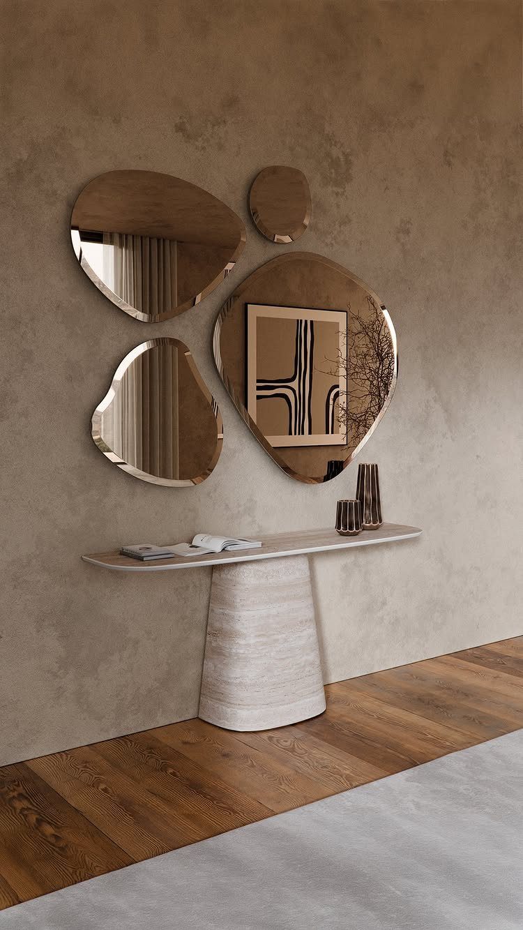
Mirrors earn their place by catching daylight and throwing it back into the room. Hang them where they face a window or sit on the wall beside one, and the whole room brightens.
Organic, rounded shapes in different sizes feel softer than one big rectangle, and I like grouping them over a console table so they read as a single piece of art. Keep the wall behind them a quiet, textured neutral.
Lay the mirrors on the floor first and shuffle them until the gaps look even.
Avoiding Outdated Trends
Trends age fastest when a whole feed latches onto them at once. Before you buy or paint, ask whether you like the thing or just keep seeing it.
Finishes give away their era more than shapes do.
Particle-scattered granite counters and matte black fixtures once signaled luxury and now timestamp a room, so go easy on them, or pick them because you love them rather than because they are everywhere.
A safer plan is to put the permanent, hard-to-change pieces in neutral tones and let cheap, swappable things carry the current look: pillows, a lamp, a print.
Traditional homes pick up a modern edge fast with 5 moves: clear surfaces entirely, paint walls in neutrals, swap dated fixtures for clean-lined ones, replace cabinet pulls and door handles, and bring in wood or stone.
Start with the clutter, since it costs nothing.
Importance of Natural Light
Sunlight does more for a modern room than any single purchase. Large windows, sliding glass doors, and well-placed skylights brighten a space and make it feel larger.
Most renters can’t add a window, but you can stop blocking the ones you have. Pull furniture back from the glass, keep the sill clear, and hang curtains so they sit beside the window rather than across it.
An open layout lets that light travel deeper into the home. I want a living room to feel like a screened porch in the middle of nowhere: open, easy, nothing competing for attention.
Once the light and space are there, art or a few well-chosen furniture pieces add the personal touch. Keep them few, so the room still has room to breathe.
Mixing Materials
The Scandinavian influence shows clearest in the materials: modern interiors lean hard on wood, linen, and stone rather than synthetics. Wood, stone, wool, linen, rattan, and clay all add warmth, and both styles prefer simple, natural looks over heavy decoration.
Texture is what keeps a clean room from feeling flat. A linen throw on a hard-edged sofa or a woven basket beside a stone surface does the job for a few dollars.
Pair those soft materials with something harder and more industrial, such as metal or brick, and each one looks better by contrast. Pick one or two of each and repeat them around the room.
Frequently Asked Questions
What is modern interior design?
Modern interior design is a style built on simplicity, clean lines and functional spaces.
The style took shape in the early 1900s, drawing from German Bauhaus and Scandinavian minimalism, and it still chooses wood, linen and stone instead of ornament. Texture does the work that ornament would do in other styles.
How do I modernize an older home?
Start by clearing surfaces, since clutter costs nothing to remove, then paint the walls in neutrals.
Beyond paint, change out light fixtures and cabinet hardware for simpler profiles, and add wood or stone surfaces where the budget allows. These moves make a traditional home look modern without a major renovation.
What colors work best for modern interiors?
Neutrals such as white, beige, gray and soft brown make the best base.
They reflect light and keep a room calm. Keep walls, floors and large furniture in those neutrals, then use pillows, throws or art for any accent color you can swap out later.
What are some beautiful interior design ideas for a small house?
Joining the living and dining areas into one room, all in the same neutral palette, gives a small house visual space it doesn’t actually have.
Rugs mark out each area without construction, which matters when you rent and can’t touch the walls.
Built-in seating at the kitchen table takes up less room than pulled-out chairs, and one statement plant or a pair of oversized mirrors fill the space without adding surface clutter.
What interior design is popular now?
Modern design with warm natural materials is popular: wood, stone, linen, rattan and clay in a neutral palette.
Brass and gold faucets have replaced brushed nickel as the warm metal finish in kitchens and baths. Finishes date a room faster than shapes do, so pick what you love rather than what everyone is posting.
What makes a house beautiful?
Daylight changes a room more than anything you can buy, so leave windows clear and pull sofas and chairs away from the sills.
After that, a narrow color range, a few well-chosen pieces and some texture keep a room feeling planned rather than collected. Leave space open so nothing competes for attention.