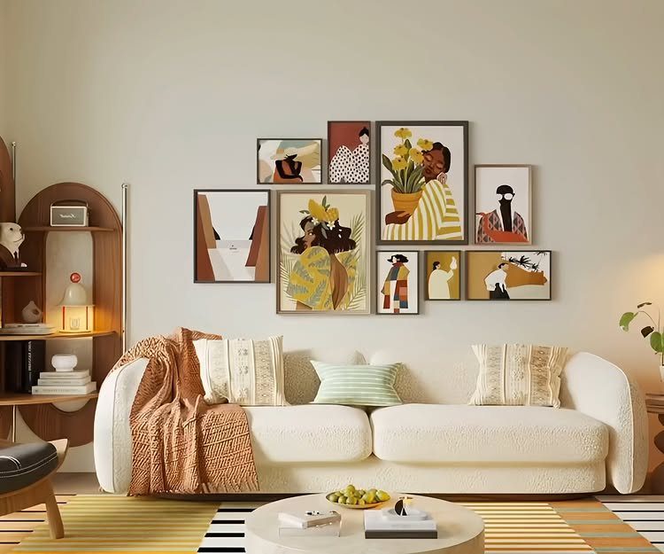
Your couch decides the wall more than your taste does: a sleek modern sofa wants clean prints, a loud or patterned one needs quieter art, and a solid gray or cream one can handle bold color.
Renters face a second filter: Picture Ledges need only a couple of screw holes, while The Grid, Framed Art and Sconces, and Art and Floating Shelves all call for more drilling and anchors.
Painter’s tape and paper templates let you test any of them before the hammer comes out.
1. Color Palette
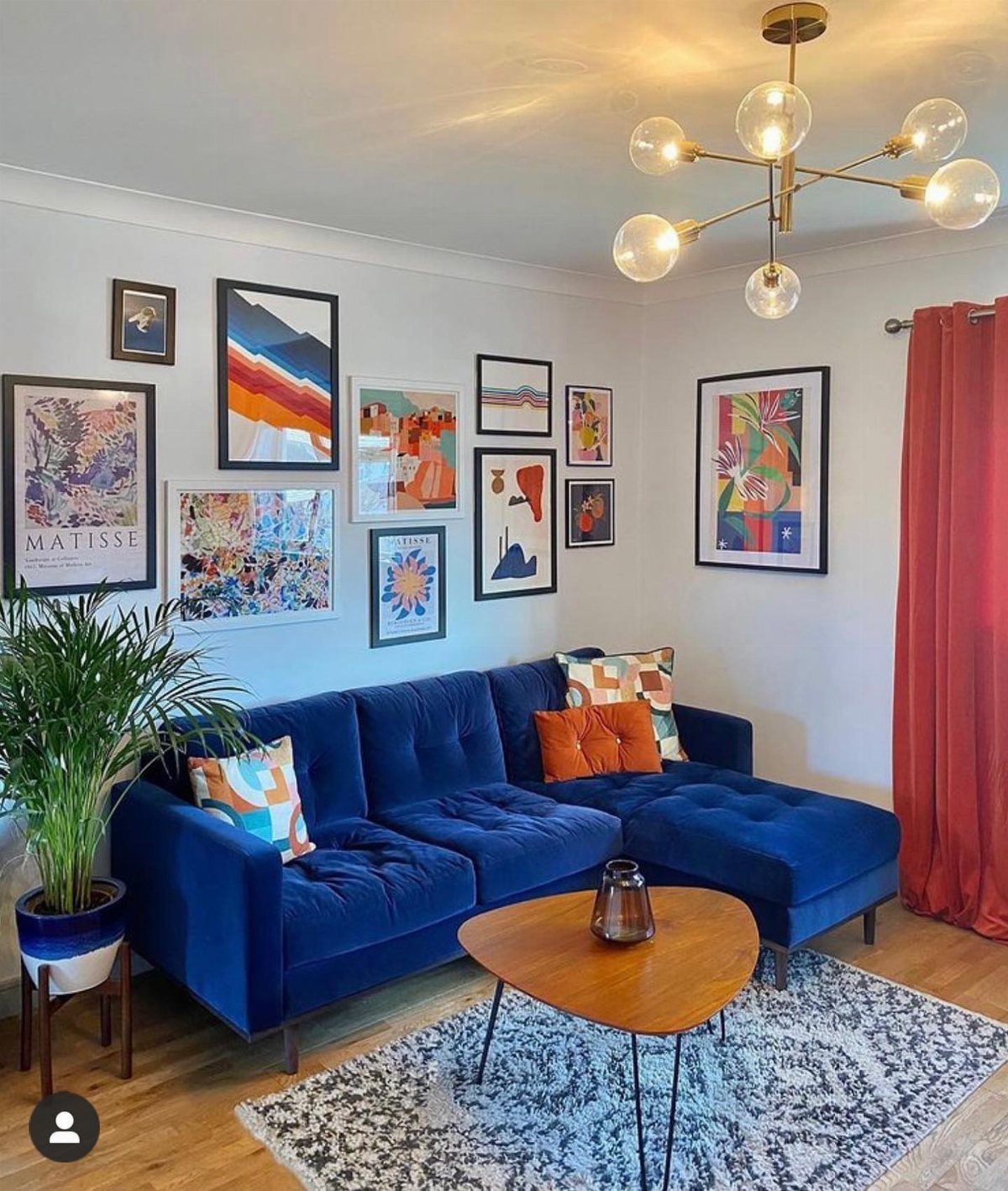
A gallery wall reads as one piece when the art shares a few colors.
Pull two or three shades from the room and repeat them across the prints: here the blues of the velvet sectional echo through the frames, and the warm tones tie back to the rug.
Pick the palette before you buy anything. Then shop your existing prints and thrift frames against it, and skip whatever fights the scheme.
2. Picture Ledges
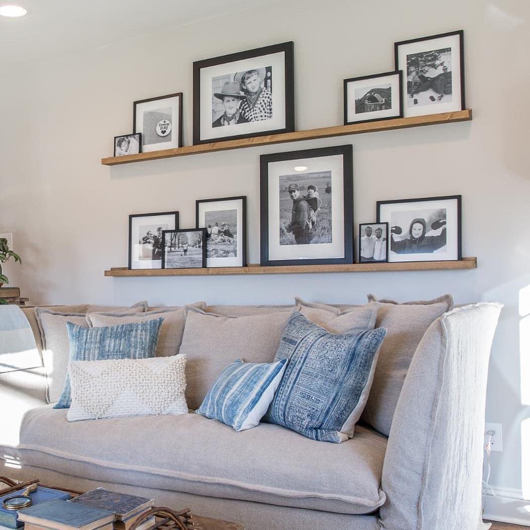
Picture ledges let you skip most of the hammering. Two shelves hold the whole display, so a renter ends up with two sets of screw holes instead of a dozen nail holes.
Frames simply rest on the ledge, which makes swapping photos a 10-second job. I like black frames on wood ledges, and leaning them a little over each other looks more relaxed than lining them up edge to edge.
3. Placement
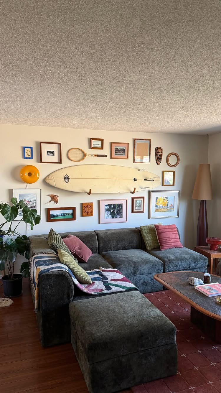
Size comes before arrangement. Decide how much of the wall the collage should fill, then hang to that footprint rather than letting it sprawl.
A cluster wider than the couch looks top-heavy, so I keep the group a bit narrower than the sofa.
Cut paper templates, tape them to the wall, and step back before you commit. A bold piece like a surfboard can anchor one side while the framed art fills in around it.
4. Picture Lights
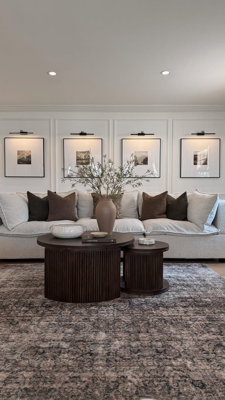
Lighting turns framed art into a focal point. A black picture light mounted above each frame puts a spotlight on the piece itself and gives the wall a finished, gallery feel even in a plain room.
Matching the finish across every light in the row keeps it tidy. Check how each one is powered before you buy, since a plug-in or battery model avoids wiring and suits renters.
5. The Salon Wall
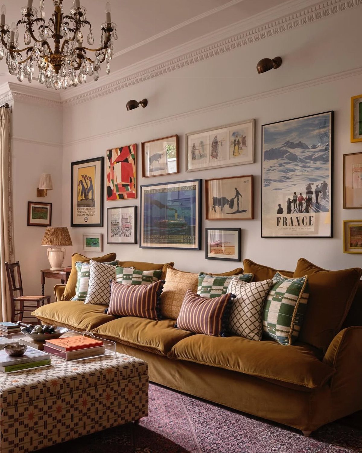
Mixing sizes and orientations is what makes a salon wall look collected over time instead of bought in a set. Combine tall verticals, wide horizontals and a few small squares, and let the frames and prints differ in style.
Lay everything on the floor first and photograph the layout so you can copy it onto the wall.
6. The Grid
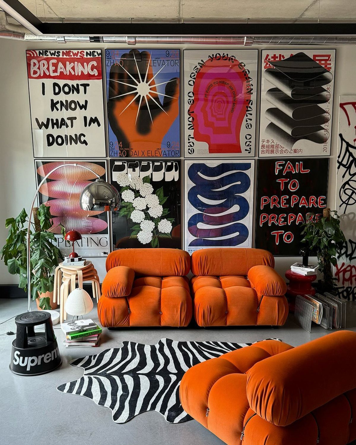
A grid is the most forgiving layout for anyone who likes order.
Identical frames in identical sizes, spaced evenly, make even loud prints look calm, and a tidy block of 2 rows is an easy shape to center over a sofa.
Measure the spacing once and keep it the same everywhere.
Paper templates taped to the wall and a level take care of most of the hard part. If one frame sits crooked, the whole grid shows it.
7. Layout Ideas
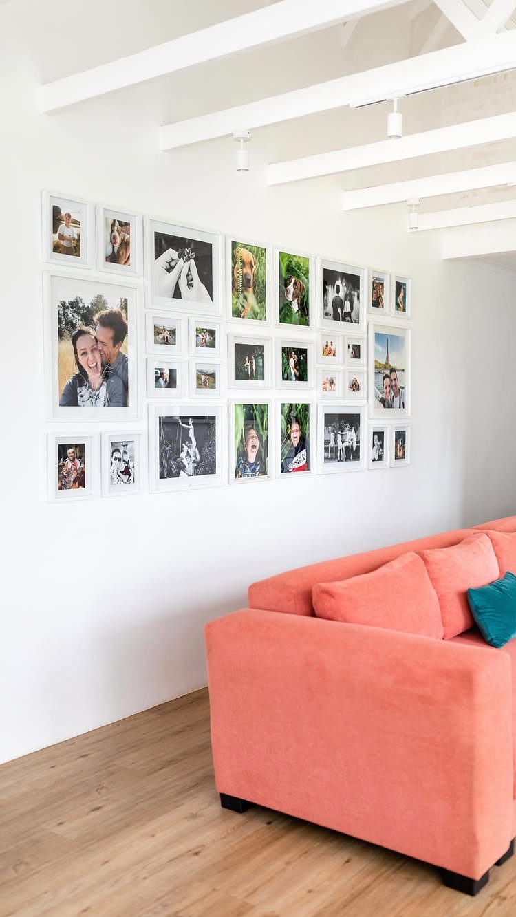
Pick the layout before you pick the art, because the layout decides how much measuring you sign up for. A symmetrical block of matching white frames is the strictest option, and it only works when every gap is identical.
Soft lead rubs off the wall easily, which helps renters. Keep the whole block a little narrower than the couch.
If exact spacing sounds stressful, choose a looser arrangement instead.
8. Large Statement Piece
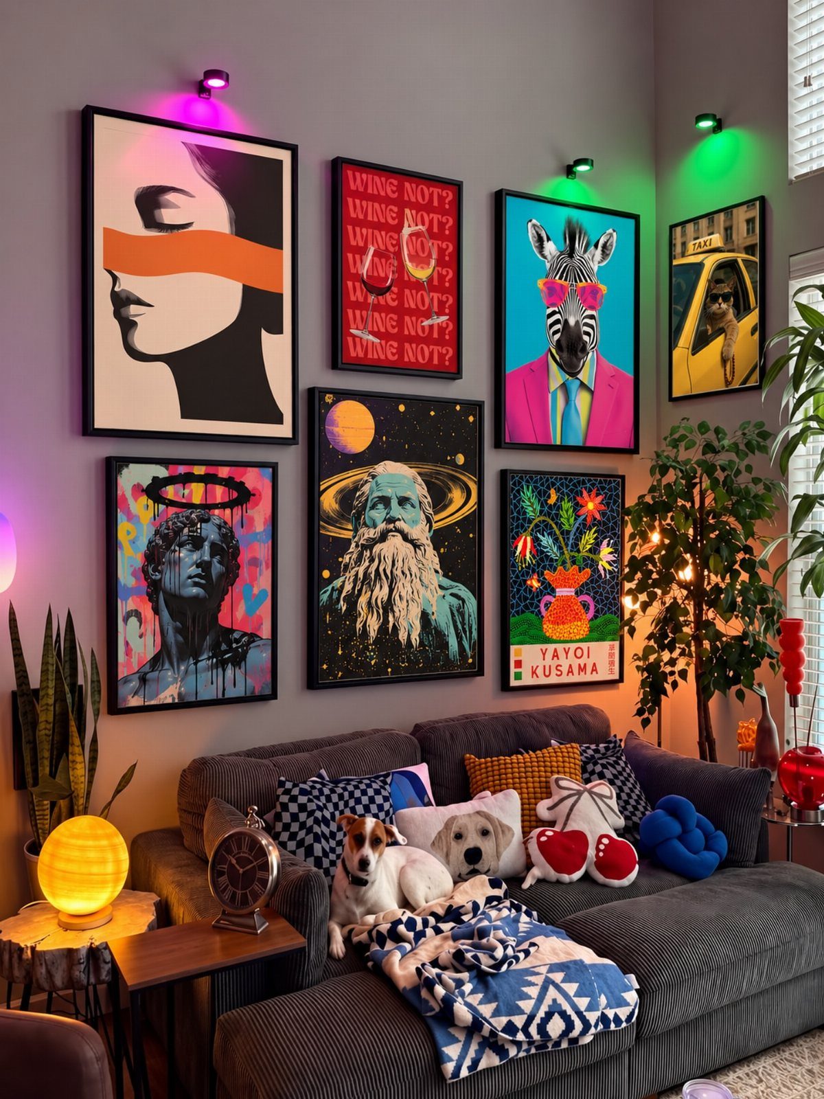
One oversized print can carry the whole wall, with smaller pieces gathered around it. Hang the big piece first, since everything else is placed relative to it.
I would pick the biggest frame in the group, set it slightly off center, and let the smaller prints fill the gaps. Bold color on the large piece keeps the rest from drifting, especially over a plain gray couch.
9. Decorative Plates and Art Mix
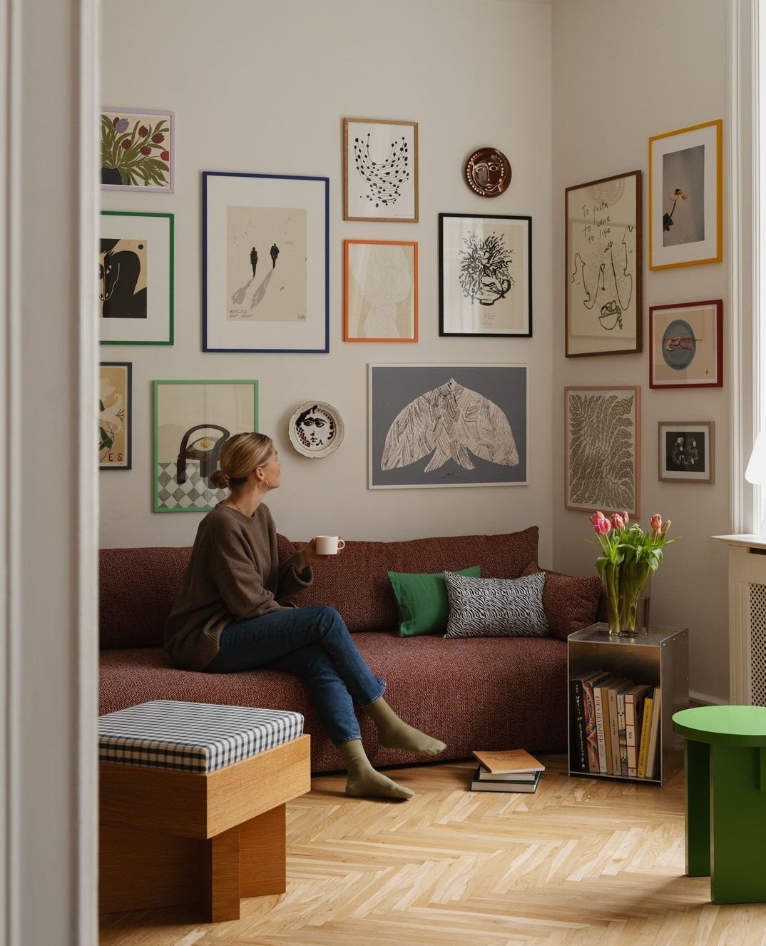
Plates break up a wall of rectangles. Mixing round dishes in among framed art adds a shape that frames cannot, and it lets you use pieces you already own.
Plates need metal hangers that clip around the rim, usually sold in small packs for a few dollars.
Switch between plates and frames as you arrange them, which stops either one from clumping. I like keeping one color repeated across both so the mix looks chosen rather than random.
10. Over Patterned Wallpaper
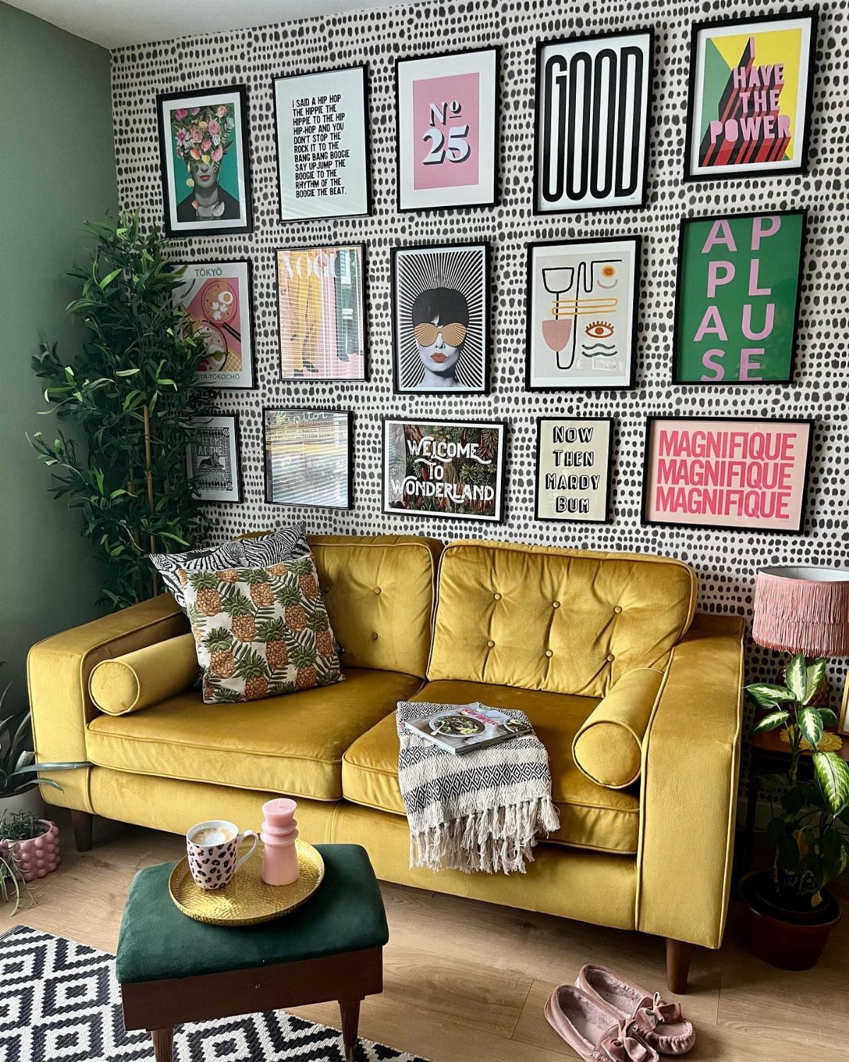
Patterned wallpaper behind a gallery wall works when the frames are strong enough to hold their own. Busy paper swallows thin, pale frames, so go for bold prints with clear text or heavy color.
Black or white frames with wide mats give the eye a place to rest against the pattern. Hang a trial layout with paper templates first, since pattern makes crooked spacing harder to spot until the art is up.
11. Against a Colorful Accent Wall
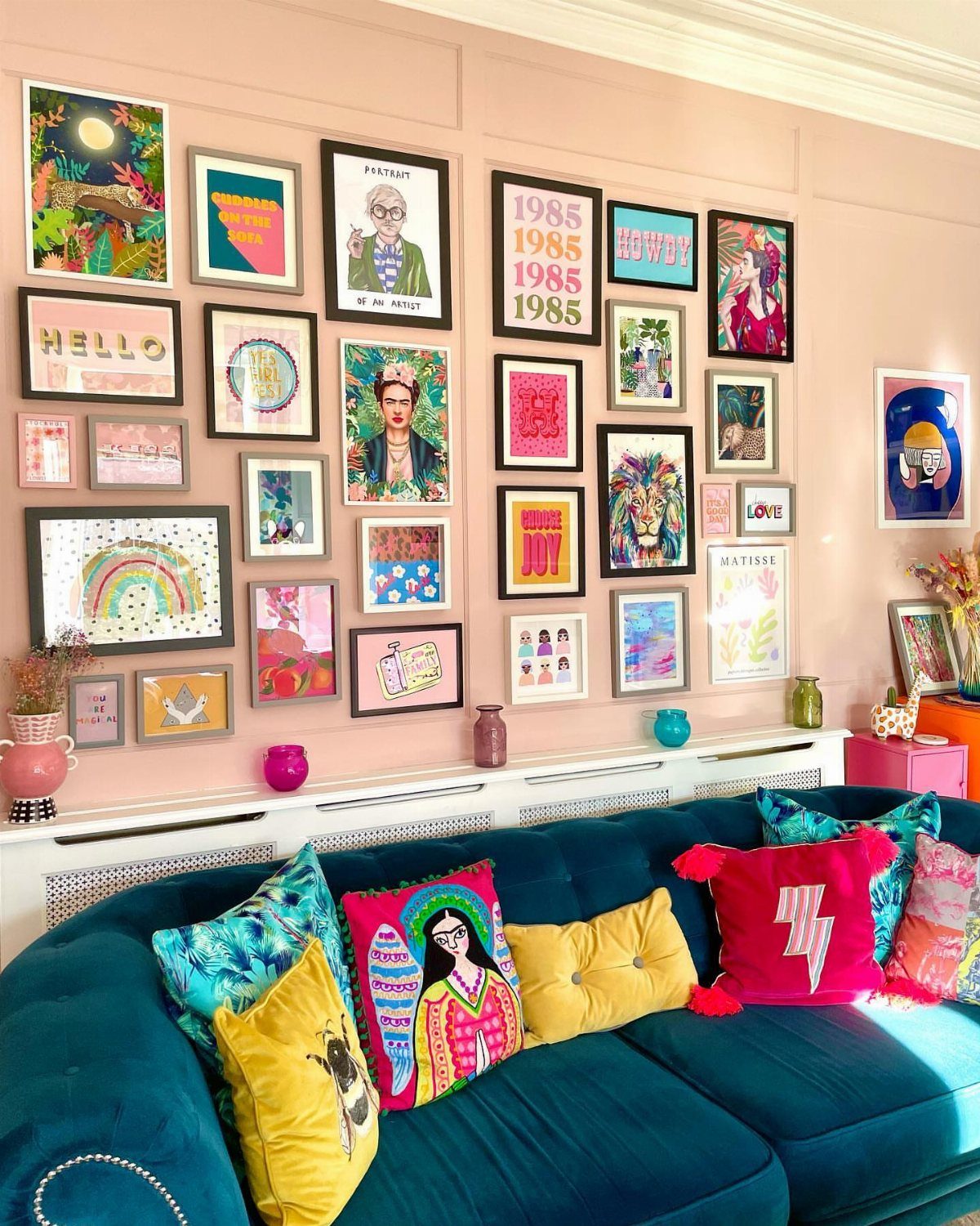
A saturated wall color is a ready-made backdrop, and a gallery wall on top of it only needs one decision: contrast. Pink looks best to me with prints that bring in a second and third color rather than more pink.
White mats help each print stand apart from the paint. Test your layout with painter’s tape before hammering, because a bold wall shows every extra nail hole.
Pillows on the couch can repeat one of the print colors.
12. Wood Framed Family Photos
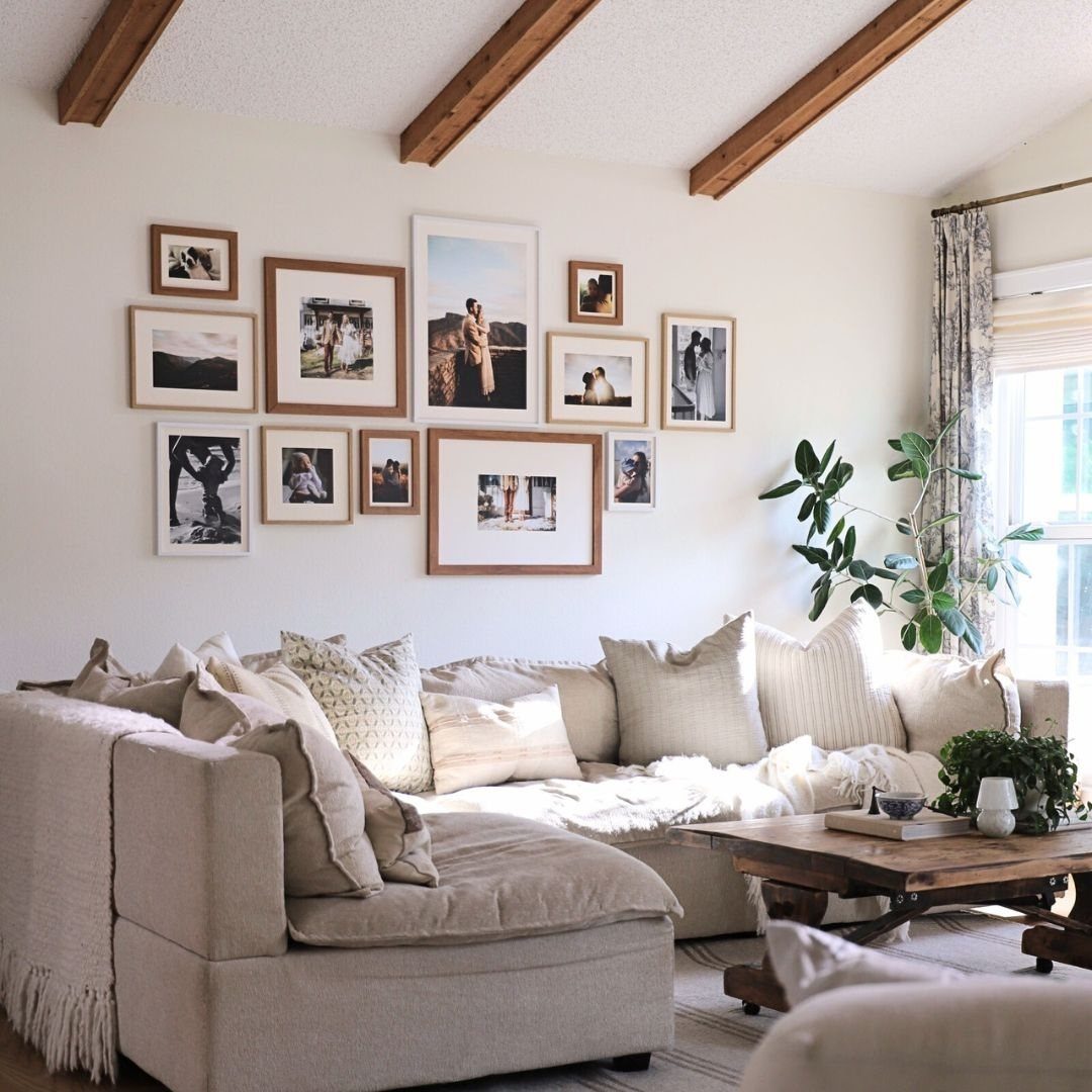
Wood frames in a matching tone make a family photo wall feel unified even when the sizes vary. Warm wood suits a neutral sofa, and it echoes the other wood in the room.
Buy frames in the same finish but several sizes, and keep the photos in a similar range of tones, or print them all in black and white. I would arrange the largest frames toward the center and keep gaps equal.
13. Art and Floating Shelves
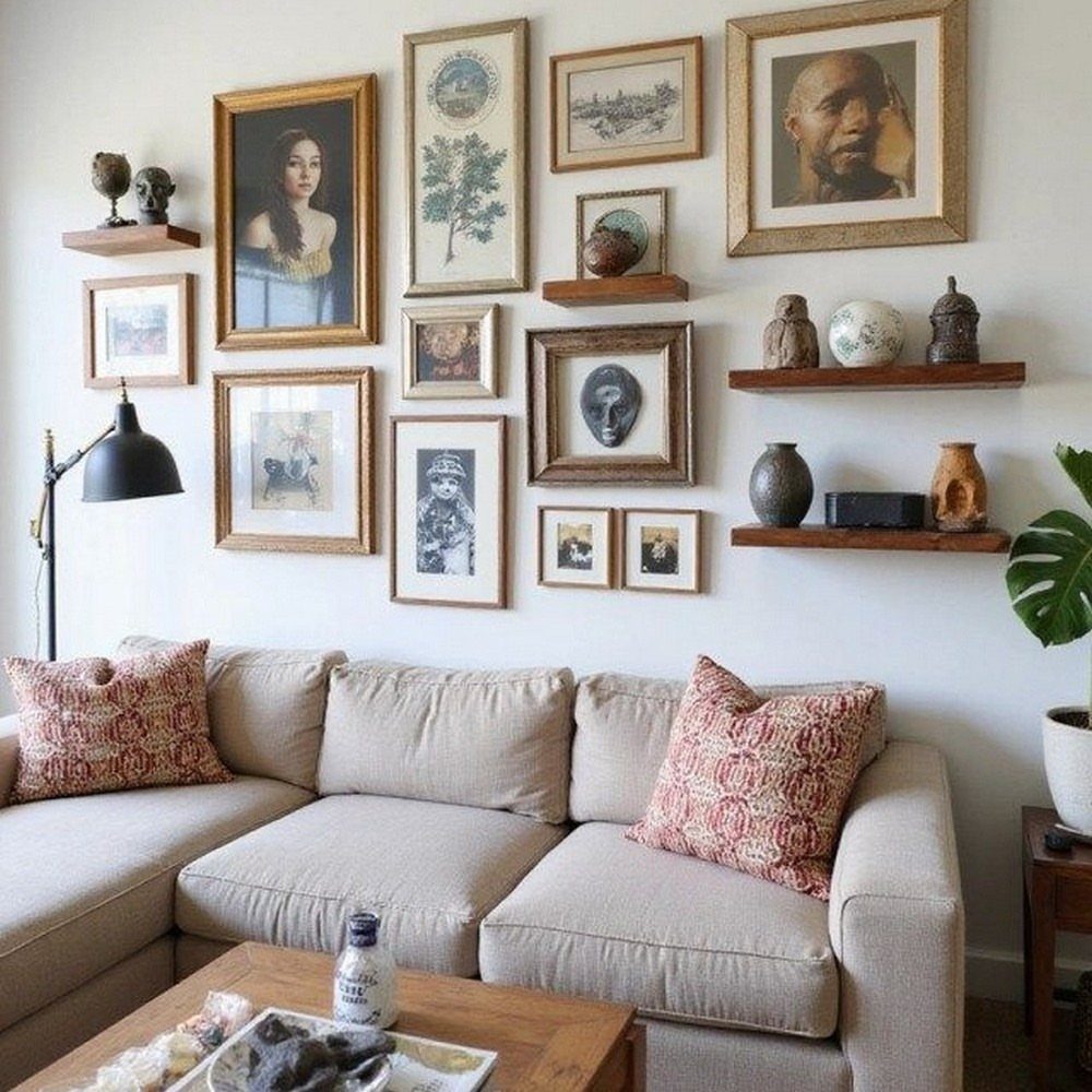
Small wooden floating shelves let a gallery wall hold things that frames can’t: vases, little sculptures, a potted plant. Mixing them with framed art gives the wall depth, and it puts objects you already own to work.
I would keep the shelf wood in one tone so the shelves read as a set. Hang the frames first, then fit the shelves into the gaps, and keep the objects small and few so each one stays visible.
Shelves need solid mounting, so use wall anchors or studs, and expect a few extra holes for a renter.
14. Framed Art and Sconces
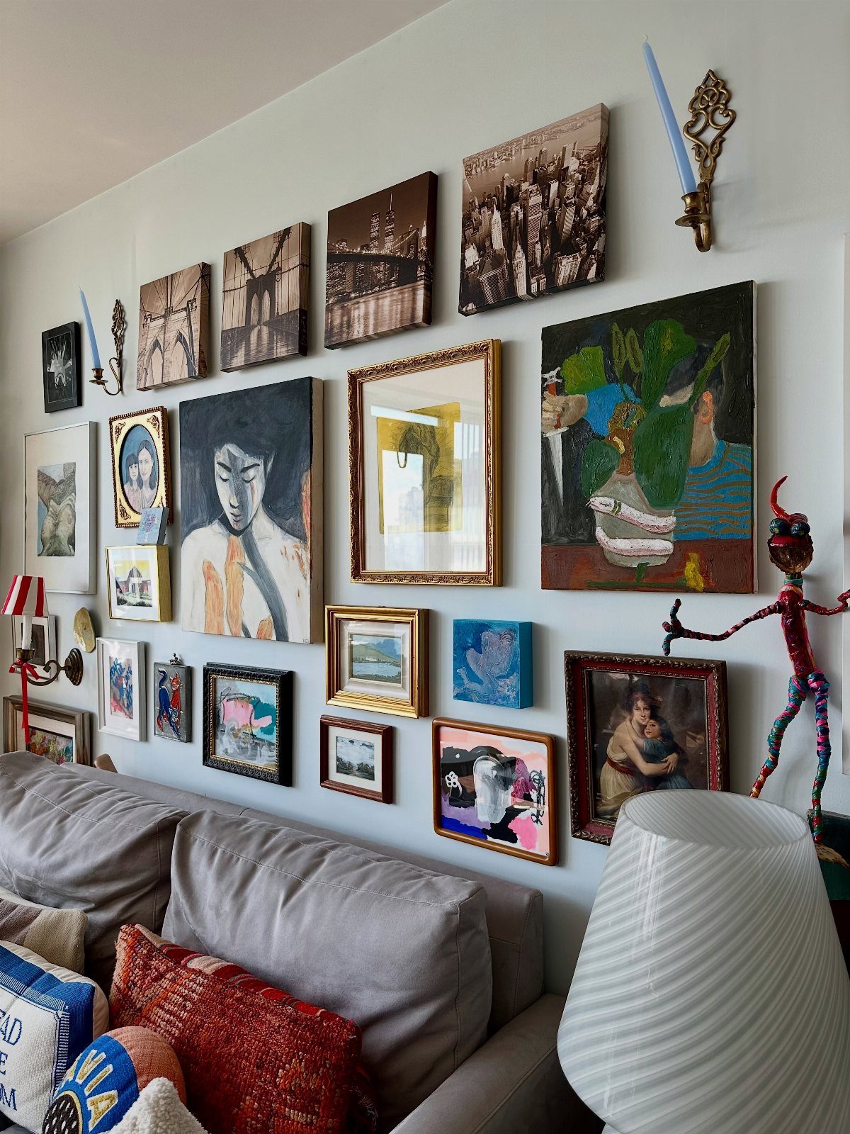
Wall sconces turn a dense wall of paintings and photographs into a lit display, and they add shapes that frames lack.
Mount them among the art rather than only at the edges, so the light feels like part of the collection.
Plan the sconce spots before hanging any frames, since their position is the hardest to change.
Plug-in sconces skip the electrician, so a renter can hang them with a couple of screws and take them along at move-out. I would pick one finish for every sconce and let the frames vary freely around them.
15. Sculptural Objects and 3D Art
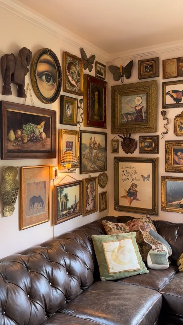
A carved animal, a mirror and a few butterfly sculptures can sit in among the framed paintings and make a wall feel like a collection instead of a row of rectangles.
Objects with real depth catch light and break up the flat look.
Start with the framed pieces, then use the 3D items to fill the gaps and set the rhythm. I would space the sculptures out rather than grouping them, so the eye keeps moving.
Check the weight of each item before choosing a hanger, because heavier pieces need anchors, not just a nail.
Choosing the Right Art
Start with the couch, since it sets the rules for everything above it.
A sleek modern or minimalist sofa pairs well with clean, modern pieces or black-and-white prints. A traditional or vintage sofa can handle more ornate frames and colors pulled from the rest of the room.
Then decide whether to match or contrast. A solid gray or cream sofa gives bold, saturated prints room to shine, while a loud or patterned one needs quieter art so the wall doesn’t compete with it.
When nothing feels right, pull one color from a pillow, rug, or curtain and pick art that echoes it.
Planning Your Gallery Wall
Before choosing a single piece, look at the couch as the base of the whole display. The art and the sofa are read together, so the wall should feel like it belongs to the furniture below it.
Stand back from the sofa and ask whether the two look like they belong in one room.
If the couch is heavy and dark, the wall needs enough weight to match it. If the couch is light and slim, a lighter group of art keeps things balanced.
Gallery Wall Evolution
Leave a little room on the wall for growth.
A gallery wall that looks finished on day one has nowhere to go, while one with a few gaps can take a travel postcard, a framed note or your kid’s artwork later on.
Mix in things that mean something to you: a candid photo between abstract pieces, a thrifted find next to a print you bought new, even a feather in a shadow box.
The more personal the wall feels, the longer it holds up.
Check the light as the wall changes.
Battery-powered picture lights or clip-on frame lamps put the spotlight on a favorite piece with no electrician and no wiring. Notice, too, how daylight shifts the colors through the day.
Frequently Asked Questions
How do you do a gallery wall above a couch?
Start with the couch, then decide how much of the wall the group should fill before buying anything.
Before any nail goes in, trace each frame onto kraft paper, cut the shapes out, and tape them up so you can judge the layout from across the room.
A cluster that runs slightly shorter than the sofa looks settled, while one that matches or overshoots it tends to feel heavy up top.
Are gallery walls still a thing?
Yes, they remain a popular and personal way to decorate. A mix of thrifted frames, prints you already own and a few new pieces can cost less than one large piece of art, though gathering them takes time.
Leaving a few gaps lets the wall keep growing with postcards, notes or kids’ artwork.