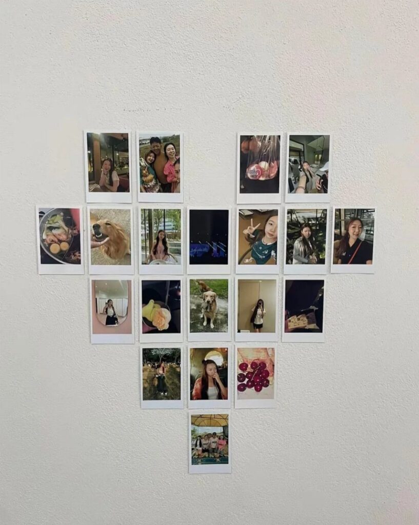
Which picture wall suits you depends mostly on how much wall space you have and what frames you already own.
Renters have options that need almost no hardware, like a wire grid with string lights, a corkboard, or floating shelves that let the display change without new nail holes.
A symmetrical grid of identical frames gives you clean lines, while a gallery wall with plug-in picture lights adds focus without electrical work.
The ideas range from a few thrifted plates or spray-painted frames to a full staircase gallery, and nearly all of them can be planned with paper templates and painter’s tape before a single nail goes in.
1. Color-Coordinated Picture Wall
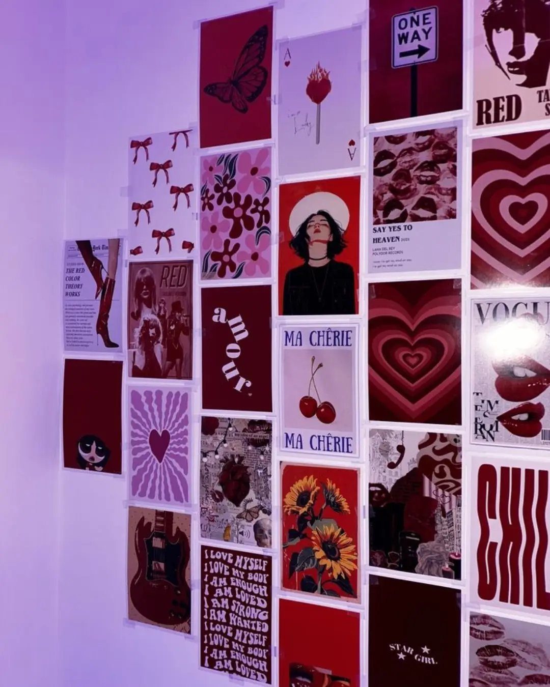
Red and pink do the heavy lifting here.
Because every print sits in one color family, the subjects can wander: fruit, flowers, a guitar, a few words in bold type. The palette ties them together.
Pick 2 or 3 shades and hold to them, then let the subjects vary. A grid keeps a loud palette from feeling messy, and white in the artwork gives the red some breathing room.
Cheap prints work well for this, since the color does the styling.
2. Staircase Gallery
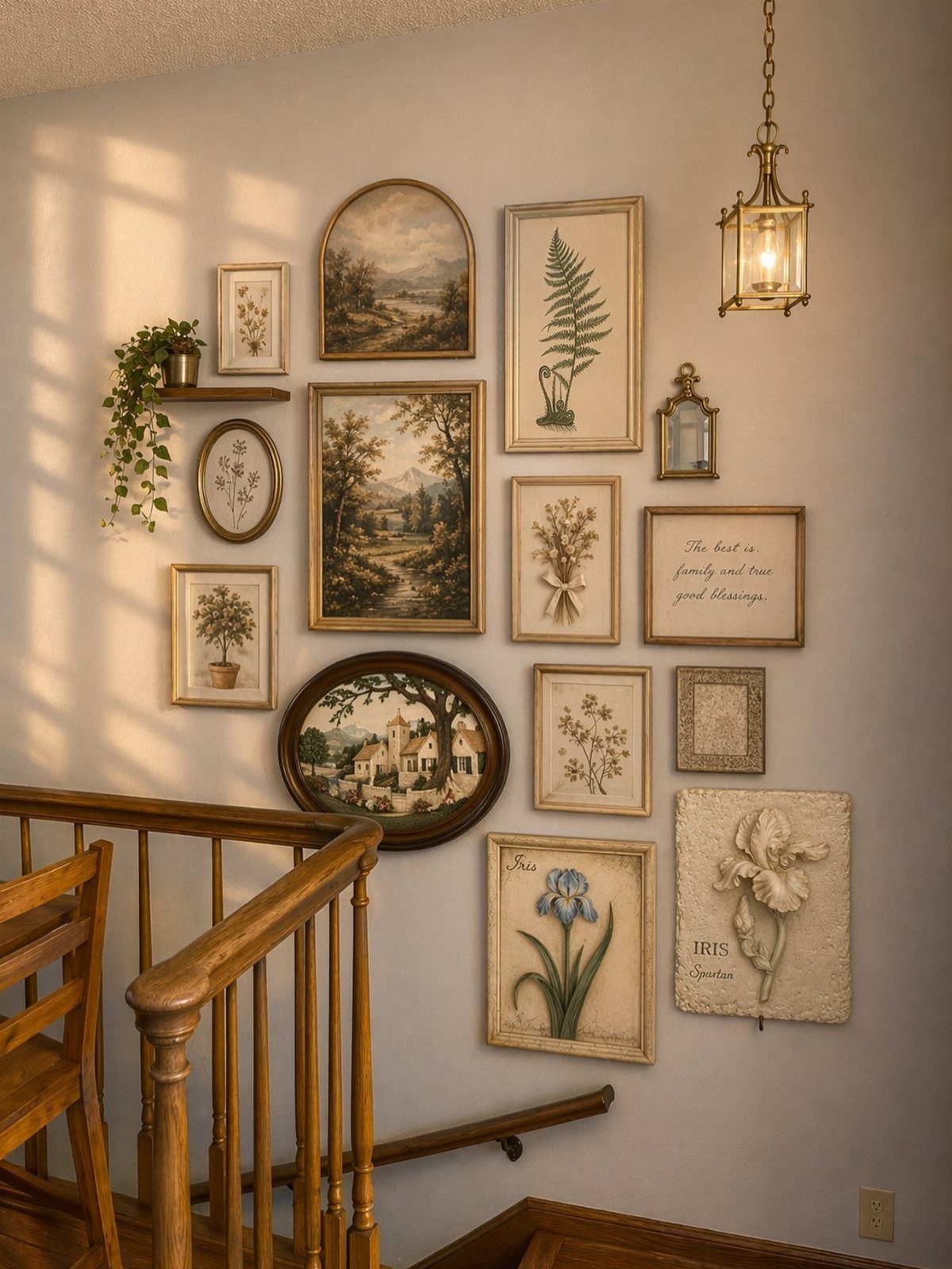
A stair wall is the one spot where a gallery can climb, and it uses space most people leave blank. Here the frames run alongside a wooden railing, so the eye follows the art up the steps.
Mix a few sizes of botanical and landscape pieces, and add a quote print and a small plant on a ledge for variety. Keeping one subject theme, like nature, makes a busy arrangement feel calm.
Lay the frames on the floor first and shuffle them before you hang a single nail.
3. Eclectic Mix of Frames and Mirrors
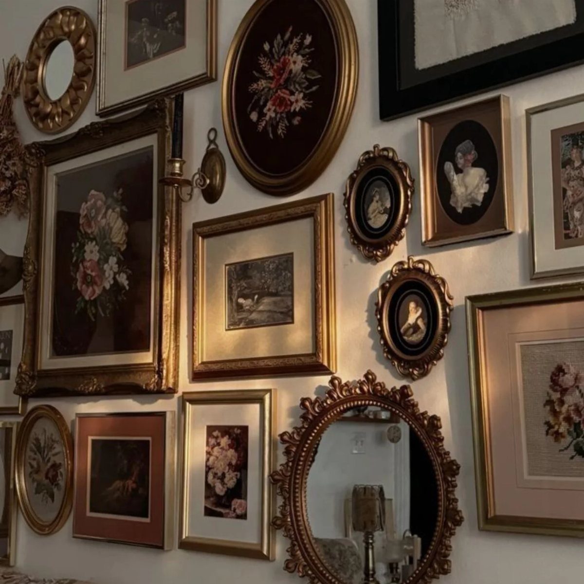
Gold and black frames in ornate and plain styles sit comfortably together, and mirrors of different shapes break up the flat art. 2 finishes are enough to hold a mismatched wall together.
Mix round, oval and rectangular pieces so no single shape takes over. Floral art softens the heavy frames, and the mirrors bounce light around a white wall.
Thrift stores are a good place to collect odd frames, and a can of black or gold spray paint will unify any that stray from the palette.
4. Family Photo Gallery
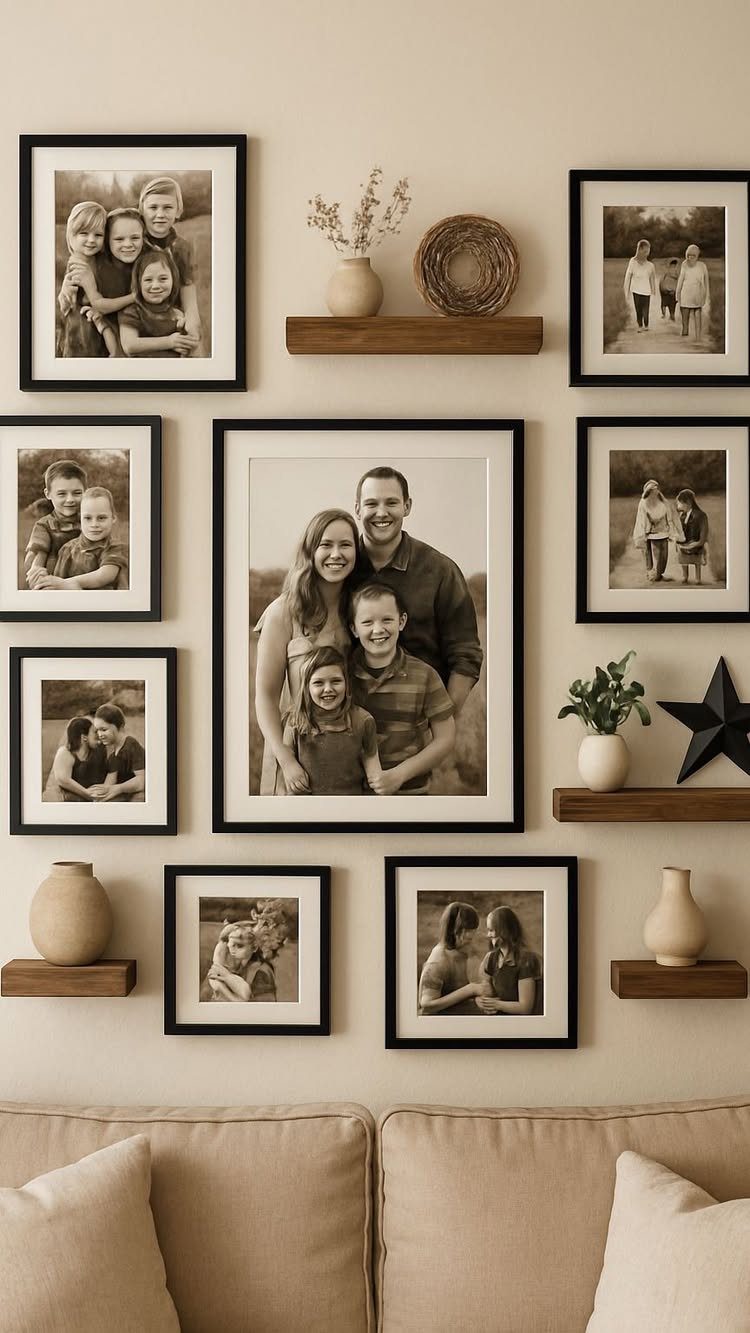
Black frames of sepia family photos read as one set, because the matching frames and the single warm tone do the organizing.
3 wooden shelves slipped between them hold small decor, which keeps the wall from feeling like a school hallway.
Hang it over a sofa, centered on the seating, and keep the photos in the same tone. Converting color snapshots to sepia is a free way to make mixed pictures match.
I like the shelves best for the break they give the grid.
5. Mirrored Gallery
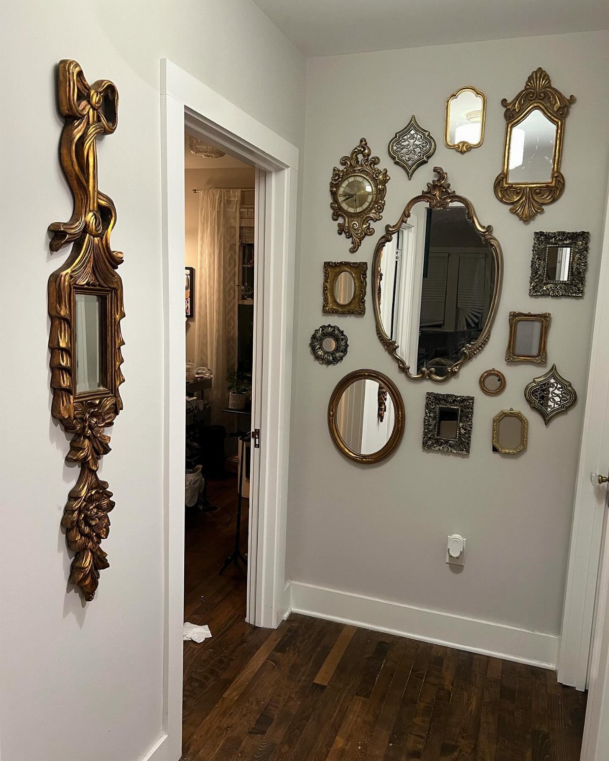
Mirrors alone can fill a wall, and a hallway is a smart place for them. Ornate gold and silver frames in mixed shapes against light gray look layered, and the glass makes a narrow passage feel wider.
Mixing the 2 metals works because the frames vary in size and shape, so nothing looks like a set. Start with the biggest mirror, then fill around it.
Hang them where they reflect a window or doorway, not a cluttered corner.
6. Vintage Vibe Picture Wall
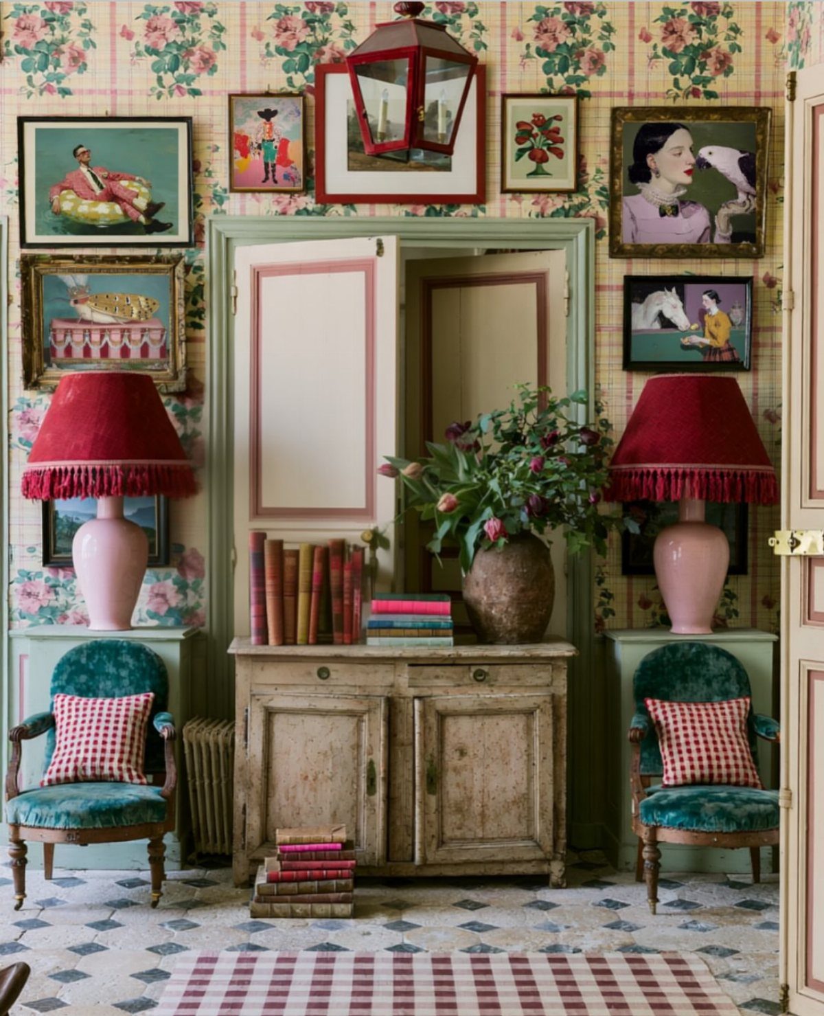
Floral wallpaper gives the frames a busy backdrop, so the art has to be old-looking to hold its own. Vintage paintings in worn frames suit this wall best, and a rustic cabinet underneath grounds them.
Red lamps and green velvet chairs pull colors from the paper, which keeps a pattern-heavy room from fighting itself. Pick one or two accent colors from the wallpaper and repeat them in the room.
Keep the frames generous with space between them, since the paper already supplies plenty of pattern.
7. Gallery Wall of Mixed Colors and Shapes
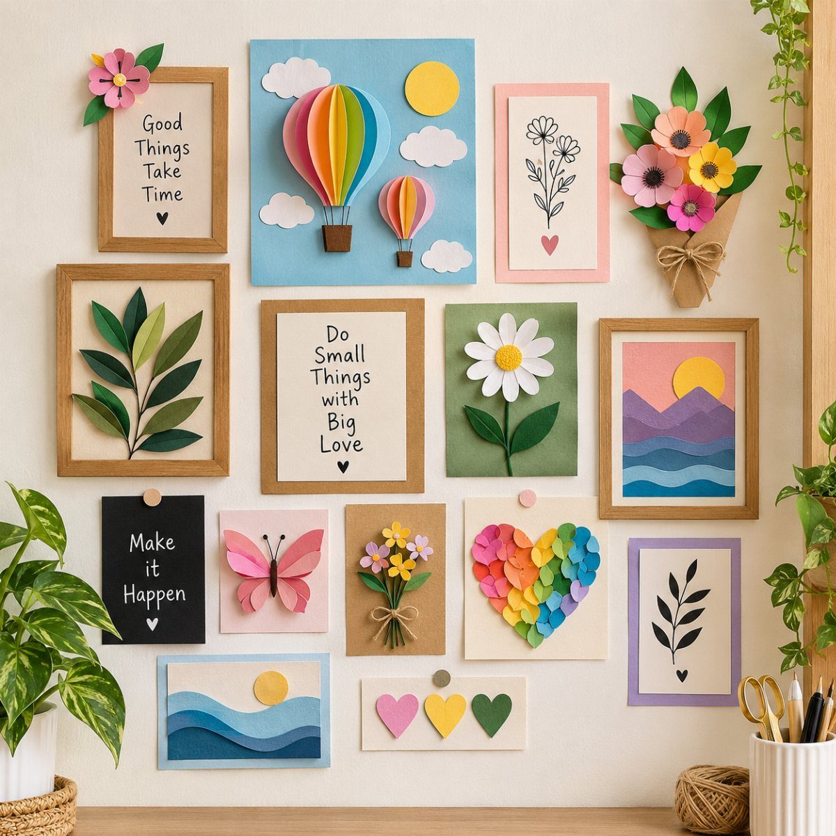
Quotes, paper art and frames of different shapes can share a wall when white sits behind them all. The white lets the bright colors do the talking without the wall feeling crowded.
Pick one or two short quotes and let the 3D paper pieces carry the rest. Mix square, round and rectangular frames so no single shape dominates, and leave a little gap between pieces so each color reads on its own.
Paper art is a cheap way to fill a gap, since it costs far less than a framed print.
8. Curate a Focal Point
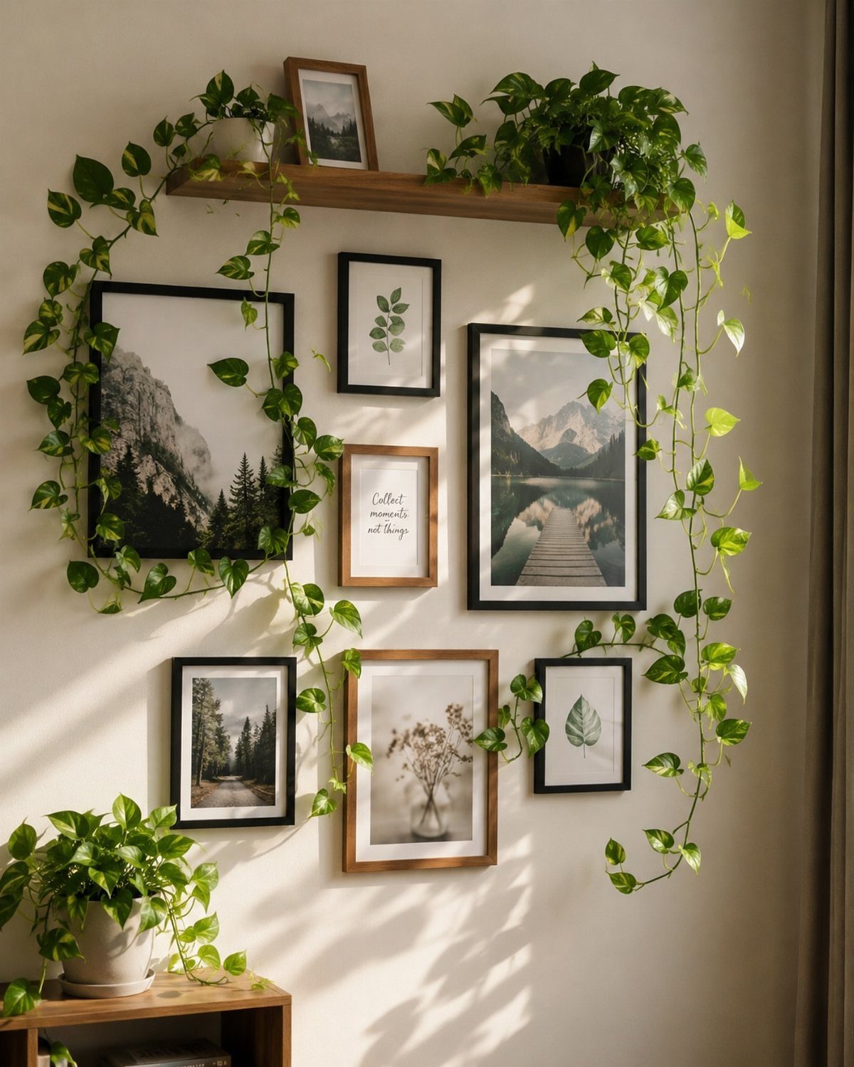
Start with the biggest piece you own and hang it first. Everything else becomes a supporting cast around it, which takes the guesswork out of a wall that could otherwise feel random.
Place the large print slightly off center, then build outward with smaller frames in the same subject, as nature prints do here.
If a wall feels flat, a trailing plant or a short wooden shelf mixed in with the frames adds height and softens the hard edges without needing another frame.
Hang the anchor at eye level and let the small ones follow its lead.
9. Symmetrical Grid
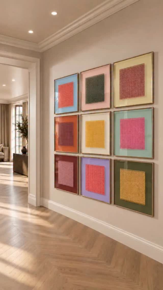
9 identical frames in a 3×3 grid make a wall that looks planned even when the art inside is wild. Matching frames carry the order, so the artwork can be as colorful as you like.
Keep the gaps between frames equal; a narrow gap looks sharper than a wide one. Trace each frame on kraft paper, cut it out, and stick the shapes up with painter’s tape.
Move them around until the spacing looks right, then hammer the nails. Use a level on the top row and measure down from it.
A hallway suits this well, since a grid reads cleanly from a distance.
To create a well-balanced wall that avoids looking too bare or overly busy, consider arranging your decor using the rule of threes.
10. Floating Shelves
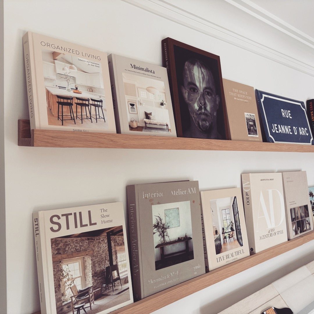
Shelves let a picture wall change without new nail holes. Books, a framed portrait and a small sign can lean and swap whenever you like, which suits renters and anyone who gets bored easily.
Mix heights: stand a book beside the frame, lay another flat, and let the portrait lean back against the wall. Two shelves stacked with space between them look tidier than three crowded ones.
Wood shelves warm up a white wall. I would pick them over plain white for that reason.
11. Corner Gallery Wall
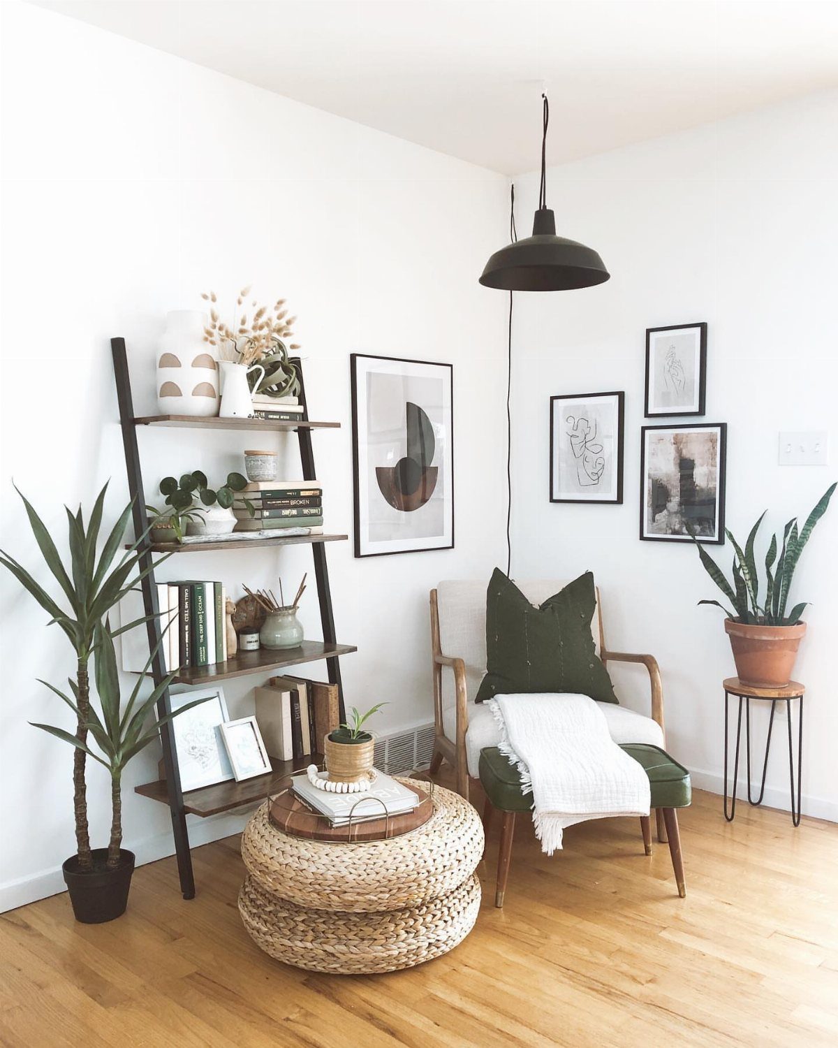
2 walls meeting at a corner give you a nook that frames a chair like a small room. Run the art across both walls so the corner itself becomes the center.
Hang the frames in a loose cluster, wrapping around the edge, and leave the lowest ones above the chair back.
A ladder shelf leaning in the corner adds a place to stack extra pieces and holds a few things without any drilling.
Add a pillow and a woven ottoman, and the corner starts to feel like a place to sit.
12. Gallery Wall with Lighting
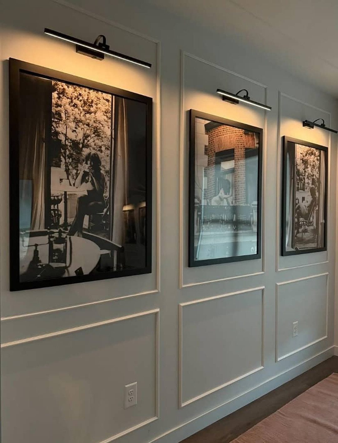
A slim picture light over each frame turns a hallway of photos into a small exhibit. Black and white prints look especially good with a focused beam, since the contrast gets a boost.
Match the light width to the frame, and pick one finish, black here, so the fixtures read as part of the set.
Battery-powered versions skip the wiring, which matters if you rent. Hardwired ones look cleaner but need an electrician.
Hang the frames at the same height so the lights line up.
13. Corkboard Wall
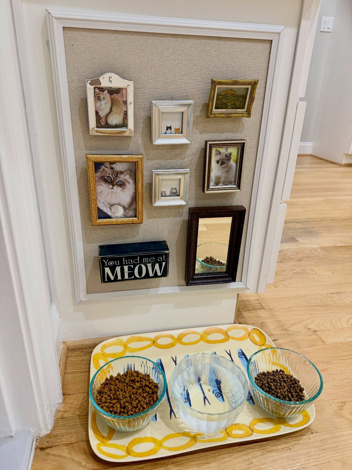
A corkboard turns a wall into a display you can rework whenever the mood strikes. Pins hold photos, cards and a small sign, so swapping them takes seconds and leaves no new nail holes beyond the one for the board.
A frame around the cork makes it read as art instead of an office bulletin board. Keep the pinned items to one subject, like pet photos, and the wall stays tidy even as pieces change.
Hang a tray or shelf below it, and the wall starts to serve the room.
14. Stacked Frames for Narrow Walls
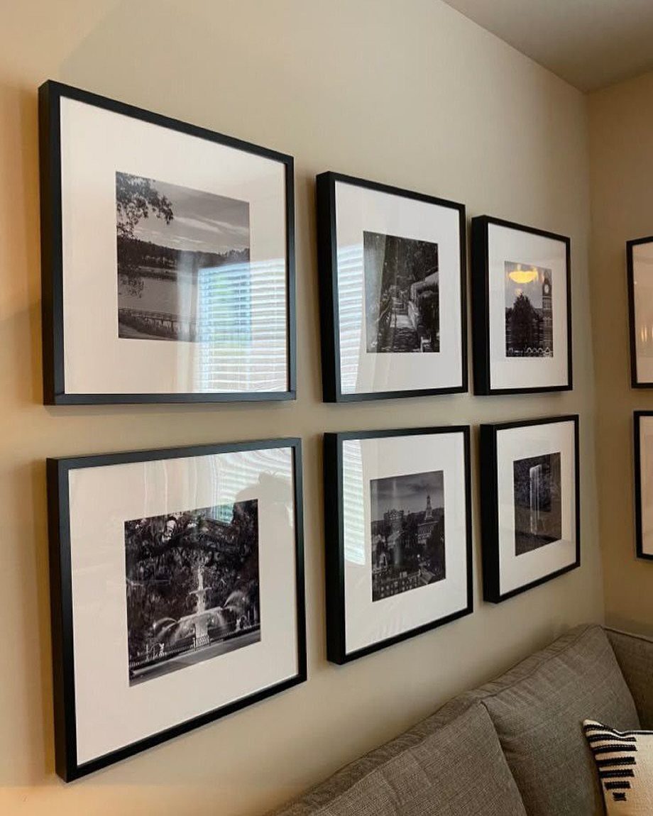
Two rows of three frames use height and width in equal measure, which makes a small stretch of wall look deliberate.
Matching black frames and a shared black and white palette keep a mix of different photos reading as one block.
Hang the block over a sofa and keep it a bit narrower than the seating. Leave equal gaps between frames, and tape paper templates to the wall before you pick up a hammer.
Black and white photos are the easy choice for a narrow stack, since they match without any editing.
15. Picture Wall Behind Furniture
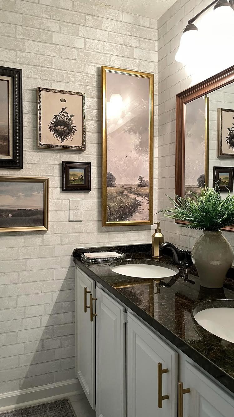
Art above a vanity puts a blank wall to work in a room that usually has none to spare.
Landscape paintings set above the mirror line and along the counter make the sink area feel finished, and the white brick gives them a plain backdrop.
Pick pieces with one color mood so they sit well beside the mirror and the plant. Frames should be sized to the counter below, not wider than it.
I would hang the art a hand’s width above the backsplash line, not floating high.
16. Wire Grid with String Lights
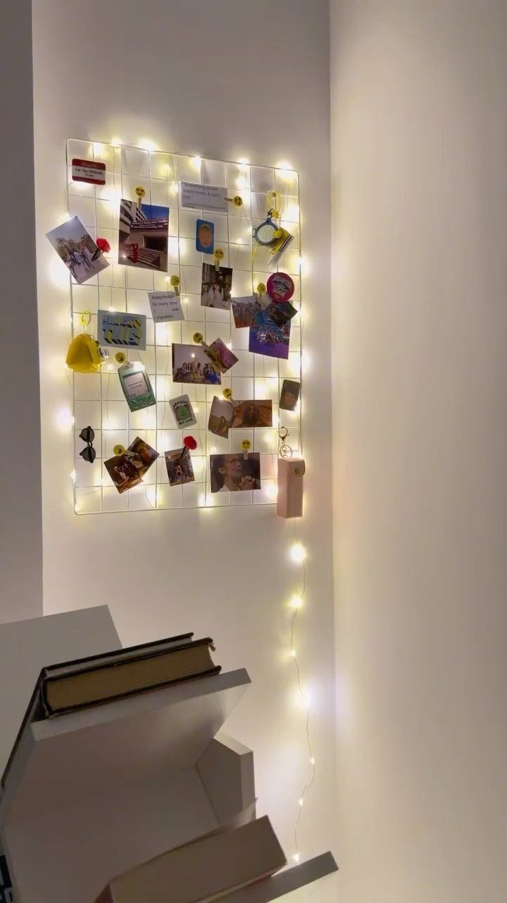
A wire grid gives you a photo wall with almost no hardware. Clip on photos and notes, hook on small items, and rearrange all of it in a minute.
Weave string lights through the wires for a warm glow, and choose a warm white bulb color over cool white so the photos don’t look washed out.
A white grid on a white wall nearly disappears, which lets the pictures stand out.
Mounting a single grid takes far fewer holes than hanging a dozen frames, so it suits renters well.
17. Decorative Plates and Framed Art
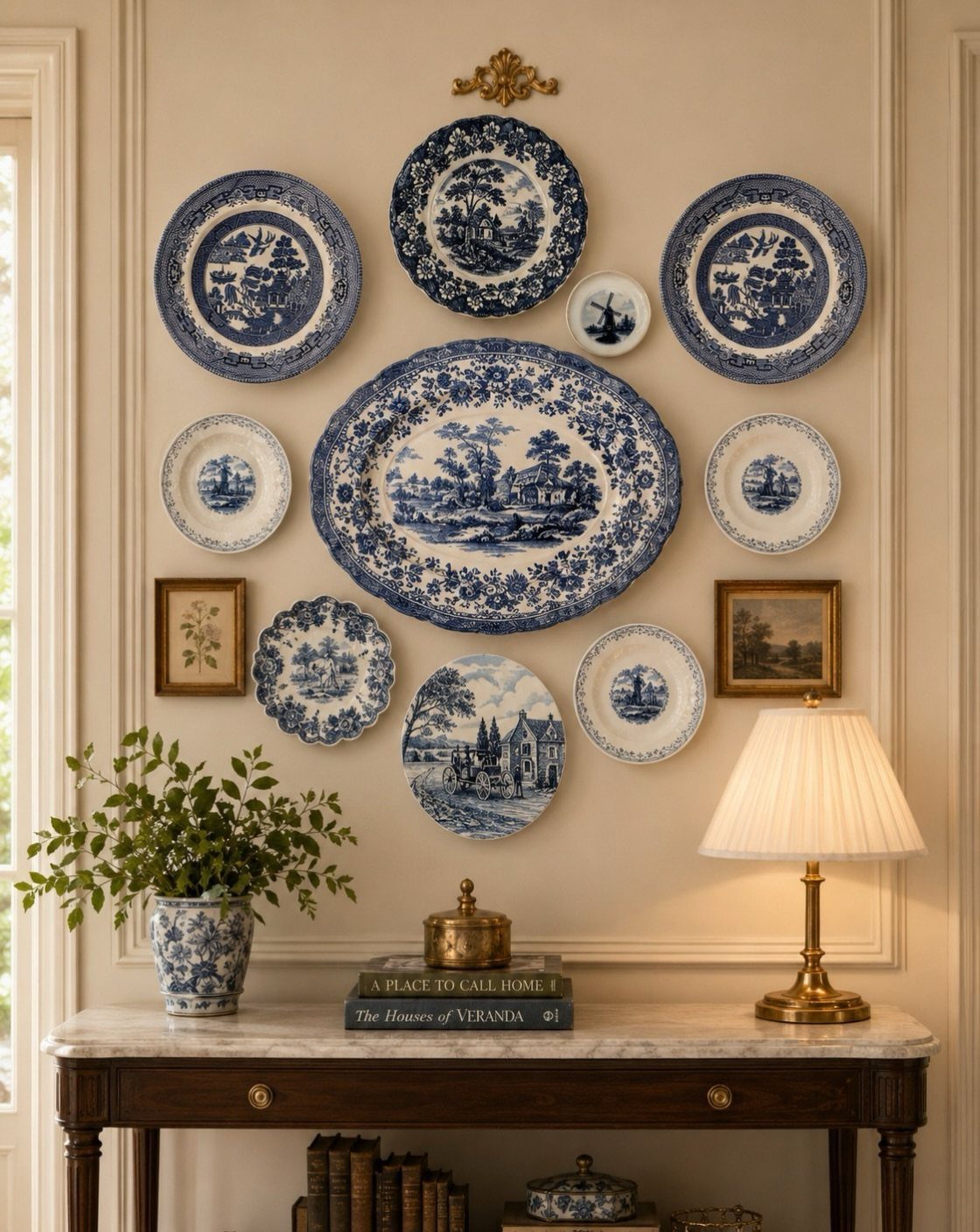
Patterned plates hang like art, and mixing them with small framed paintings keeps the wall from looking like a china cabinet. Blue and white plates share a palette, so different patterns still agree.
Plates need plate hangers, either the adhesive disc kind or the metal spring kind that grips the rim. Lay everything on the floor first and fill in around the largest plate.
Thrift shops and flea markets are cheap sources for odd plates. Hung above a console, the group should be narrower than the table below it.
Planning Your Gallery Wall
Hang your largest frame first, right at eye level, and let the smaller pieces gather around it so the whole wall has an anchor to build from.
Spacing decides whether the wall looks polished.
Rearrange the paper as many times as you like, since tape leaves no holes, and hang the real frames only when the layout feels balanced.
Choosing Frames and Styles
Let your decor style pick the frames. A neutral frame in wood, black or white suits most rooms, and one metallic or colored frame among them adds a playful note without breaking the set.
Mixing frame styles works when the frames share something: a color, a material or a design style. Without a shared thread, the wall reads as random instead of collected.
Combine rectangular, oval and square shapes to break up the monotony of straight edges.
Floating frames and clips are worth a look when you want the picture itself to take center stage, since they leave out a heavy border.
Arranging Photos Effectively
A symmetrical layout feels calm and formal, and an asymmetrical one feels relaxed. Both work as long as the wall looks balanced, with no heavy side pulling the eye away from the rest.
Use a range of sizes, and spread the large pieces across the wall so they don’t pile up in one corner.
Balance color the same way: if one side holds a bold red print, repeat that red somewhere on the other side.
A free-form, organic shape is also fair game.
Skip the grid, arrange the pictures in a loose flowing outline, and let the wall reflect your taste. Paper templates on the wall will show you whether the shape holds together.
Frequently Asked Questions
What are some creative ideas for a small gallery wall?
A grid of 6 black frames in 2 rows works well over a sofa when you keep the width a few inches narrower than the cushions.
A corkboard in a frame, or a wire grid with clipped photos, also works on a small wall and takes few or no new nail holes.
Both let you swap pictures whenever you like, and a shared palette keeps a small wall from looking busy.
What should I use to put pictures on my wall?
Nails and a hammer work for frames, and painter’s tape is best for testing the layout first.
Adhesive disc hangers stick to the back of plates, or use spring-wire hangers that clip onto the rim. Renters can skip drilling with a ladder shelf that leans on the wall, a corkboard, or a wire grid with clips.
What is the rule for gallery walls?
Plan the layout before you hang anything. Test your layout on the floor first, or cut paper templates to the frame sizes and tape them up so you can shift the arrangement before you commit to nail holes.
Then give the wall one shared thread, like a color, a frame finish, or a subject, so it reads as collected instead of random.
Is there a wrong way to do a gallery wall?
Not really, but a wall looks off when it is crowded, lopsided, or has no shared thread.
Frames with nothing in common, such as color, material, or style, make the wall read as random. Balance helps too: spread large pieces across the wall, and repeat a bold color on both sides.