The ideas run from a neutral two-tone wall that takes a weekend and a quart or two of paint to a diagonal split that needs a long level and a steady hand, so the real choice is how much taping and patience you will give the wall.
A straight line is forgiving and a scalloped edge is not, and the room’s own proportions decide where the break belongs, which is what the height section below walks through: a low ceiling wants it near window-sill height, while 10-foot ceilings can carry one at 60 inches.
1. Two Toned Wall Paint with Neutral Color
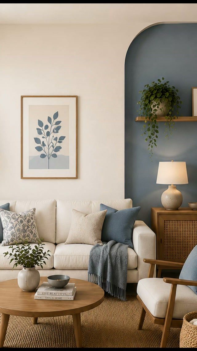
Two colors that sit close together read as one calm room, and that is why I pick a neutral for the big wall and save the stronger shade for a single feature.
A blue arch against white shows the idea: the bold color lands only where you want the eye to go.
The maker of this piece wrote about 7 pairings that work with different furniture tones and decor styles, so a shortlist of safe pairs is easy to build. Test 2 sample swatches on the wall for a day before buying gallons.
An arch takes more taping and patience than a plain block, so keep the first attempt to one wall.
2. Horizontal Half-Painted Walls
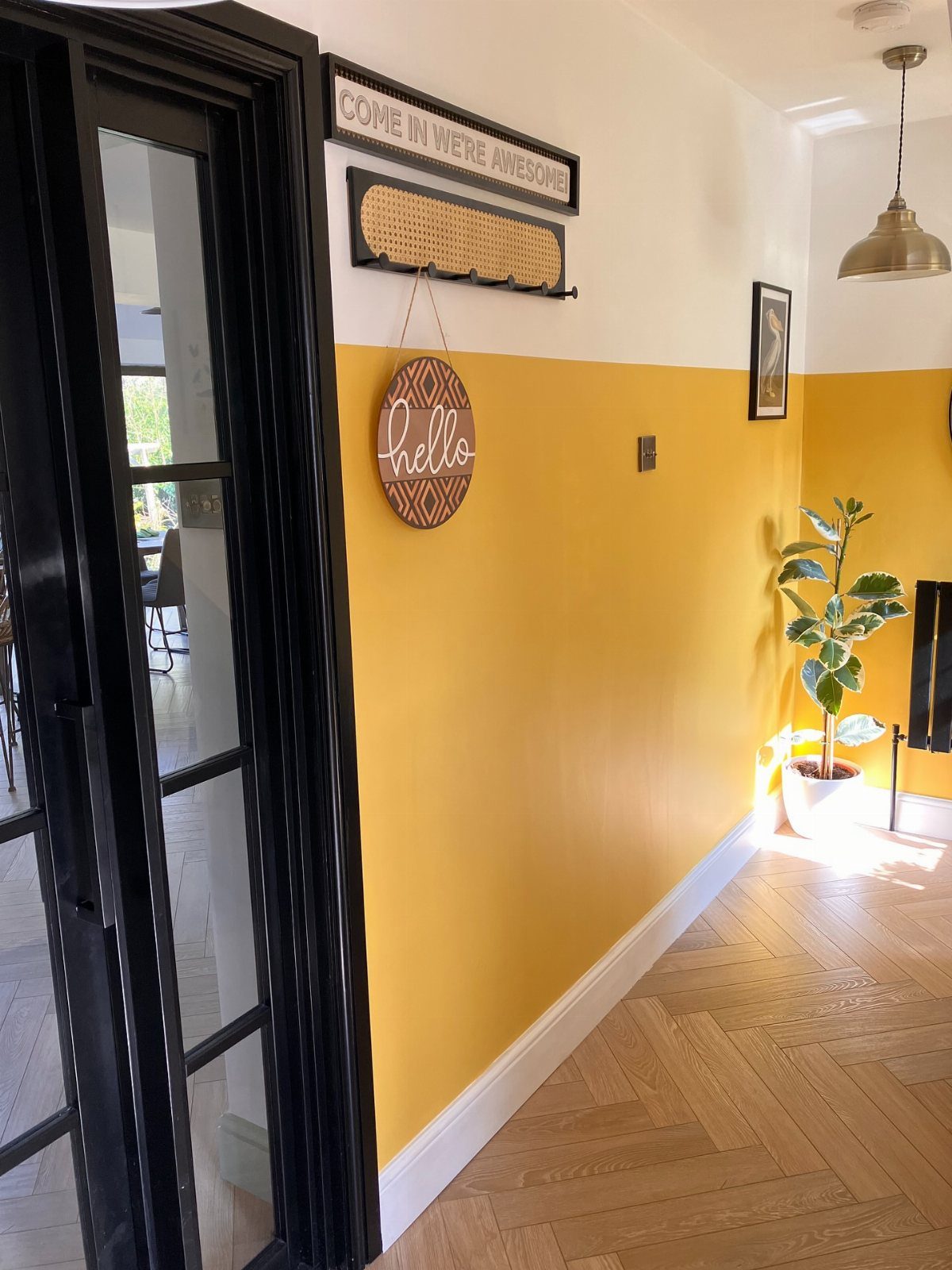
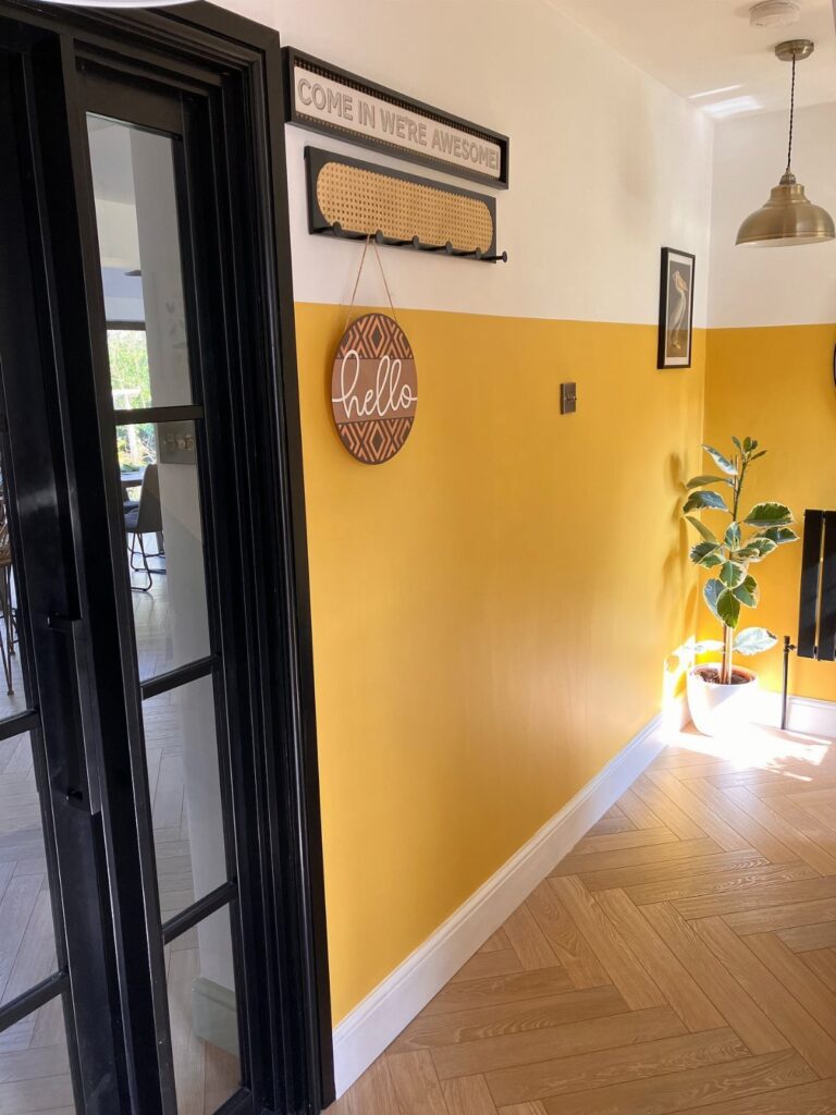
A line at the halfway mark is the oldest two-tone move, and in a narrow hallway I find it works better than one flat color.
Paint the lower half the darker or brighter shade and keep the top light so the space stays open.
Tape is the whole job: mark the line with a level, press the edge down firmly, and pull the tape while the top coat is still slightly wet.
One weekend covers a hallway, and the cost is a quart or two of paint plus tape.
3. Painted Wainscoting with Contrasting Wall
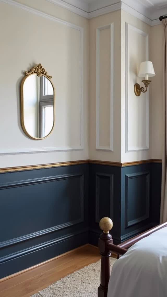
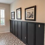
Dark navy below and a soft cream above give a bedroom the look of old paneled walls, and the paint does most of the work.
Navy below the rail hides scuffs from chair backs and sofa arms, and the dark band gives the room a grounded base.
Use a semi-gloss or satin on the wainscoting so it wipes clean, and a flat or matte finish above.
If the molding is already there, this is a one-weekend project with a brush and a small roller. Add trim only if you are comfortable with cutting and caulking.
4. Diagonal Geometric Two-Tone Wall
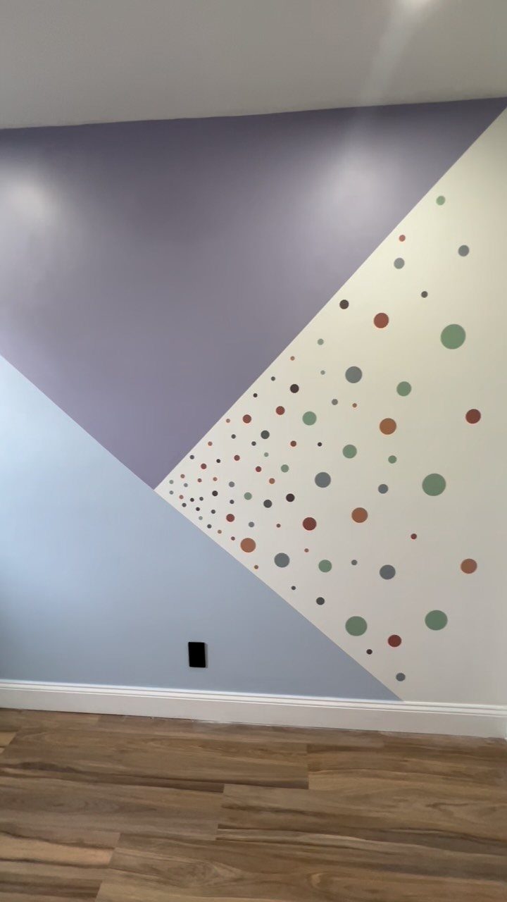
A diagonal split is the boldest option here, and I would only try it with painter’s tape and a long level or straightedge.
Purple and light blue meet along a slanted line, with a row of colorful dots softening the seam.
Mark the angle lightly in pencil from corner to corner, tape just outside the line, and seal the tape edge with a thin coat of the base color before the second shade.
Paint the dots last with a sponge brush or a round stencil. It suits a playroom or a teen’s room better than a living room.
5. Scalloped Border Two Tone Wall
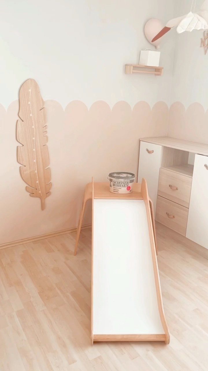
Scallops turn a plain two-color wall into something playful, and a peach border against white suits a child’s room well.
Cut one scallop template from cardboard, trace it along a level pencil line, and fill the curves with a small angled brush.
Tape does not follow curves well, so I paint the edge freehand and go over it with the lower color.
Plan on an afternoon for the tracing alone. In a kid’s room, pick washable paint, since the bottom third of the wall takes the most abuse.
Choosing the Right Height
A line about one-third to two-fifths of the way up the wall, roughly 36–42 inches, gives the traditional chair-rail look and feels balanced.
Let the room’s own lines guide you. Window sill height, door openings, cabinets and the height of any artwork all make good reference points, and the border should relate to at least one of them.
In a room with a low ceiling, I’d drop the line to window-sill height or lower, because a higher one makes the walls feel squeezed.
With 10-foot ceilings, like a loft, a line at 60 inches gives the wall more drama and the room can carry it.
Before you commit, tape a line at a few heights and look at each for a day.
Avoiding Common Mistakes
The step most people skip is sealing the tape.
Brushing a thin coat of the base color along the tape edge fills any gaps under the tape, so the second color has nothing to bleed into. Give it about 30 minutes to dry.
Let the base coat cure overnight before taping.
Two thin coats of the second color cover better than one heavy coat, and they are far less likely to run or peel.
While the paint is still damp, peel the tape back over itself at roughly 45° so the edge stays crisp. If a little paint creeps under the tape, a small artist’s brush and a steady hand will fix it.
Room-Specific Recommendations
Use color placement to fix a room’s proportions.
For a low ceiling, go light on top, ceiling included, with a darker bottom; the eye drifts upward toward brightness. For a cavernous room, reverse it: dark on top and the ceiling pulls the room down to a cozier scale.
In a narrow hallway, light paint on the long side walls and a darker shade on the end walls pushes the ends back and makes the hall feel wider.
A towering wall looks shorter with a dark band across the top 20 percent.
In a dining room, a darker lower section grounds the table and chairs.
In a shared bedroom, give each child one of the two colors.