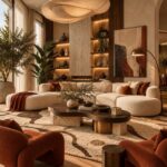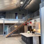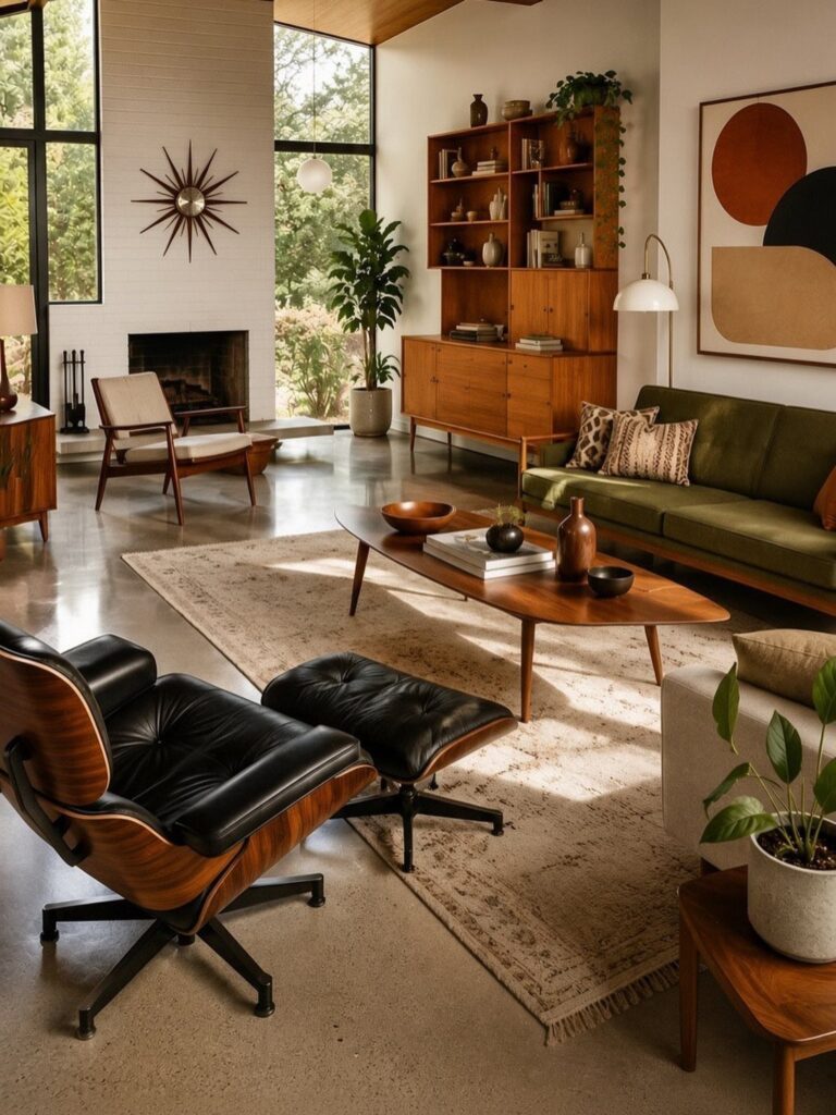
A paper lantern or a floor lamp with a planter sits at one end of this list, and wood-paneled walls or a green tile backsplash sits at the other.
What decides your pick is whether you own the walls: renters can copy the look with a lounge chair, a floor lamp or vintage accessories, while owners can take on wood paneling, tile and stone.
Either way, the post keeps coming back to bold accent colors and natural materials like wood and glass.
1. Eames Lounge Chair
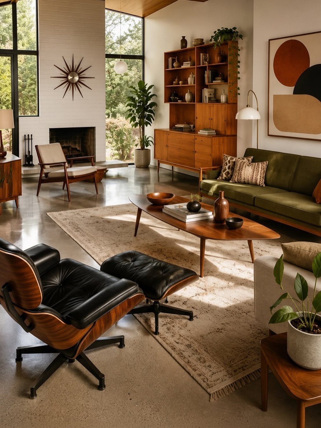
Black leather against warm wood is a pairing I would copy.
Give the chair a clear corner and a side table within reach. Keep the sofa a muted color so the chair stays the focal point.
2. Sculptural Forms
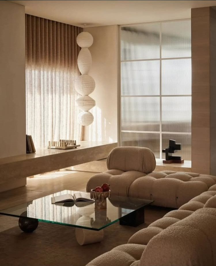
Keeping the palette neutral lets the shapes read as the decoration.
On a budget, pick one sculptural piece instead of three. A single oversized globe pendant over a plain sofa gets you most of the effect, and swapping a light fixture is a weekend job.
3. Sputnik Chandeliers
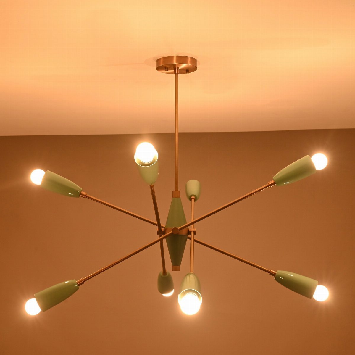
The shade color is what keeps it from feeling like a generic brass fixture.
Hang it against a plain ceiling and a quiet wall, as here, so the radiating arms are the only busy thing in view. Bulbs sit exposed, so choose a warm tone you like looking at directly.
4. Clean Lines
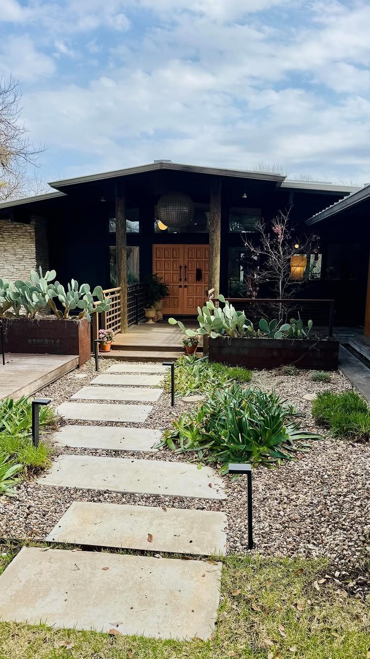
Flat rooflines, rectangular pavers and a plain wooden door: this exterior proves clean lines can be built from very few parts. Each element is a simple shape repeated.
For a rental or starter home, the cheapest copy is the entry path.
5. Functional Spaces
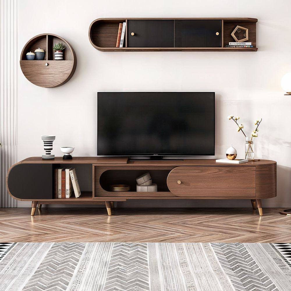
A low wooden TV stand with one round and one rectangular shelf above it shows how a media wall can stay useful and still look designed. Mixing the 2 shapes adds interest without clutter.
Mount shelves at a height you can actually reach, and use them for what you pick up daily. A patterned rug underneath keeps the arrangement from feeling stiff.
6. Natural Materials
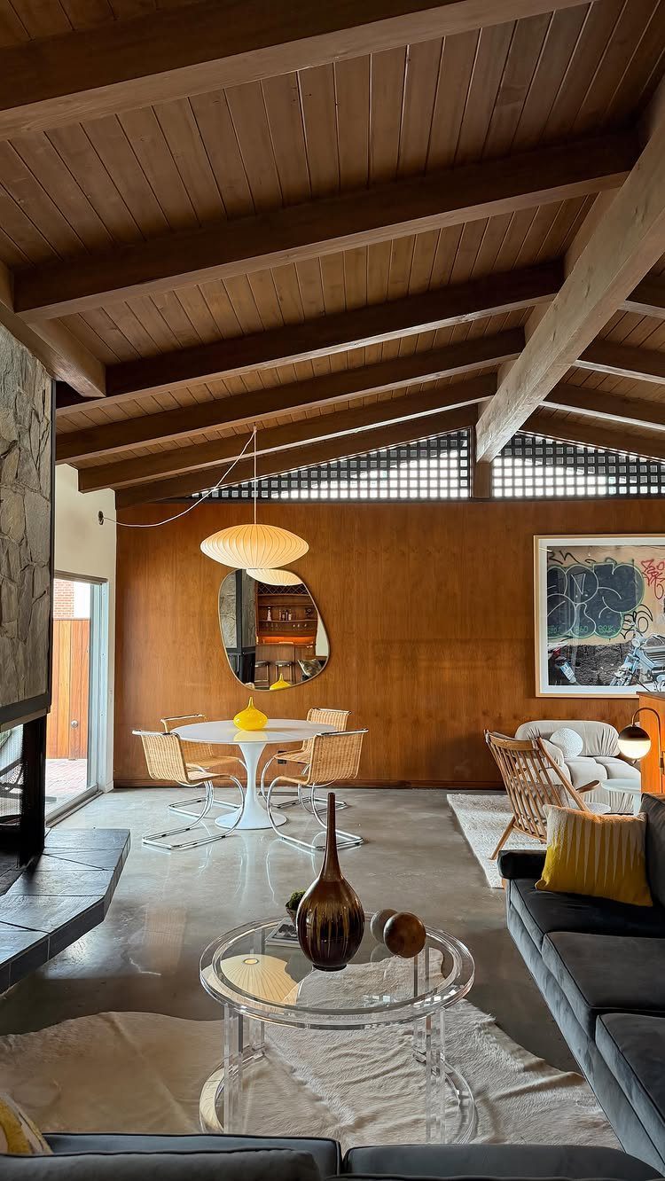
Wood overhead, wood on the walls, wicker at the table: this room leans on natural material in 3 different textures, and the white tulip table and clear acrylic coffee table keep it from getting heavy.
That balance is what I would copy. If you cannot add beams, wicker chairs are the easiest way in, and a few pale or clear pieces will stop the wood from swallowing the room.
7. Bold Accent Colors
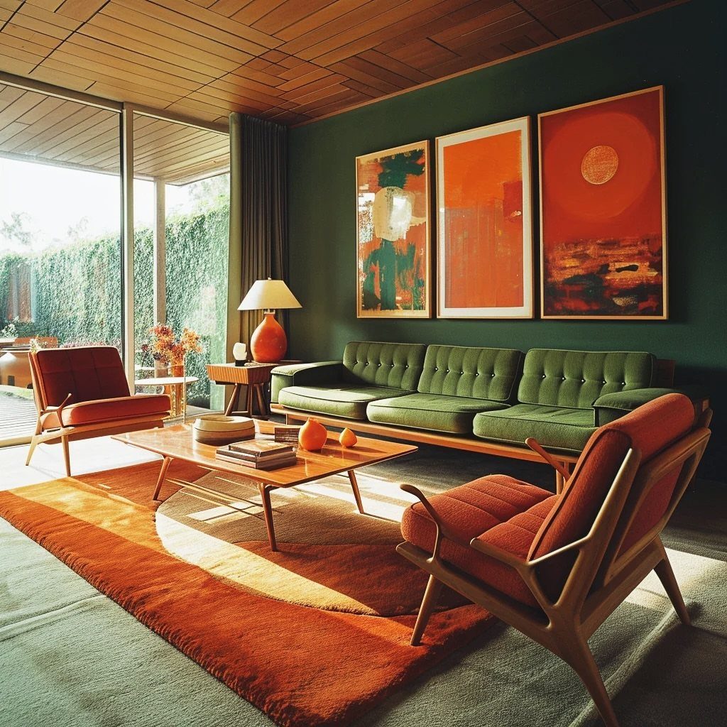
Dark green walls make orange look louder than it would on white, and that contrast is why this room works. The green sofa sits close to the wall color, so the orange chairs, rug and art carry the attention.
Pick one accent color and repeat it three times at different sizes. A rug is the priciest piece, so if money is tight, start with the art and a pillow.
8. Open Layouts with Large Windows
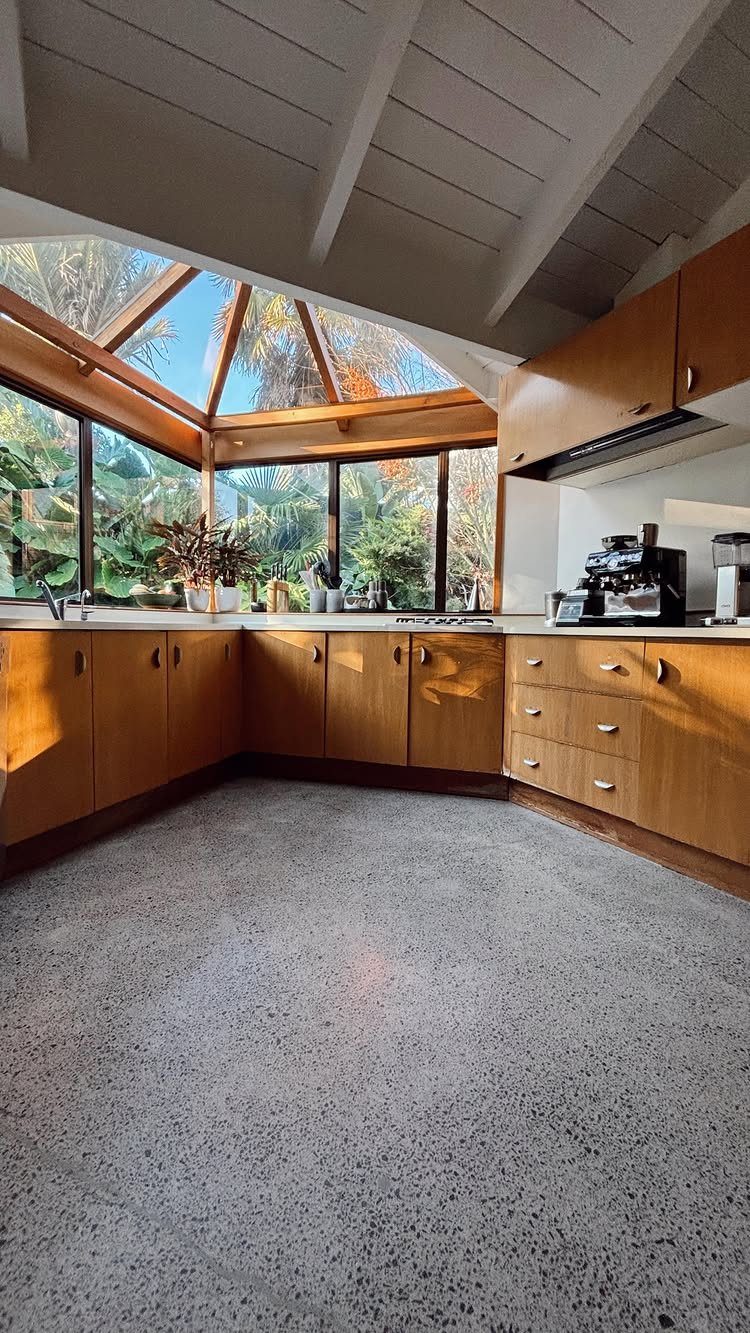
A sloped ceiling and tall glass turn a kitchen into a room that seems to open onto the trees outside. Wood cabinets and a terrazzo floor keep the inside calm, so the view gets the attention.
Renters can borrow the effect without touching the structure. Keep the window bare or hang sheer curtains, and clear everything off the sill.
9. Mixed Materials
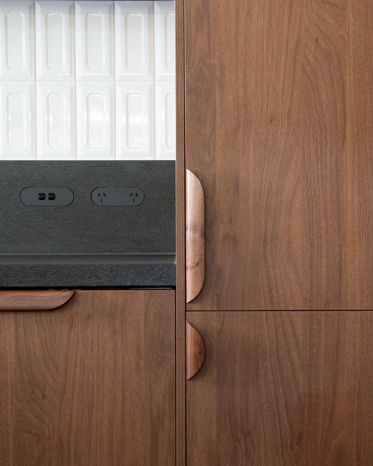
Walnut cabinets, a dark stone counter and white vertical tile give three different surfaces in one small stretch of kitchen. The curved handles add a fourth shape without adding another material.
I would stop at 3 materials. Let the wood be the warm one, the stone the heavy one, and the tile the light one, so none of them competes.
10. Geometric Patterns in Textiles
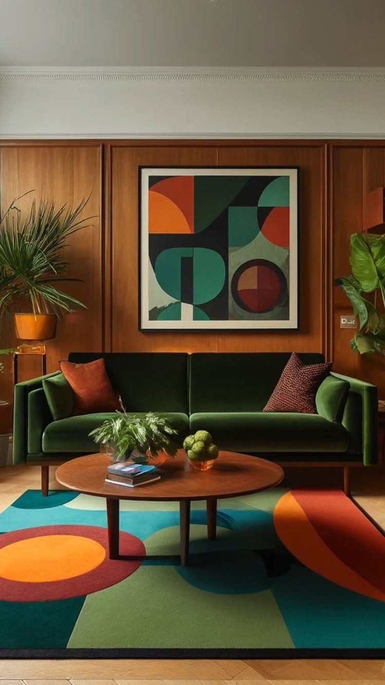
A bold geometric rug does the work of a painting on the floor.
Geometric textiles work best against calm, warm surfaces like wood paneling or a solid velvet sofa, and a round coffee table helps by breaking up all those straight lines and angles.
Put the pattern in one large textile, not several. If you want it to look planned, echo its colors in a piece of art, as this room does.
11. The Dining Room
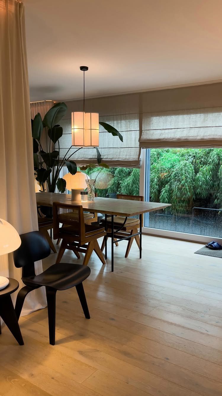
A mid-century dining room starts with function: a solid wooden table, chairs you can sit in for an hour, and one pendant hung over the middle. Nothing else needs to be there.
The creator of this room says it has rainy window views, and I like that the table is left bare to let them show. Keep the center clear except for meals.
12. The Bedroom
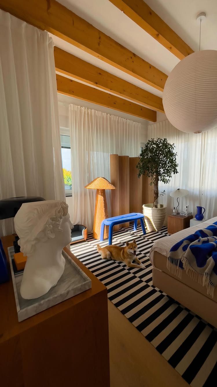
This bedroom is calm without being bare. Wood beams, a striped rug, a blue bench and a big paper lantern give the eye several things to rest on, which is where it parts ways with Scandinavian minimalism.
To copy it, add a bench at the foot of the bed and a paper lantern shade. Both are cheap, and the lantern is a quick swap.
13. Biophilia
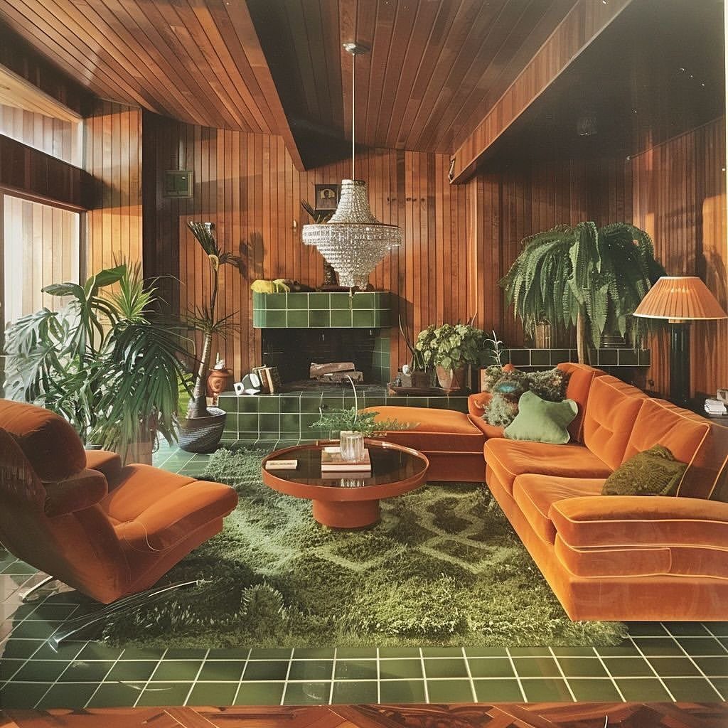
Several large plants against wood paneling, orange velvet and a green shag rug make a room feel grown rather than decorated, so pair plants with warm wood and saturated textiles.
Foliage reads as another color block here, so it holds its own next to the loud furniture.
Start with one big floor plant in a corner and leave the rest of the room as is. Group a second and third nearby at different heights, and a plain planter on a low stand keeps the look in period.
14. Layered Textures
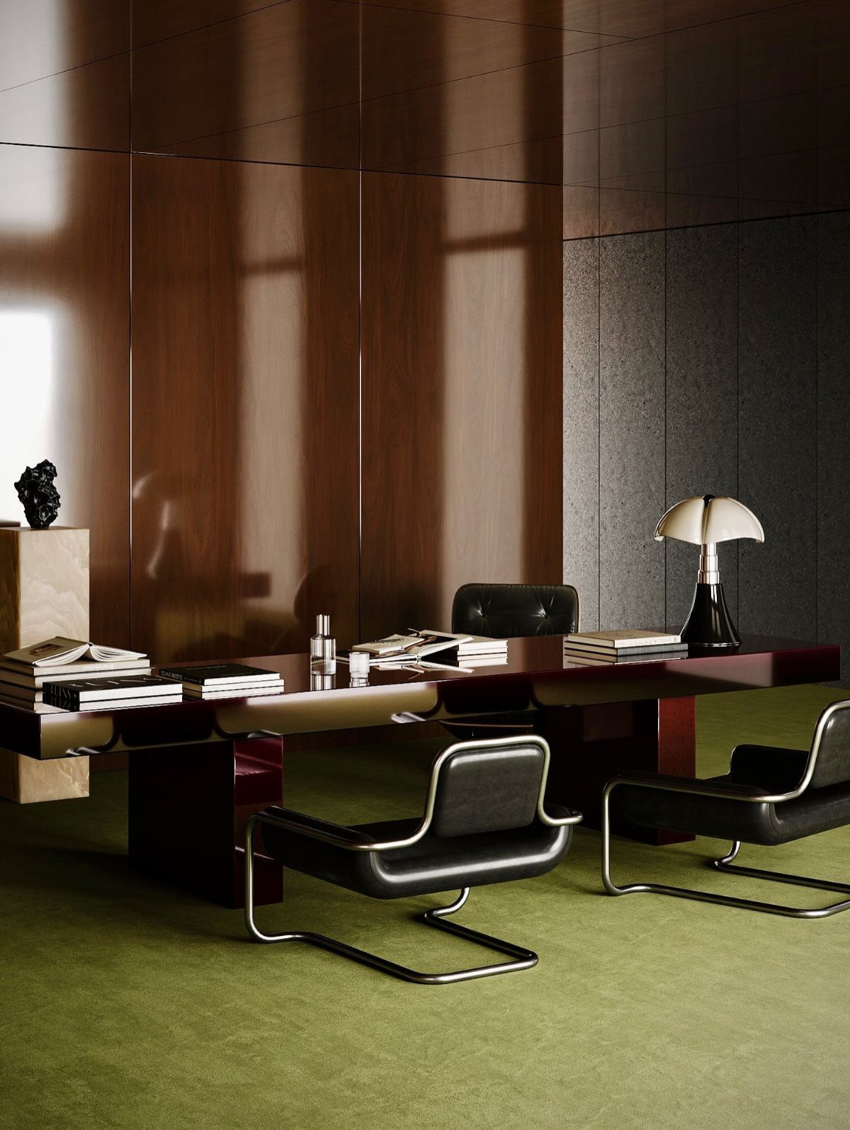
Smooth leather, grained wood and a green carpet give this office 3 different surfaces to look at, and none of them needs a pattern to hold interest.
The dark desk and black chairs stay heavy, so the carpet is where the room gets its softness.
I would copy that split: hard, polished pieces on top, one soft layer underfoot. A rug under the desk is the cheapest way to add it.
15. A Single Large Piece of Art
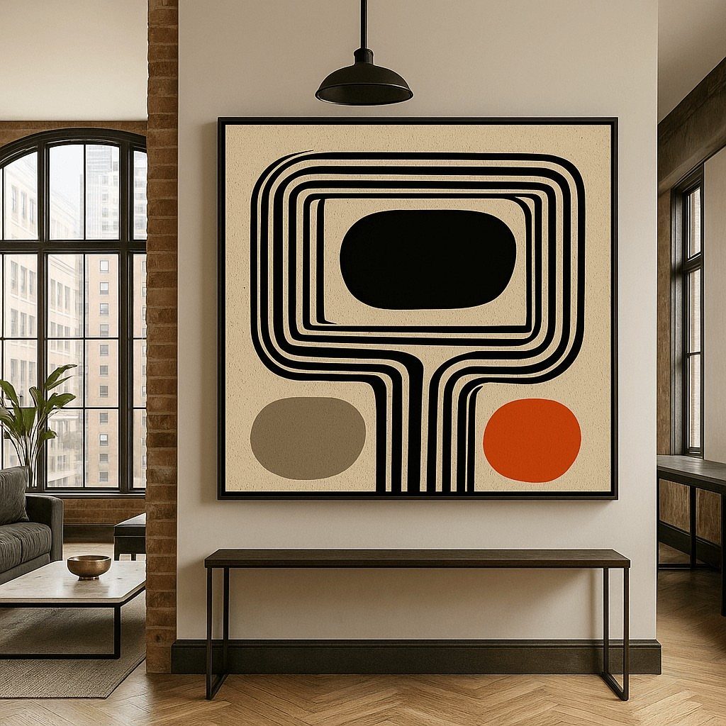
The brick and herringbone floor are busy surfaces, and the art is large enough to compete with them.
Choose a piece that is wider than the console beneath it, or close to it, and pull a color from the painting into one small object on the table. A large print or canvas costs much less than a sofa.
16. Use of Glass
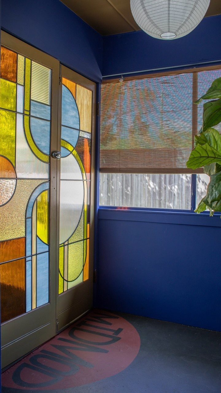
Stained glass in a door lets light through while keeping a room private, and the geometric panes suit the era.
Against a deep blue wall, glass becomes the brightest thing in the room, so hang or stand it there on purpose.
Vintage green glass with natural bubbles and texture looks right for the era, and opalescent glass gives privacy while still letting light through. Renters can try window film in a similar pattern instead of replacing a door.
17. Stone Elements in a Kitchen
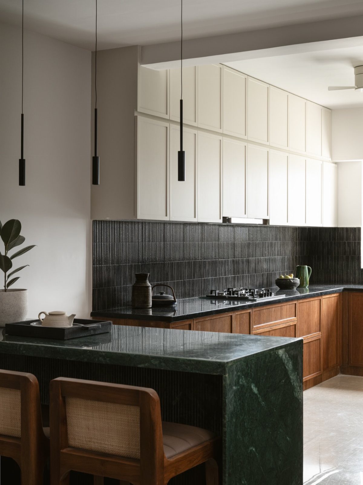
A dark green marble island makes a kitchen feel solid and a little dramatic, and the wood cabinets and white uppers keep it from turning heavy. Black tile and black pendants echo the stone’s depth.
Stone is the expensive part, so I would use it on one surface only, the island. Repeat the dark tone in small hardware or lighting, and let wood and white do the rest.
18. Vintage Accessories
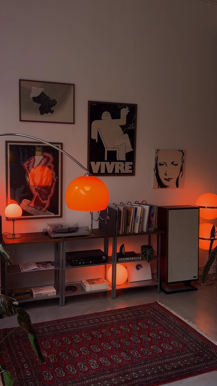
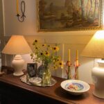
Vintage pieces give a room the worn, collected look that reproduction furniture lacks.
Group them on one shelf, as here, so they read as a collection, and keep the rest of the room simple.
19. Low-Profile Furniture
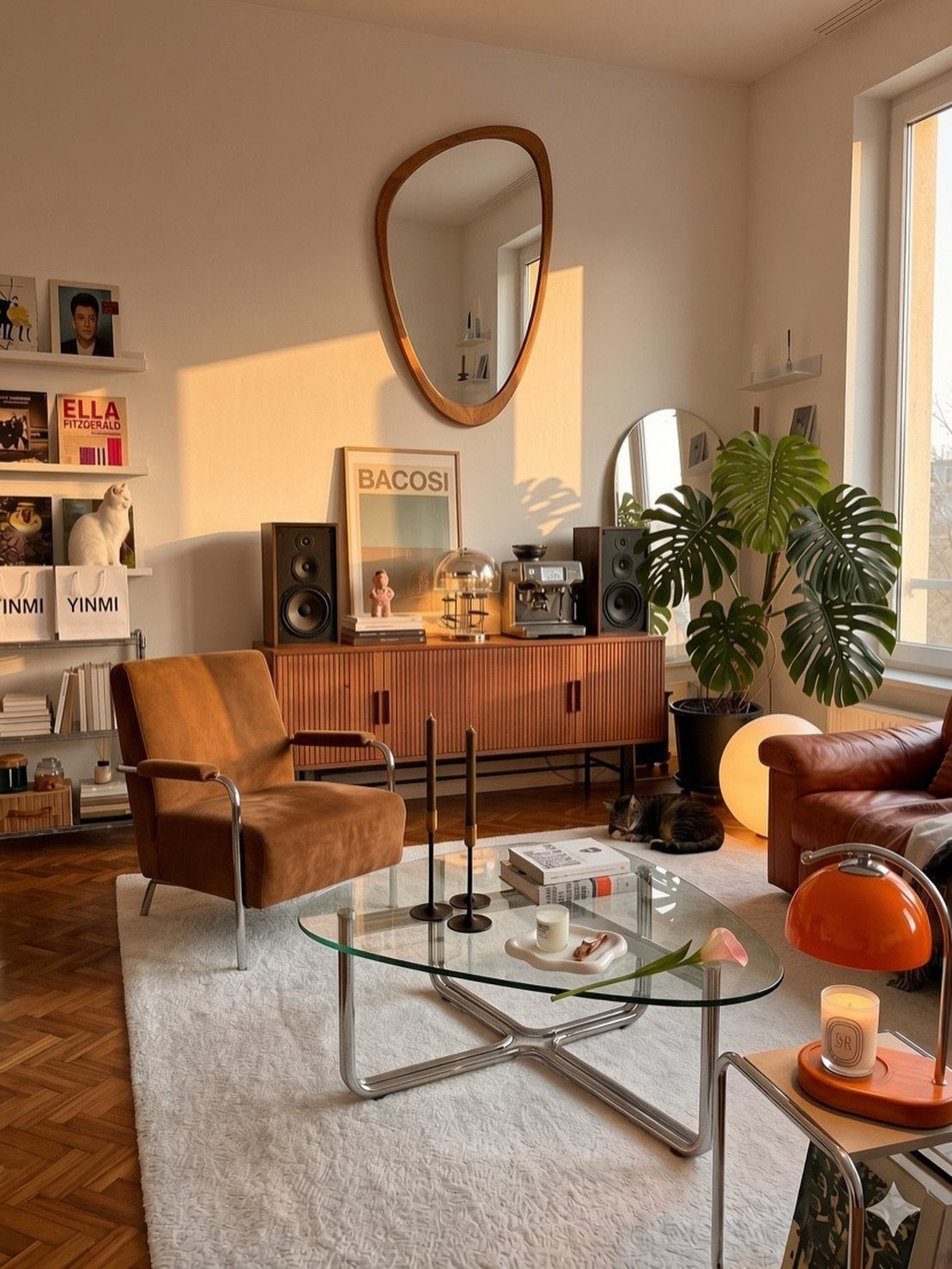
Keep the armchair, the glass coffee table and the wooden sideboard all close to the floor, since low pieces make a room feel wider and the walls look taller.
Glass keeps the center light, which matters when the other pieces are dark brown.
Leave breathing room around each piece instead of pushing everything against the wall. A pale rug under the group keeps the dark furniture from sinking into the floor.
20. Paper Lantern Lighting
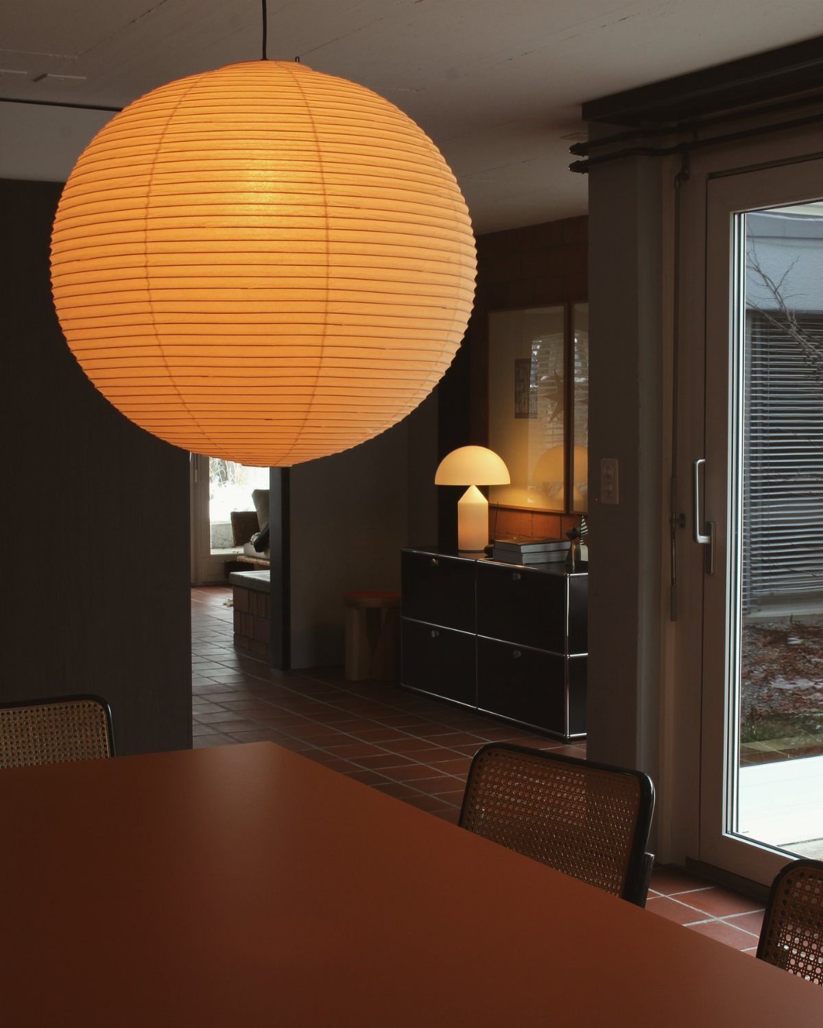
One big, glowing paper sphere over the table does the lighting and the decorating in a single move. Paper diffuses the bulb into a soft, even glow, which flatters a plain wooden table and a black sideboard.
Hang it low enough to sit within the table setting, and keep the rest of the room quiet so the sphere stays the star. It is also an easy fixture swap for a weekend.
21. Wood-Paneled Walls
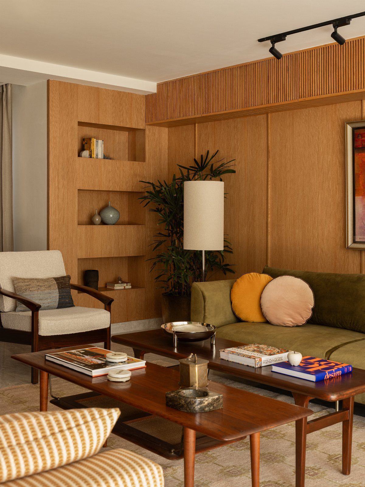
Wood on the walls turns a living room into a warm box, and built-in shelves set into the paneling look original to the house rather than like an add-on. The green sofa pops against all that wood without fighting it.
I would pick one color for the sofa and keep the other pieces in wood or cream, as here. Real paneling is a bigger project, so renters might start with the shelves and the wood coffee tables.
22. Green Tile Kitchen Backsplash
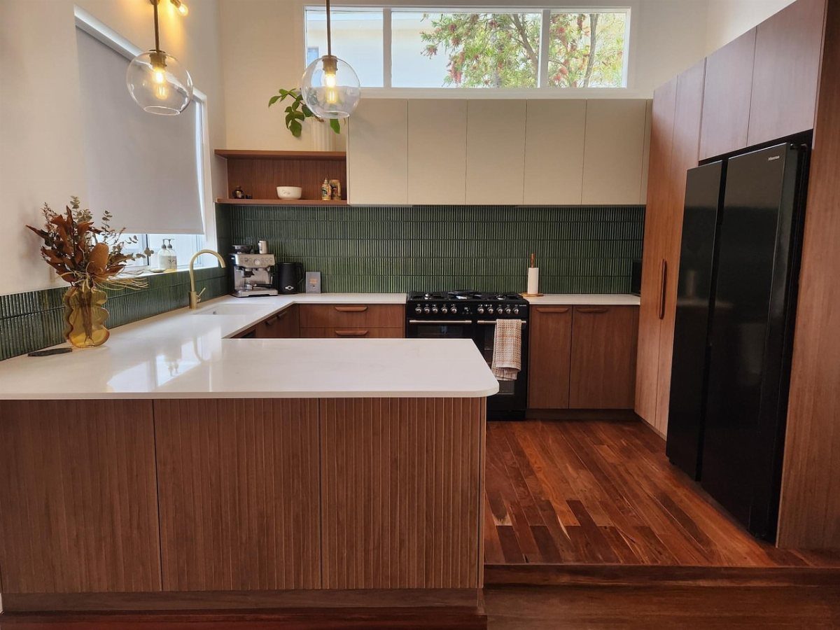
Green tile laid vertically stretches a short backsplash upward and gives plain flat-panel wood cabinets something to play against. With a white countertop and 2 globe pendants, the color is the only loud thing in the kitchen.
That restraint is what I would copy. A backsplash covers a small stretch of wall, so tile costs a fraction of what new cabinets do, and it is a good place to spend on color.
23. Retro Home Office Setup
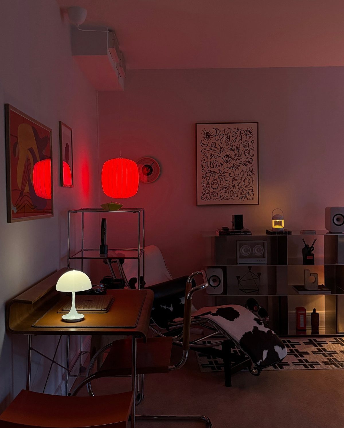
A mid-century desk, a cowhide-patterned chair and chrome shelving make a workspace that looks like a room rather than a corner.
The mushroom lamp gives the desk its own pool of light, while the red pendant adds the one bold color.
Start with the desk and a good lamp. Keep the walls white and let art hang where you will see it from your chair.
24. Conical Floor Lamp with Planter
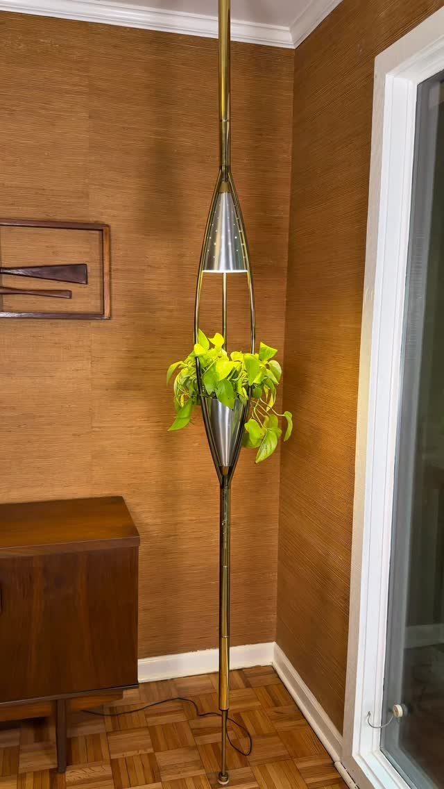
A conical gold floor lamp with a plant growing from its center covers lighting and greenery in one slim piece. Beside a wood cabinet and a brown textured wall, the gold finish reads as warm rather than flashy.
Choose a plant that suits the light the lamp gives off, and keep the cabinet top mostly clear so the lamp stands out. Vintage ones turn up secondhand, which is where I would look first.
Maintaining Balance
Wood tone is where a mid-century room most often goes off.
A gray-brown oak or ash next to a warm walnut or teak sideboard can make a room feel off, and the undertone is usually why, so hold the sample up to what you already own first.
Pick one undertone, then change how dark or light each piece is rather than whether it runs warm or cool. A pale warm wood next to a dark warm wood reads as one family, and the room still has range.
Bare floor and open wall do real work in the design, so leave some of both alone.
Avoiding Common Mistakes
The clean lines fool people into thinking this look is easy, and that is where most rooms go wrong.
Copying the surface (a tapered leg here, an orange pillow there) without the structure behind it gives you a room that feels off and can’t say why.
Overcrowding is the most common slip. Simplicity carries this style, so buy only the pieces that earn their spot and leave clear space around each one.
Before you add anything, ask what the piece does in the room. If the answer is nothing, leave it out.
Mismatched wood tones and cramped layouts cause the same problem: too many things competing. Fix those two and most of the rest sorts itself out.
Frequently Asked Questions
What defines the mid-century modern design style?
Clean lines, functional simplicity and very little decoration define it.
Pieces earn their place by what they do in the room, and natural materials like wood, leather and stone carry most of the look. The style grew out of the mid-20th century, roughly the 1940s to 1960s.
How can I incorporate a mid-century modern style in a contemporary space?
Start with one or two pieces: a low wooden sideboard, a sculptural pendant or a bold geometric rug.
Keep the rest of the room calm and leave open floor and wall around each piece. A light fixture goes up in an afternoon, and a large print runs a fraction of what a new sofa costs.
Is marble mid-century modern?
Stone fits the style, and a dark green marble island is a good example.
Budget one surface for stone and stop there. Pick up that dark tone in a few small pieces like cabinet pulls or a pendant, then balance the room with wood and white.
What is the 3-5-7 rule for decorating?
I can’t point to a version of this rule in mid-century design, so I won’t guess at it.
The closest rule I would give is to pick one accent color and repeat it 3 times at different sizes, such as art, a pillow and a rug. That keeps the color looking planned.