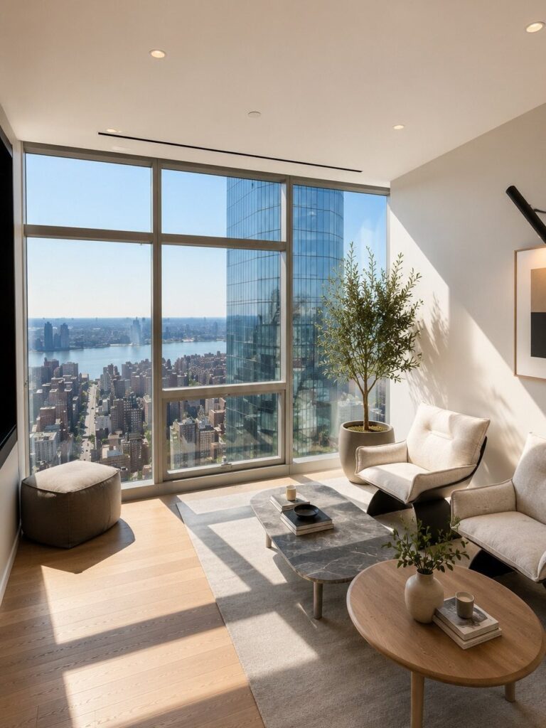
The ideas here run from curvy sofas and vintage finds to glass walls and industrial loft touches, and what decides which one fits is how much space you have and whether you own or rent.
1. Curvy, Rounded Shaped Furniture
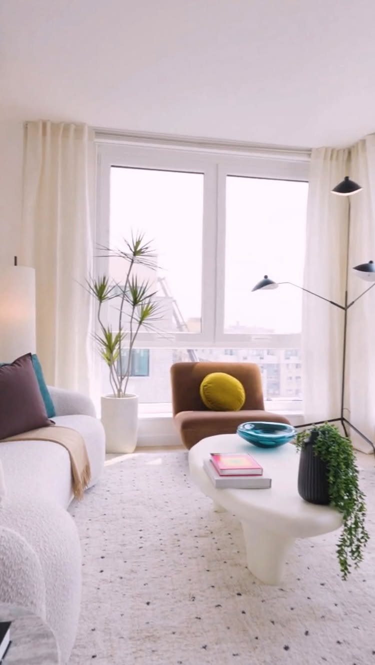
A sofa with a curved back and a coffee table with soft, organic edges do something a rectangle can’t: they remove the corners you bump in a small room.
In a New York apartment, that matters more than any paint color.
I’d start with one piece, not three.
The white curved sofa here carries the room alone, and the brown armchair keeps it from going flat. Pick a single curve to lead, then let a tall plant and a slim black floor lamp stay simple beside it.
2. Streamlined Furnishings with Natural Wood Tones
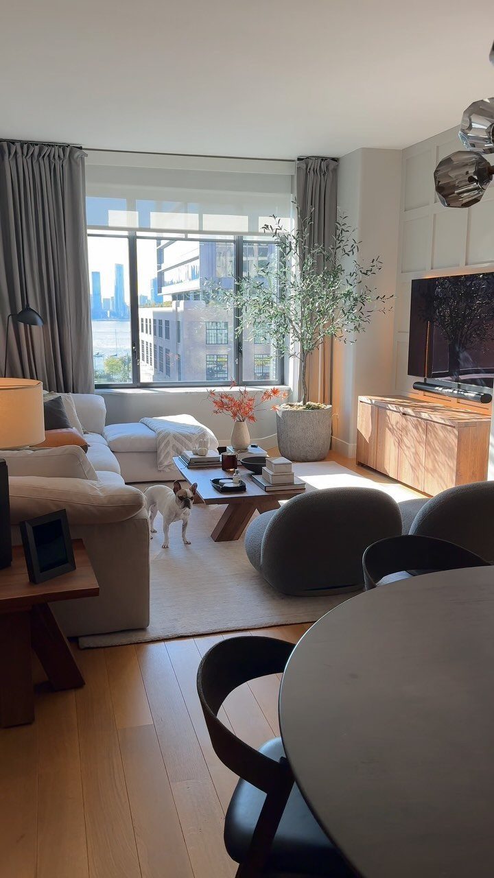
Light wood floors, a wood coffee table and a slim console: the whole look rests on keeping the lines clean and the wood warm. White upholstery gives that wood room to read.
For a small apartment, I like it because few pieces do the work. Choose a console with a narrow depth so it holds keys and a lamp without crowding the walkway.
Keep the wood tones close to each other. Three different shades in one room starts to look accidental, while one family of tones looks planned.
3. Open Layouts with Glass Walls
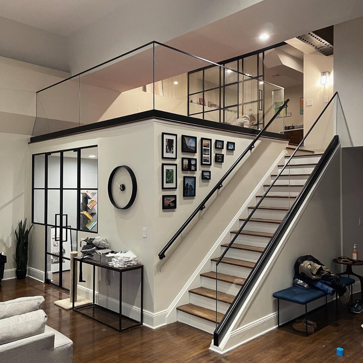
Black-framed glass walls let light travel through a loft while still marking where one zone ends and the next begins.
A wooden staircase with glass railings carries that openness upward, since a solid balustrade would block the sightline the glass walls worked to keep.
You probably can’t build glass walls in a rental, so borrow the effect instead. Keep furniture low, leave sight lines clear, and use a console table with a gallery wall above it to give the living area its own edge.
Black frames add a graphic outline, and wood softens it. I’d keep both.
4. Vintage Finds
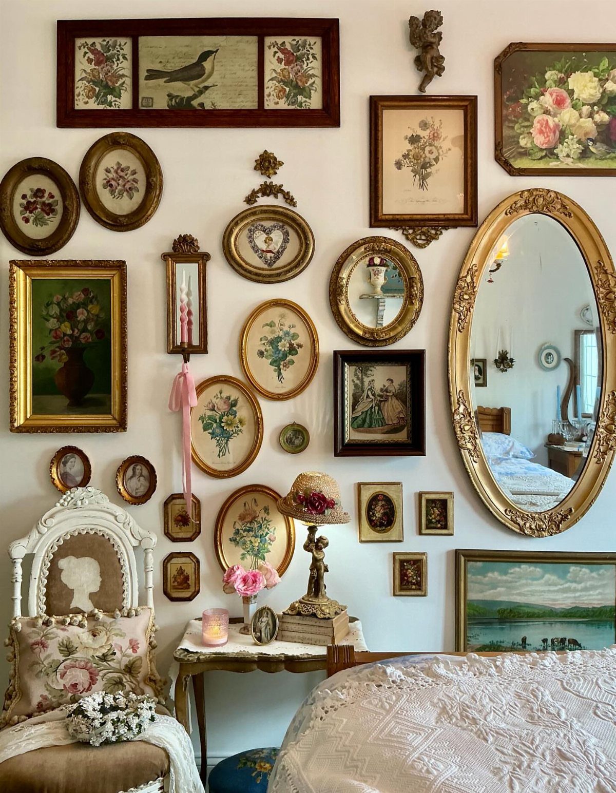
Mismatched frames feel deliberate when they share a color, and here the gold does that job.
Hang the largest piece first, the oval mirror, then fill in around it with the smaller frames. Lay everything on the floor before touching a nail.
One old chair is plenty; I’d resist adding more.
5. Bold Statement Lighting
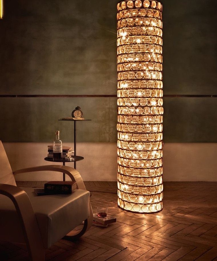
A tall glass bubble floor lamp gives a corner a glowing sculpture, and it needs no wall space or wiring, which makes it ideal for renters.
Dark green walls and herringbone floors give it a deep backdrop so the glass really stands out.
Place it beside a chair and a small side table with books, as here, so the light has a job as well as a look.
I’d pick one bold lamp and keep everything else around it quiet. 2 statement pieces compete.
6. Modern Sectional Living Room
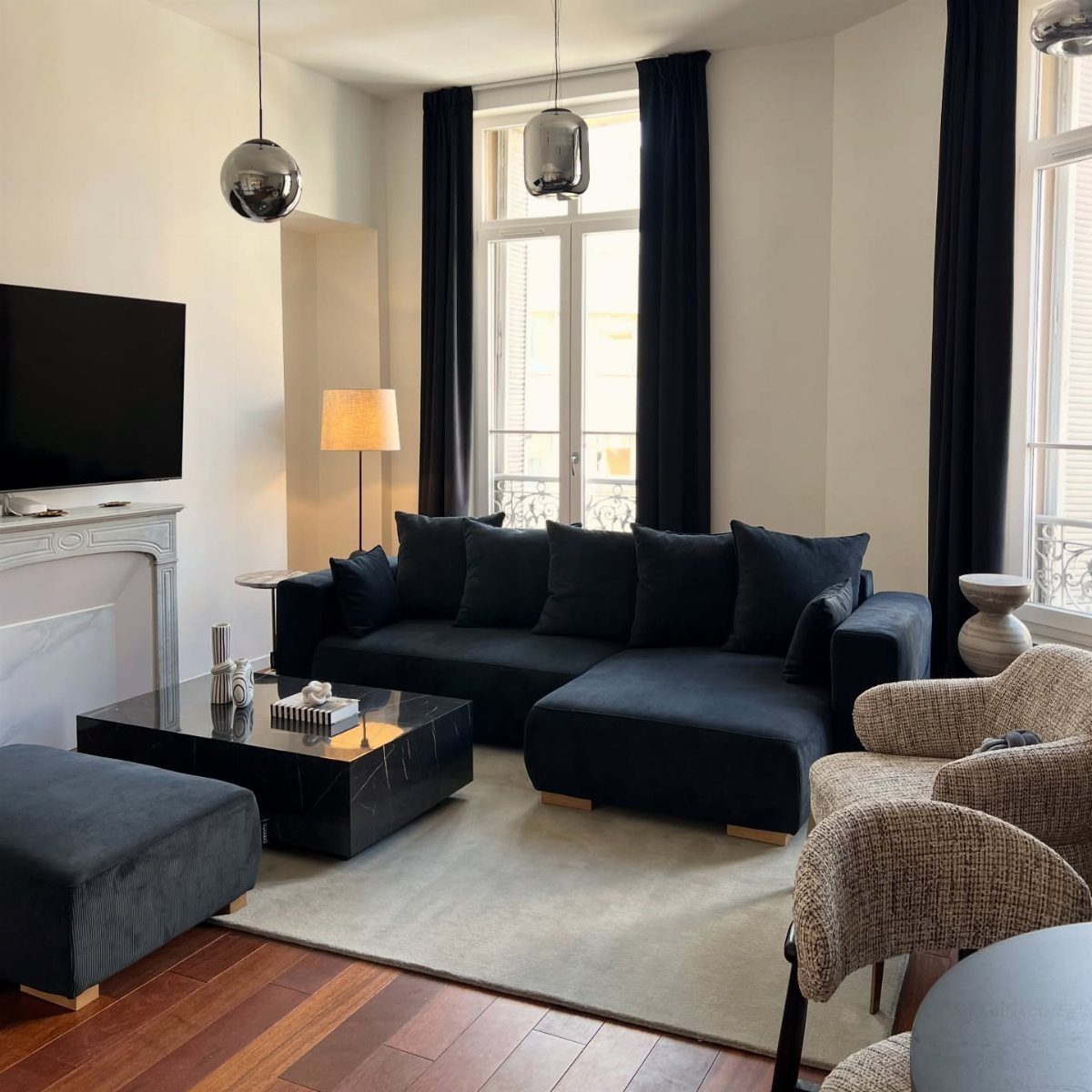
A navy sectional anchors a living room in a way a loose set of sofas can’t, since one big piece defines the seating zone at once. White walls and dark curtains keep the navy from feeling heavy.
Textured armchairs in beige soften the sectional’s solid color, and a black marble coffee table adds a sleek, polished contrast.
Mix textures, not colors.
Navy plus one neutral, such as warm white or soft gray, keeps the whole space calm. I’d choose a sectional only if the room can truly spare the floor space.
7. Industrial Loft Design
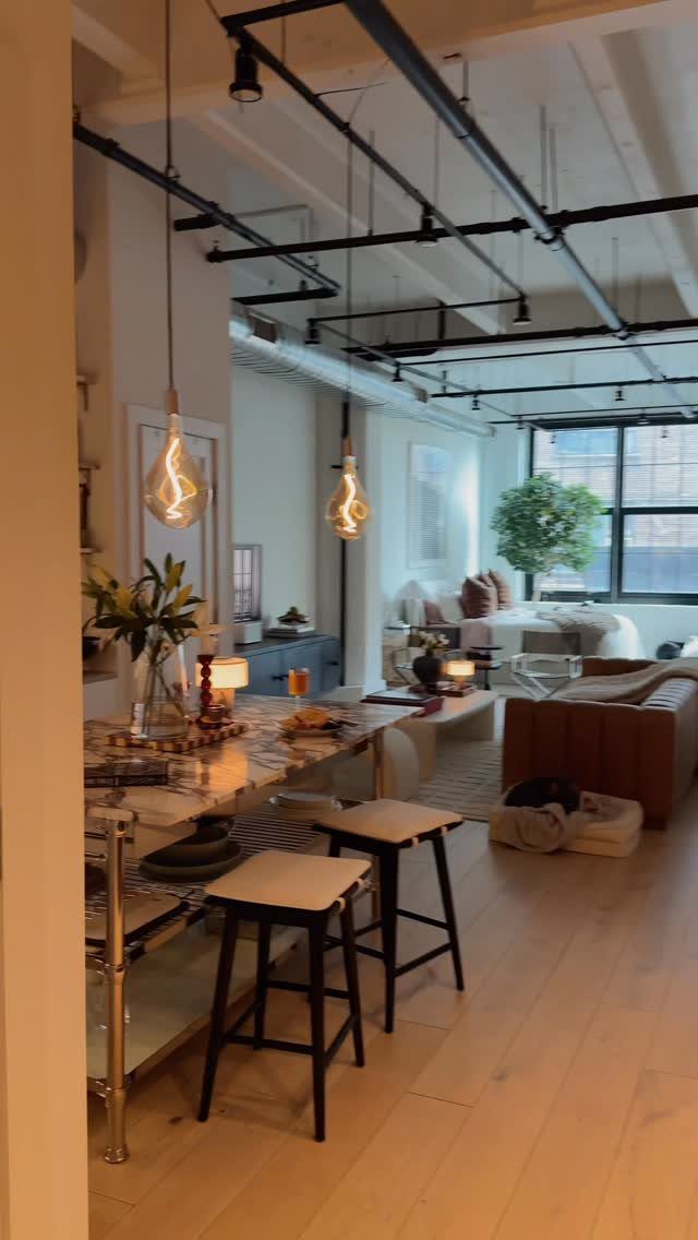
Exposed ceiling pipes and bare bulbs on long cords do the decorating before any furniture arrives, so the rest of the room can stay plain. A brown leather sofa and light wood floors keep that rawness from turning cold.
In a rental, you can’t open a ceiling, but you can hang Edison bulbs from a plug-in cord kit and let the sofa carry the weight. I’d pick leather in a worn, mid-brown shade over anything glossy.
Keep the table small, like the marble one with stools here, so the open floor stays open.
8. Skyline View Focal Point
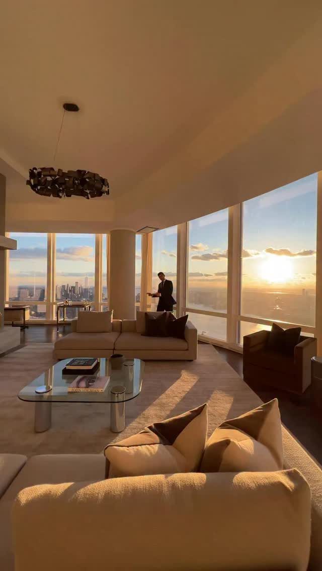
Floor-to-ceiling windows already hold the best thing in the room, so the furniture should face them and stay out of the way.
Set the seating so no one’s back is to the view, and keep pieces low. Sheer panels or bare glass are my pick, since heavy drapes block the one thing the window is there to give you.
A glass table lets the view carry through the room, so I’d choose it over solid wood, which cuts the sightline in half.
Maximizing Small Spaces
Sliding doors are the most useful trick I know for a room that has to do 2 jobs.
Closed, they make a guest space; open, the room goes back to being one. A renter can copy the idea with a floor-to-ceiling curtain on a tension rod, no drilling needed.
A pullout sofa earns its floor space only if the room also works as a study or lounge on the nights nobody is sleeping over.
A queen-size pullout, a desk and a bar cart can share one zone if each has a single home.
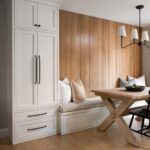
Storage works best when it looks like part of the room. Built-ins and a bench with space inside, finished in the same wood as the floor, read as architecture instead of clutter.
Before buying anything, tape the footprint on the floor and walk the path. A clear line from the door to the window makes a small room feel longer.
Lighting Importance
Plan light in layers: one overhead source, one or two lamps at eye level or lower, and something to light the task, such as a desk or the kitchen counter.
A single ceiling fixture flattens a room, and lamps give it depth after dark.
Check the bulbs before blaming the room.
Warm white, around 2700K, suits living areas and bedrooms, while a cooler 3000–4000K works at a desk or in a kitchen. Put the same color temperature throughout a room so the light doesn’t look patchy.
For daylight, keep the window clear. Pull curtains fully off the glass, and place a mirror across from the window to bounce light deeper into the room.
If the ceiling fixture is ugly and you rent, swap the shade or bulb and leave the wiring alone. Plug-in sconces and dimmer cords add control without touching the walls.
Personalization Tips
Start with what you already own and love: books, framed family photos, a travel souvenir, a piece of your own artwork. A room feels personal when it holds things you can explain.
Group items instead of scattering them. Three objects of different heights on a tray or shelf look planned, while one lonely item on every surface looks like clutter.
Art doesn’t have to be expensive. Prints, fabric, postcards and even a child’s drawing look good in a frame with a wide white mat.
Leave some empty space. A shelf that’s 70% full lets the things you chose stand out, and it gives you room to add the next find.