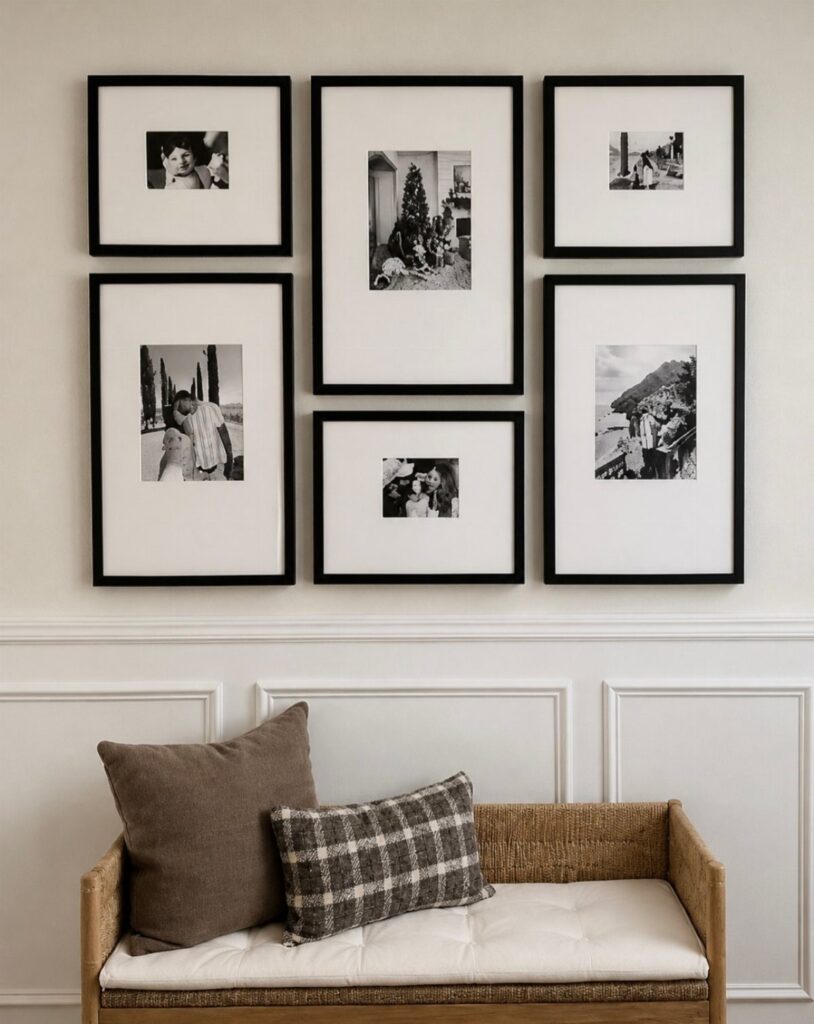
The wall you’re hanging on picks the layout before taste does: a couch or bed gives you a width to follow, a stairwell gives you a slope, a corner or bookshelf changes what fits, and a console table sets a center line.
The ideas run from unframed posters in a corner to matching frames in a grid where a level and tape measure matter more than anything else.
1. Pictures on Wall Above the Couch
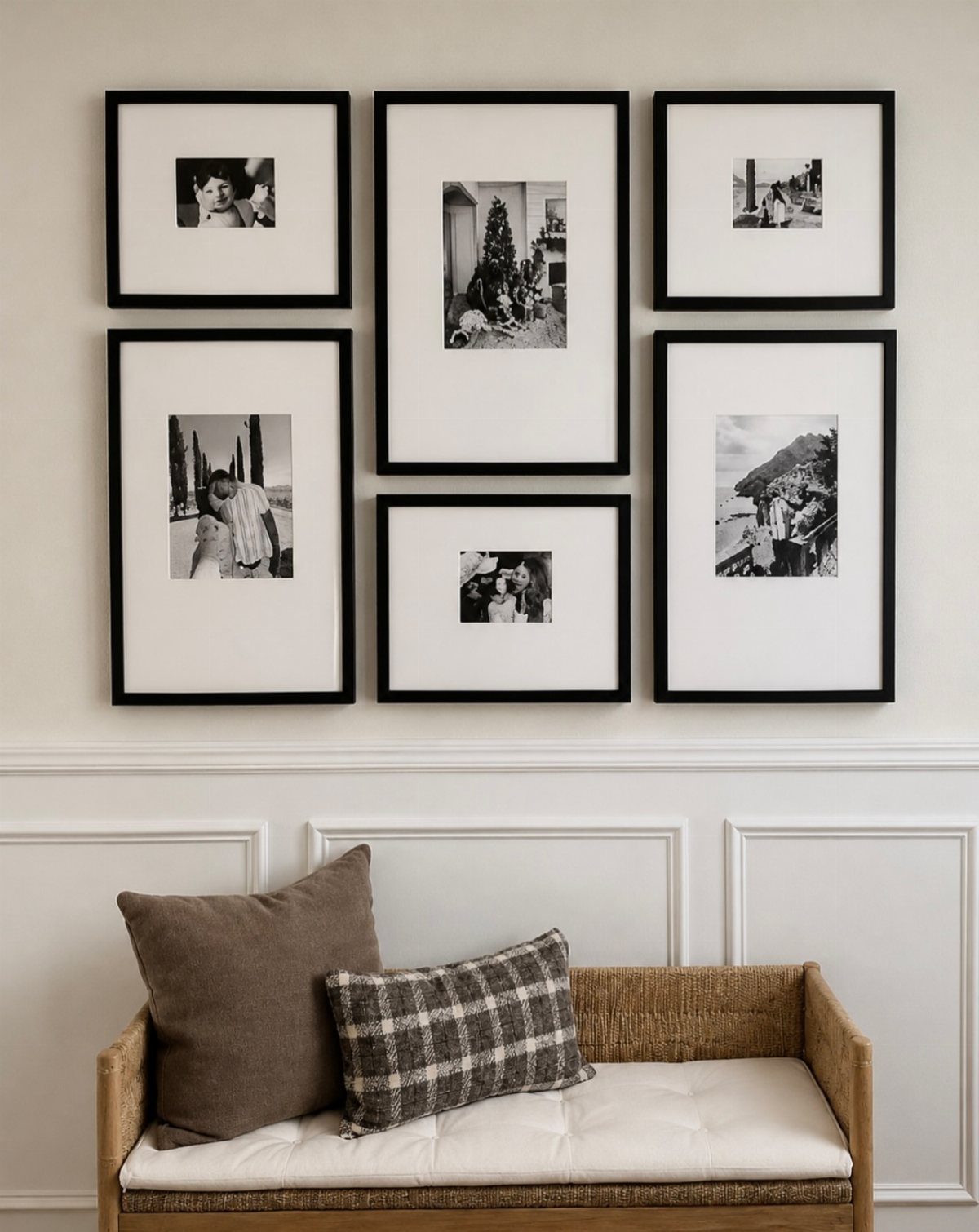
A couch wall already has a anchor, so the frames only need to follow its width. Keep the group a little narrower than the sofa, and hang the lowest frames above the cushions so the two read as one piece.
Six frames in one color, as here, keep the grouping calm against a textured couch. Paper templates taped to the wall let you test the spacing before you drive a single nail.
2. Pictures on Wall in a Specific Genre

Pick one subject and let it do the curating. Horses, landscapes, botanicals: a single theme makes mismatched paintings look chosen instead of collected.
That approach costs less than any other when building a wall on a budget, since thrift stores and flea markets reward a narrow search.
Stay inside one color family, earthy tones for a rustic room, and the frames can vary freely. I would rather see loosely related pieces in a clear theme than a few perfect ones with no thread.
3. Framed Art with Unique Items
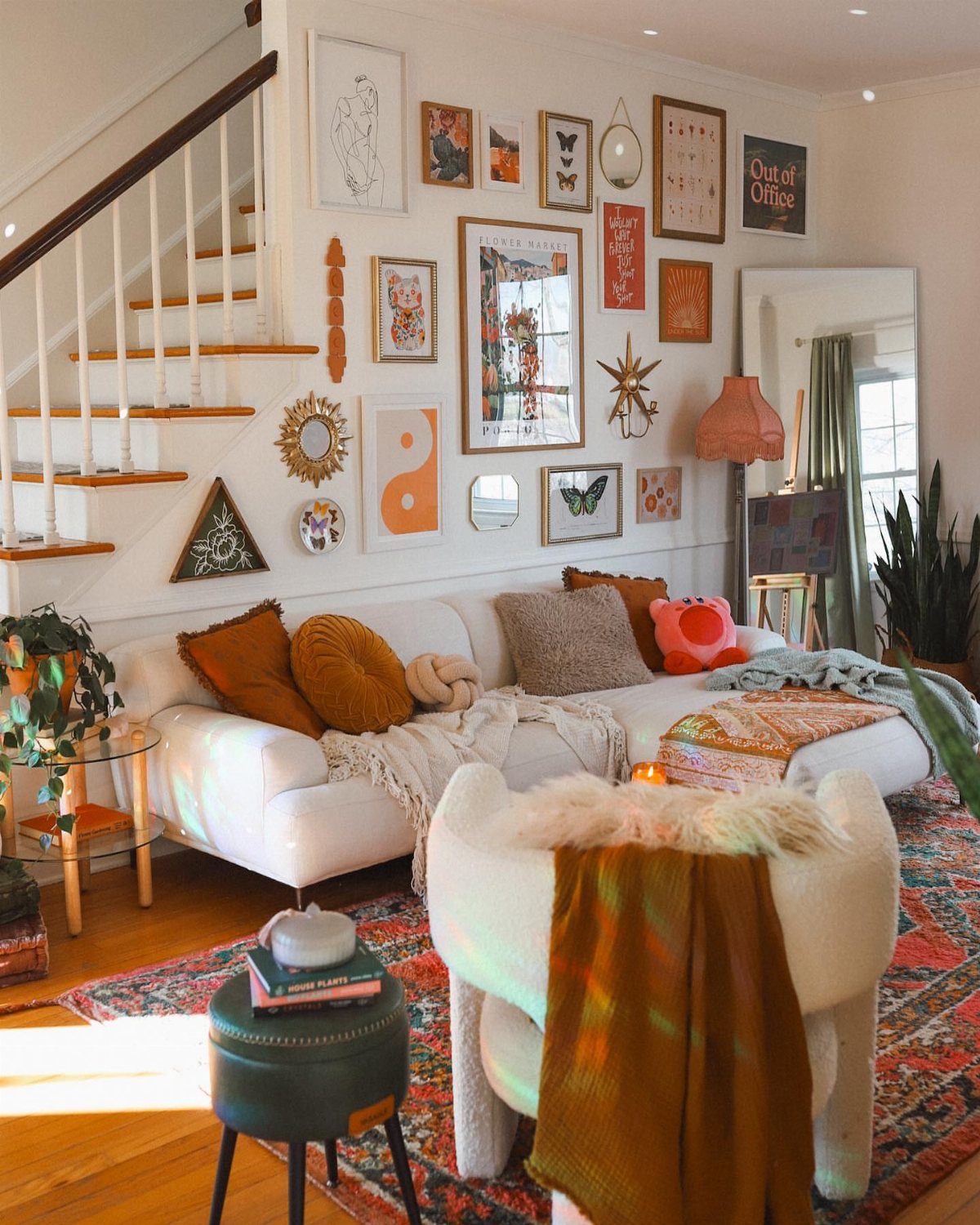
Not everything on a gallery wall has to be a print. A round mirror, a cheeky sign like "Out of Office," or any flat object with some character breaks up the rows of glass and paper.
Mix the objects in between the framed pieces rather than grouping them off to one side.
Keep a few frames in a shared color so the wall still feels held together. Lightweight signs hang from a single nail, which makes this an easy, low-cost way to start.
4. Mix Art Mediums for a Layered Gallery Wall
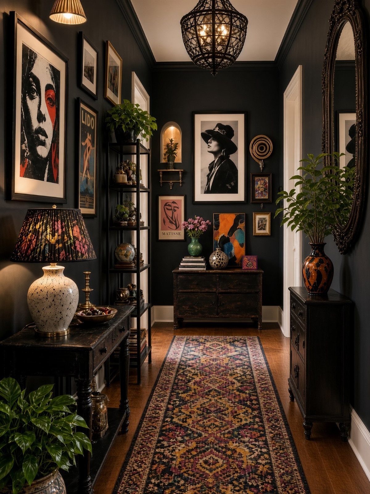
Layering works when the surfaces differ: a glossy mirror, a matte print, a portrait in a heavy frame, maybe a small shelf. Each one catches light differently, and that is where the depth comes from.
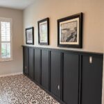
A dark wall suits this approach, since it makes the mix look intentional instead of busy.
Lay everything on the floor first and shuffle until no 2 similar pieces touch. A narrow hallway tolerates a dense arrangement better than a big open wall does.
5. Different Shapes and Sizes of Frames
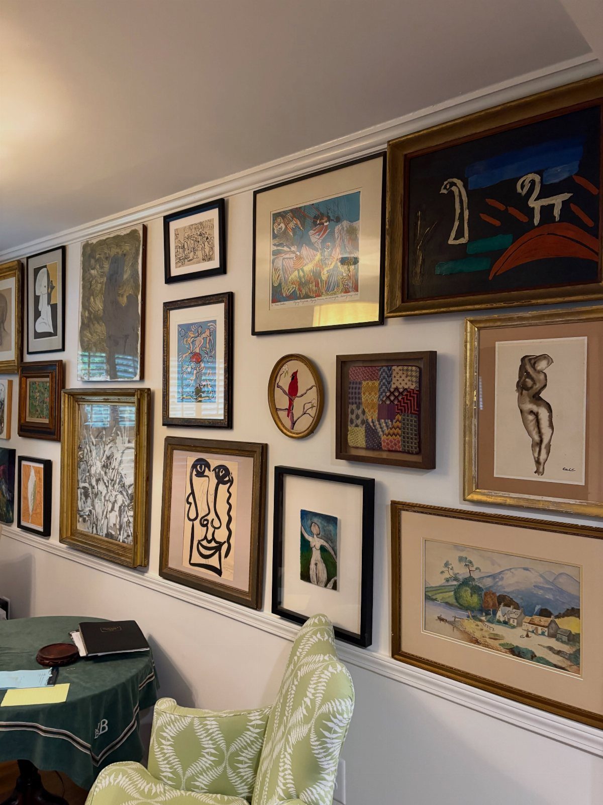
Frame variety does the work here: different sizes, finishes and proportions, all crowded onto one white wall. White gives the mix a quiet backdrop, so the frames can be as unmatched as you like.
I would start with the largest piece, set it slightly off center, and build outward with smaller ones.
Keep gaps between frames consistent so the variety reads as a plan. Secondhand frames in odd sizes are the budget route.
6. Matching Frames in a Grid Layout
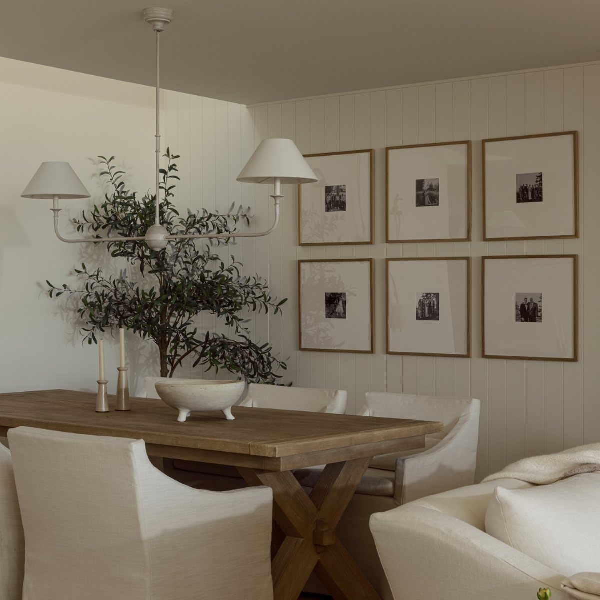
Identical frames in a grid look the easiest to hang, but a grid is also the layout that shows every spacing mistake, so measure twice. The repeating shapes do the design for you, and the only real skill is measuring.
Use the same frame, the same mat and equal gaps on every side; a level and a tape measure matter more than taste here.
A grid of pieces in two rows suits a dining wall, and a set of matching frames from one store keeps the cost low. Mismatched spacing is the one thing a grid will not forgive.
7. Black-and-white Photo Gallery Wall
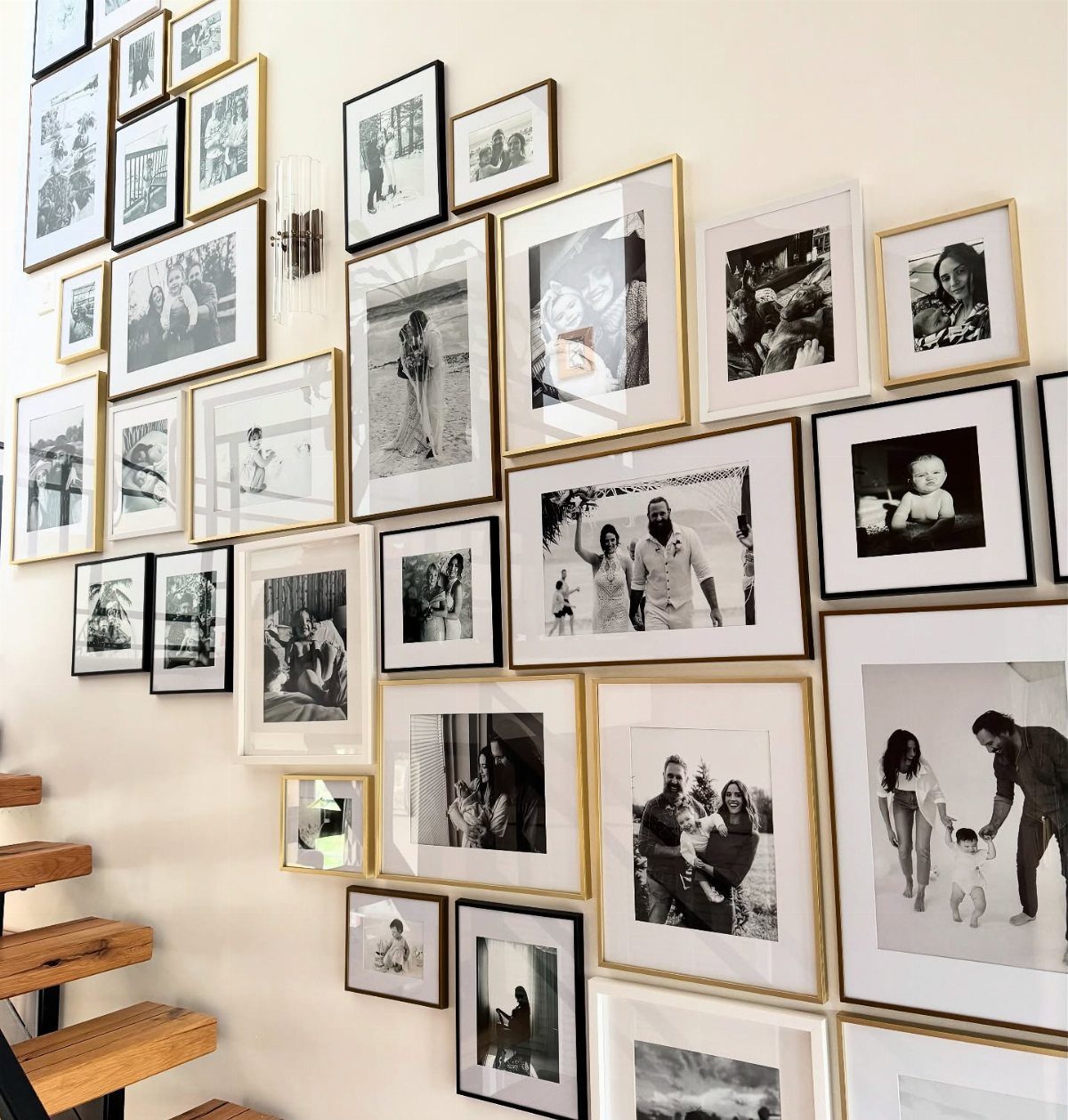
Black-and-white film is the quiet fix for family photos shot in different years, on different cameras, in different light. Once the color is gone, the images read as a set, and the frames can vary.
Gold and black frames mixed together, as here, add warmth without competing with the pictures.
Print everything at a few standard sizes, since prints are cheap, and keep the gaps between frames even. A stairwell wall gives you height to spread the group out.
8. Asymmetrical Gallery Wall Layout
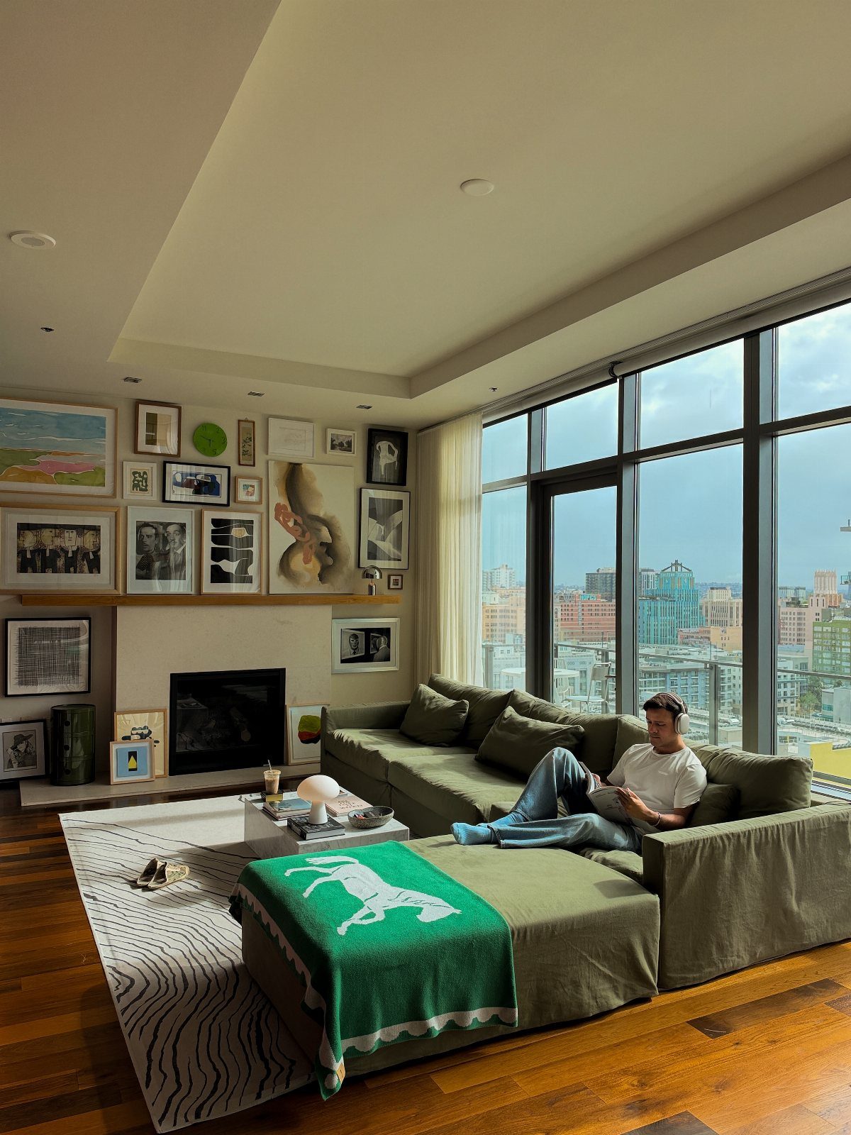
Asymmetry means no mirrored sides: a few large pieces, a few small ones, and uneven edges that still feel balanced. It suits a wall with a fireplace or a window nearby, since the arrangement can bend around them.
Start with the biggest frame and place the others by weight, so no corner feels heavy.
Lay the whole thing on the floor first and trace each frame on paper. I like mixed frames here, because matching ones can make a loose layout look like a mistake.
9. Rectangular/square Grouping Technique
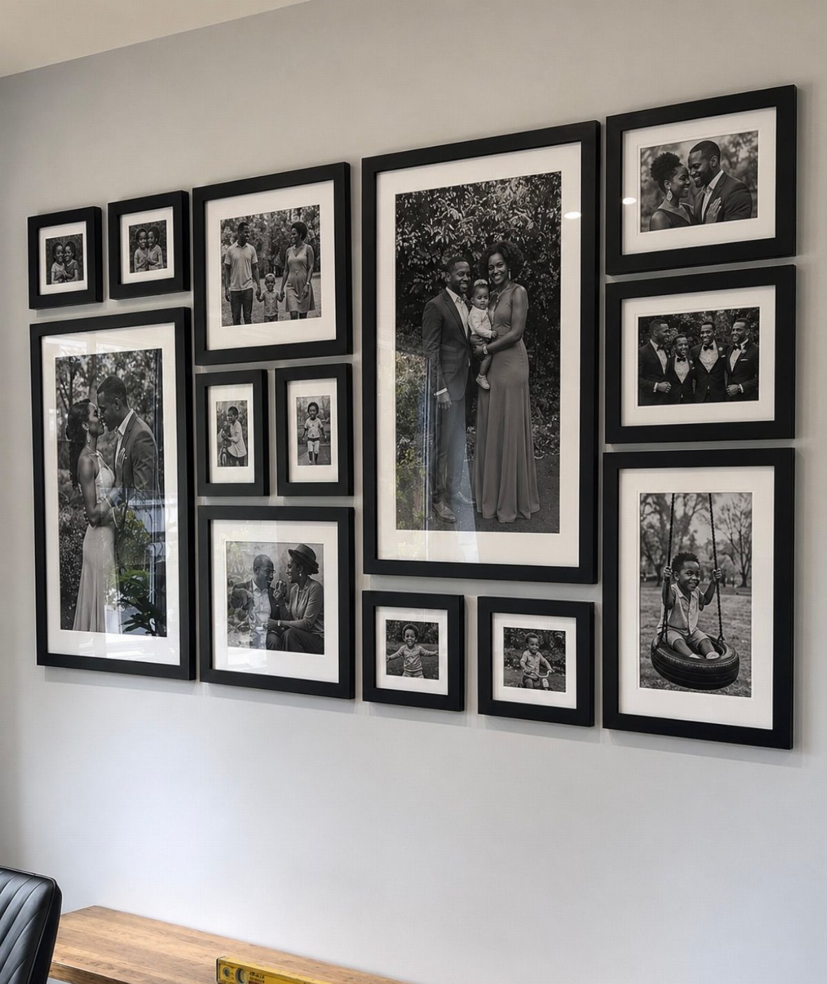
Treat the whole group as one big rectangle: the outer edges of the frames form a clean box, and what happens inside can be as varied as you like. That gives you a firm outline to hang to.
Mark the box on the wall with painter’s tape first, then fill it in so the top, bottom and sides line up.
Matching black frames on a grey wall keep it tidy, and a level helps most on the outside edges. This works well for a mix of photo sizes.
10. Staircase Diagonal Wall Layout
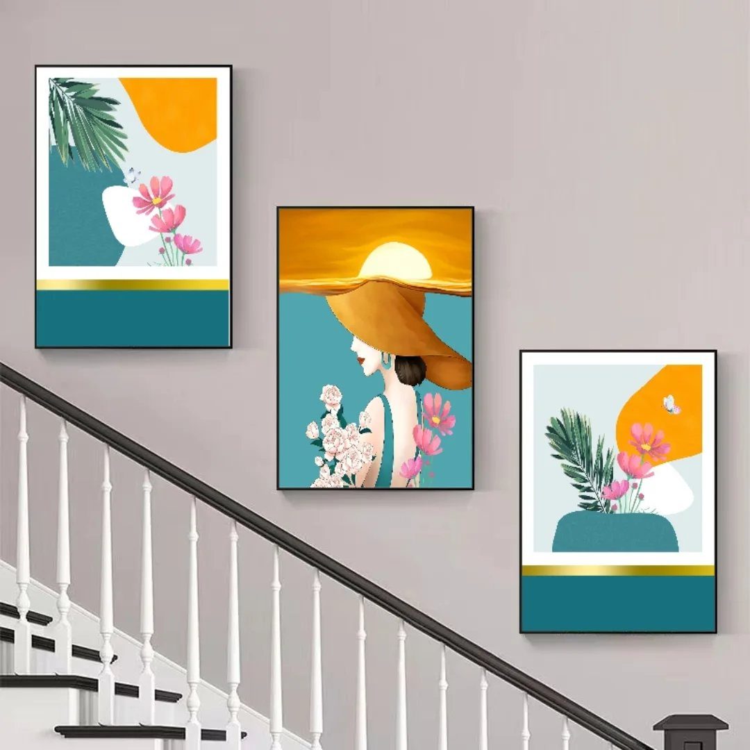
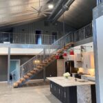
Hang the frames so their centers step down at the same angle as the stairs. 3 pieces are enough, and the slope does the work of making them look planned.
Follow the handrail or the stair line with a strip of painter’s tape, then hang each frame the same distance from it. Keep gaps equal.
Colorful prints stand out on a neutral wall, and abstract pieces forgive small errors in alignment better than portraits do. Cutting paper templates cheaply saves nail holes.
11. Corner Wall Poster Layout
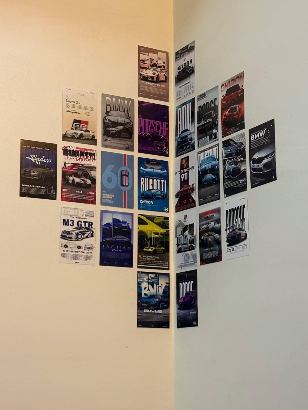
Unframed posters cost the least of any wall art, and a corner lets them wrap around 2 walls for a bigger effect than a flat wall gives.
Work out the grid first, with every poster the same size and the gaps equal.
Pick a method that suits a rental: removable tape or putty leaves the paint intact.
Run the rows across the corner line so the edge of one poster does not land right in the fold. I would stick to one theme, as cars work here, so the wall looks like a collection.
12. Pictures Over the Bed
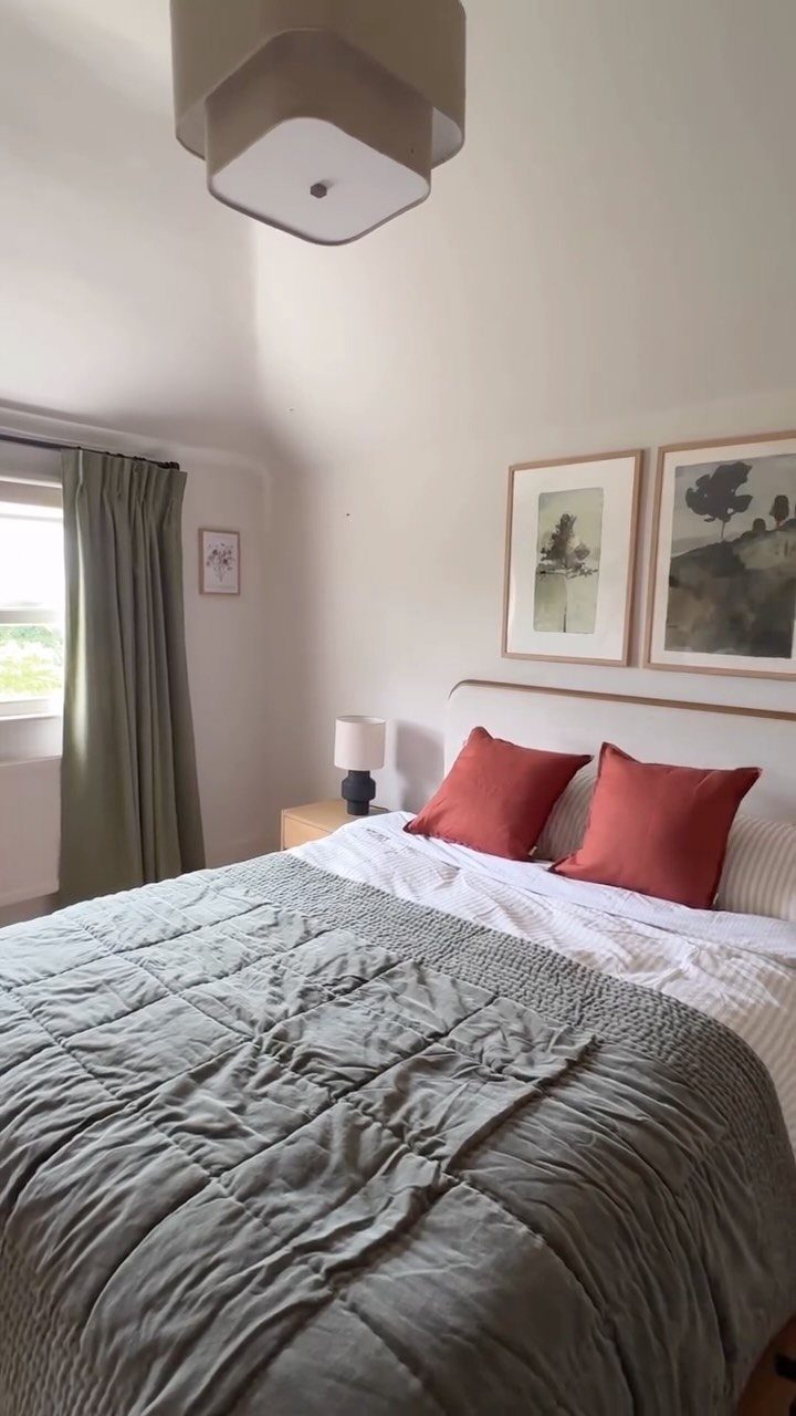
2 matching frames above a headboard feel balanced and take little effort. Center the pair on the bed, not on the wall if the bed sits off center, and keep the group narrower than the headboard.
Leave a hand’s width of space above the headboard so the art does not look crowded against it.
Landscapes in a calm palette suit a bedroom, and a gray quilt with a couple of red pillows gives a color to pick up from.
Two frames keep the job small, with just a nail or a hook for each one and a quick check with the level.
13. Gallery Wall Above a Console Table
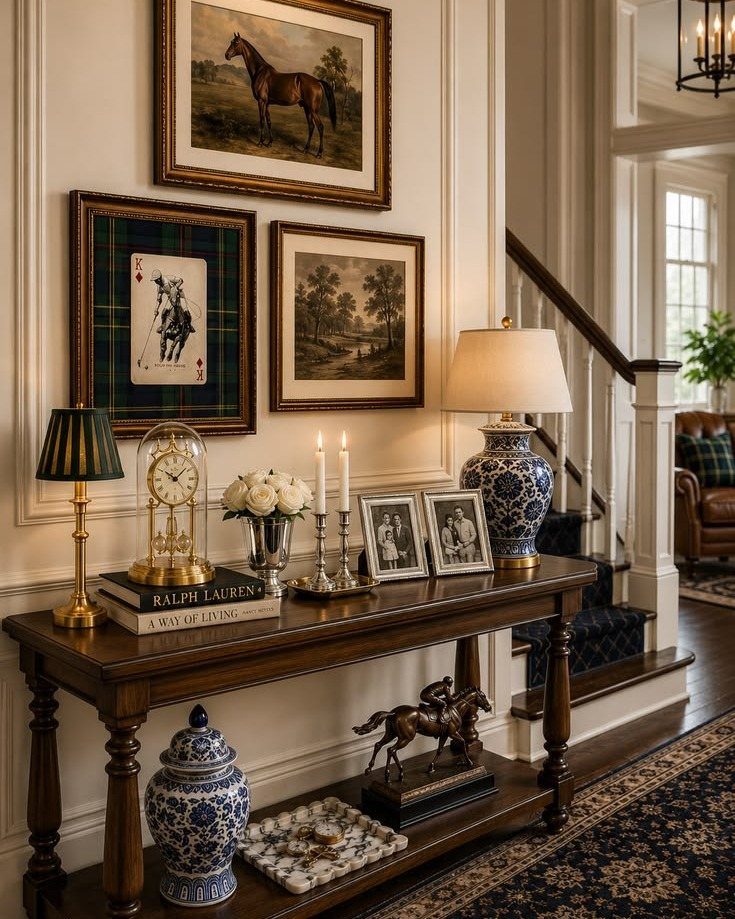
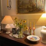
A console table gives a gallery wall a built-in base, so the frames only need to follow the table below.
Keep the cluster close to the width of the table, and leave a modest gap above the lamps so nothing crowds them.
3 frames are enough here. Because the table already holds lamps, a clock and books, I would keep the art simple and let the tabletop carry the variety.
Trace each frame on paper and tape the templates up first, so a lamp shade never ends up touching a corner.
14. Frames Arranged Over a Bookshelf
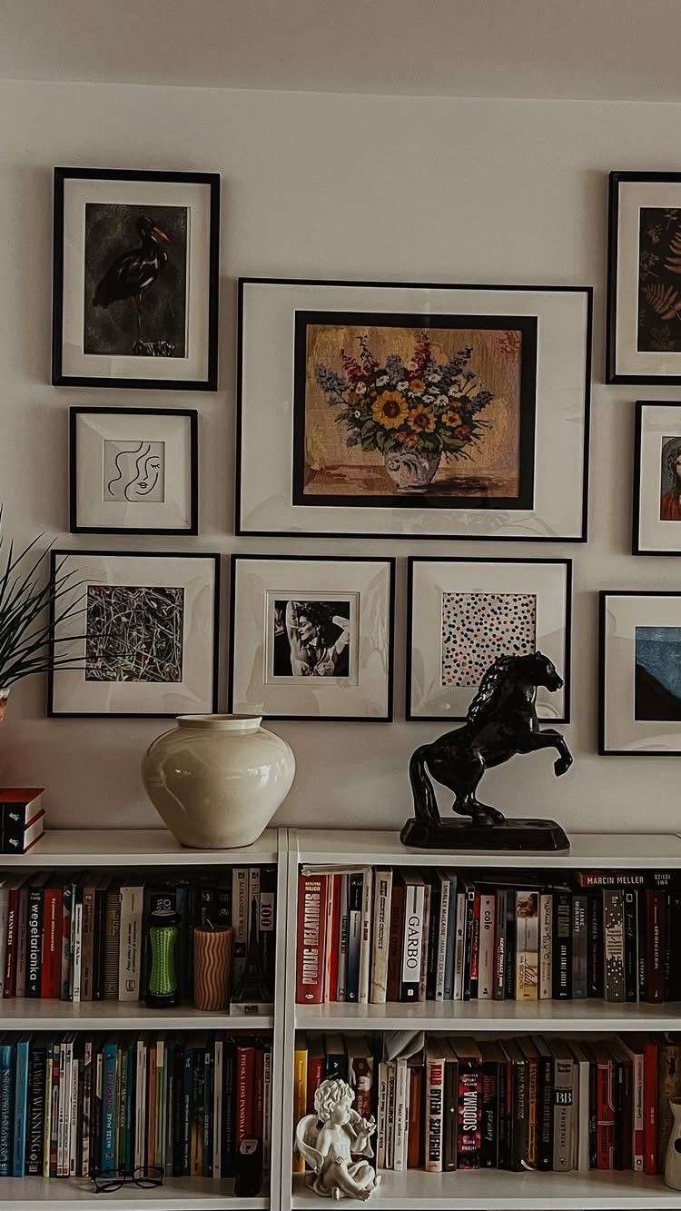
Low bookshelves leave a lot of bare wall above them, and a mix of frames fills it without any new furniture.
Vertical and horizontal frames in different sizes, hung on a white wall, keep the grouping lively over a shelf of books.
Start the arrangement a few inches above the shelf top so the objects below have room to breathe.
I would line up the outer edges of the group with the shelf, so the two read as one unit. Keep the gaps between frames equal, since the sizes already supply the variety.
15. Horizontal Row of Three Frames
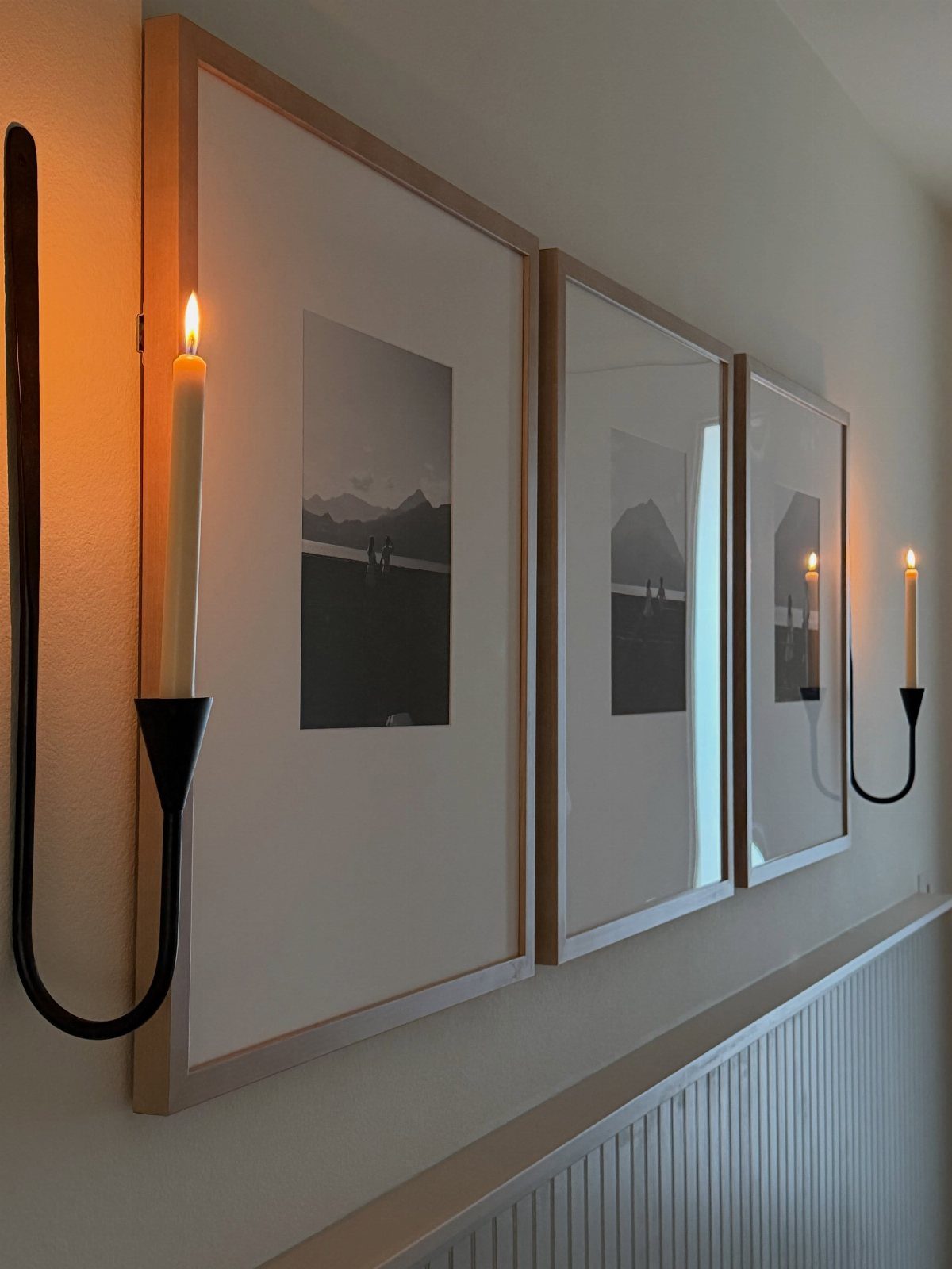
Three frames of the same landscape series in one even row is about the calmest wall you can hang. Match the sizes, keep the spacing equal, and the row reads as a single long picture.
A pair of sconces on either side, as here, frames the group and gives the wall symmetry for free.
Cut 3 paper templates and tape them up at eye level before any nails go in. A level matters most here, because a row of 3 shows a tilt immediately.
16. Vertical Stack of Three Frames
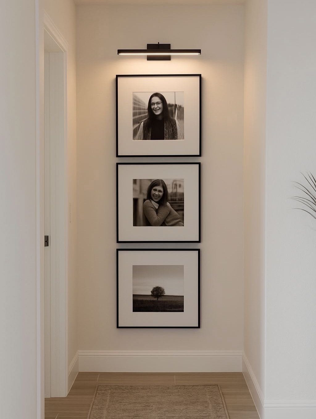
A narrow wall suits a vertical column, and 3 identical frames stacked top to bottom fill it without crowding. Same frame, same size, equal gaps: the repetition does the design.
Hang the middle frame first at eye level, then work up and down from it with a tape measure.
I would keep the gaps tight, since wide ones break the column into 3 separate pictures. A hallway is the natural spot, and a pencil line plumbed straight down the wall keeps the stack from drifting.
Best Products for Gallery Walls
Match the product to the style of the room. Canvas prints with a black edge and Forex® photo boards suit a modern space, and metal prints work there too.
For a minimalist or Scandinavian look, one large canvas print or a single metal print with lots of bare wall around it does more than a crowd of small pieces.
Canvas prints and framed photo prints handle that well.
If you want a photo wall with no frames at all, peel-and-stick photo tiles hang fast and come off easier than nails.
A modern wall also stays cleaner when I cap it at 5–7 pieces. Frames in thin black, or no frame at all, keep the focus on the image.
Gallery Wall Trends
Color and texture are the current direction. Gallery walls have moved away from the monochromatic, mixed-metallic look of the past few years, and rich antiqued frames, linen accents and playful striped mats are the details people are adding now.
Grid arrangements are trending too, and that pairs well with the other shift: smaller walls. Petite two- or three-piece arrangements are among the most popular, and they are quick to plan and hang.
If a full wall feels like too much, scale down. A small group with a bit of texture reads as deliberate, and it costs less than filling the whole wall.
Common Gallery Wall Locations
Above the sofa is where most people in the US hang a gallery wall, and I get why.
A dining room gives you a second good spot. Behind the table, the wall pulls the eye right away, so big, bold prints hold up well there.
An entryway is a narrow wall with heavy foot traffic, so a single row or a vertical column of prints fits better than a sprawling mix.
Tricky spaces work too. Corner nooks and staircases now get gallery walls, and a stair wall offers a diagonal line that guides a rising arrangement.
Frequently Asked Questions
How do I create a gallery wall layout?
Start by choosing a layout style that fits the wall, such as a grid, an asymmetrical cluster or one big rectangle outlined in painter’s tape.
Start by arranging the frames on the floor or taping paper templates to the wall, which lets you adjust the layout without committing to holes.
Match the spacing between frames and level the outer edges, because uniform gaps make the difference between a gallery wall that reads as intentional and one that looks haphazard.
What is the 57 rule for hanging pictures?
The "57 rule" refers to centering the arrangement 57 inches from the floor, which is roughly average eye level.
Center the arrangement at 57–60 inches from the floor, keep the width about two-thirds the furniture below, and leave 6–8 inches above a headboard or sofa back. Test it with paper templates before committing.
What is the best color to use on an art gallery wall?
White is the easiest choice, because it gives a quiet backdrop and lets frames of any size or finish look intentional.
A dark wall works well too for a layered mix of mirrors, prints and portraits, since it keeps the variety from looking busy.
When frames and art span different styles, stick to a single color palette so the collection holds together visually.
What pictures should I put on my wall?
Pick one theme, such as horses, landscapes or botanicals, and even mismatched pieces will look chosen rather than collected. Family photos shot in different years work well converted to black and white, which makes them read as a set.
For variety, add a round mirror or a small sign between the framed pieces. Thrift stores and flea markets are cheap sources if you search narrowly.